\n
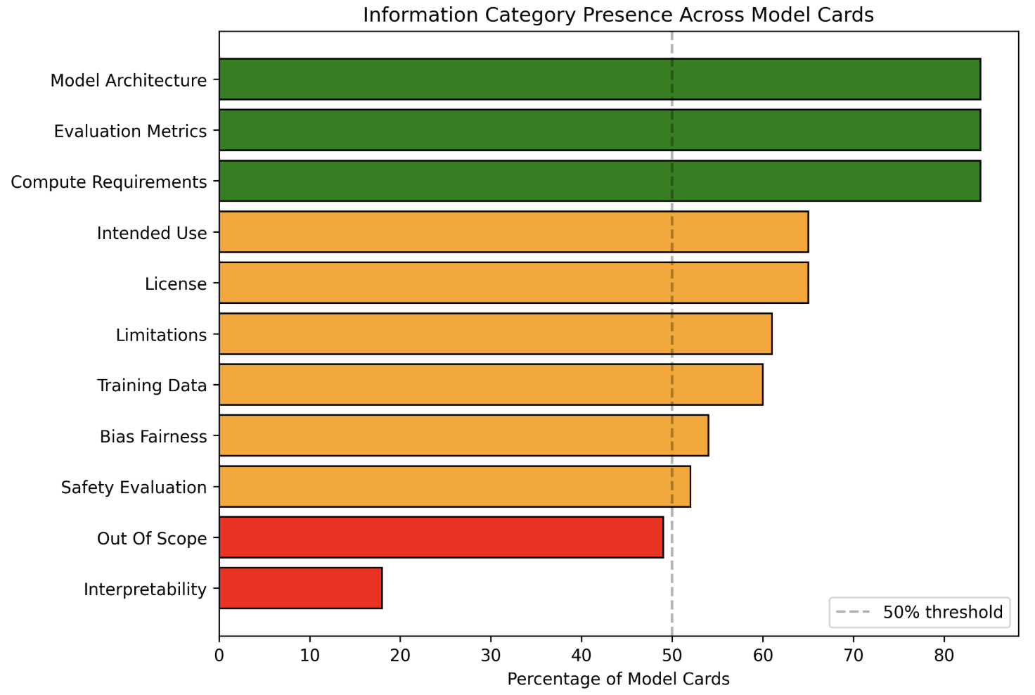
## Horizontal Bar Chart: Information Category Presence Across Model Cards
### Overview
This is a horizontal bar chart visualizing the percentage of model cards that include information about various categories. Each bar represents a category, and its length corresponds to the percentage of model cards containing information about that category. A vertical dashed line at 50% indicates a threshold.
### Components/Axes
* **Title:** "Information Category Presence Across Model Cards" (Top-center)
* **X-axis:** "Percentage of Model Cards" (Bottom-center), ranging from 0 to 80 in increments of 10.
* **Y-axis:** Lists the following information categories (left-aligned):
* Model Architecture
* Evaluation Metrics
* Compute Requirements
* Intended Use
* License
* Limitations
* Training Data
* Bias Fairness
* Safety Evaluation
* Out Of Scope
* Interpretability
* **Legend:** A dashed vertical line labeled "50% threshold" (right side of the chart).
* **Bar Colors:** Varying shades of green, yellow, and red, presumably indicating the degree of presence.
### Detailed Analysis
The chart displays the following approximate percentages for each category:
* **Model Architecture:** Approximately 78% (Dark Green)
* **Evaluation Metrics:** Approximately 75% (Dark Green)
* **Compute Requirements:** Approximately 65% (Dark Green)
* **Intended Use:** Approximately 60% (Orange)
* **License:** Approximately 58% (Orange)
* **Limitations:** Approximately 55% (Orange)
* **Training Data:** Approximately 53% (Yellow)
* **Bias Fairness:** Approximately 52% (Yellow)
* **Safety Evaluation:** Approximately 50% (Yellow)
* **Out Of Scope:** Approximately 48% (Red)
* **Interpretability:** Approximately 22% (Red)
The bars are arranged from top to bottom in the order listed above. The trend is generally decreasing from top to bottom, with the highest percentage at the top (Model Architecture) and the lowest at the bottom (Interpretability).
### Key Observations
* Model Architecture, Evaluation Metrics, and Compute Requirements are consistently present in a high percentage of model cards (above 60%).
* Interpretability is the least frequently included category, with only approximately 22% of model cards containing this information.
* Out of Scope is also relatively low, at approximately 48%.
* The 50% threshold line highlights that Safety Evaluation is right at the threshold, while Out of Scope is just below.
### Interpretation
The data suggests that certain categories of information are considered more important or are more commonly included in model cards than others. The high presence of Model Architecture, Evaluation Metrics, and Compute Requirements indicates a focus on the technical aspects of the model. The low presence of Interpretability suggests that understanding *why* a model makes certain predictions is less prioritized.
The 50% threshold serves as a benchmark for identifying areas where model card documentation could be improved. Categories below the threshold (Interpretability and Out of Scope) may benefit from increased attention and inclusion in future model cards.
The color scheme (green, yellow, red) likely represents a gradient of completeness or importance, with green indicating high presence and red indicating low presence. This visualization effectively communicates the gaps in information across model cards, providing insights for improving documentation practices. The chart implies a need for standardization and completeness in model card documentation to ensure transparency and responsible AI development.