## Grouped Bar Chart: Used Weights [%] per Layer
### Overview
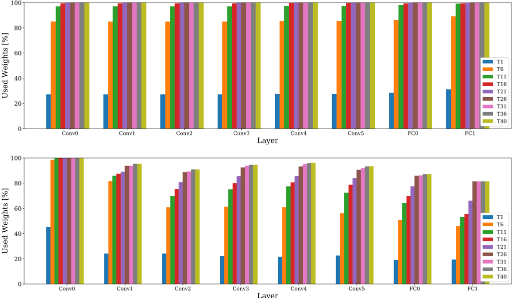
The image displays two grouped bar charts stacked vertically. Both charts visualize the percentage of "Used Weights" across eight distinct neural network layers (Conv0 through FC1). The charts compare nine different experimental conditions or thresholds, labeled T1 through T40, represented by a consistent color-coded legend. The top chart shows a high-saturation scenario, while the bottom chart illustrates a scenario with significant weight reduction (sparsity) across the layers.
### Components/Axes
* **Y-Axis:** "Used Weights [%]", scaled from 0 to 100.
* **X-Axis:** "Layer", with categories: Conv0, Conv1, Conv2, Conv3, Conv4, Conv5, FC0, FC1.
* **Legend (Right side of both charts):**
* **T1:** Blue
* **T6:** Orange
* **T11:** Green
* **T16:** Red
* **T21:** Purple
* **T26:** Brown
* **T31:** Pink
* **T36:** Gray
* **T40:** Olive/Yellow-Green
### Detailed Analysis
#### Top Chart
* **Trend:** This chart shows high weight utilization across all layers.
* **T1 (Blue):** Consistently low, hovering around 25-30% across all layers.
* **T6 (Orange):** Starts at ~85% at Conv0 and remains stable at ~85% across all subsequent layers.
* **T11–T40:** These categories show near-total weight utilization, consistently at or very close to 100% across all layers (Conv0 through FC1).
#### Bottom Chart
* **Trend:** This chart demonstrates a clear downward trend in weight utilization as the network progresses from Conv0 to FC1.
* **Conv0:** T1 is at ~45%. T6 through T40 are all at ~98-100%.
* **Conv1 to Conv5:**
* **T1 (Blue):** Drops to ~20-25% and remains stable.
* **T6 (Orange):** Shows a steady decline from ~82% (Conv1) to ~55% (Conv5).
* **T11–T40:** Show a gradual decline. For example, T40 (Olive) starts at ~95% at Conv1 and drops to ~93% at Conv5.
* **FC0 to FC1:**
* **T1 (Blue):** Remains at ~20%.
* **T6 (Orange):** Drops significantly, reaching ~45% at FC1.
* **T11–T40:** Show the most significant drop in this region. By FC1, T11 is at ~53%, while T40 is at ~80%.
### Key Observations
* **Sparsity Gradient:** The bottom chart clearly illustrates that the "Used Weights" percentage is inversely proportional to the depth of the layer (the further into the network, the fewer weights are used).
* **Threshold Sensitivity:** In the bottom chart, higher T-values (e.g., T40) consistently retain more weights than lower T-values (e.g., T6), suggesting that the "T" variable likely represents a pruning threshold where higher values are less aggressive.
* **Layer Sensitivity:** The fully connected layers (FC0, FC1) in the bottom chart show the most dramatic reduction in weight usage compared to the convolutional layers (Conv0-5).
### Interpretation
This visualization likely represents a **Neural Network Pruning Analysis**.
* **The "T" Variable:** The "T" values (1, 6, 11, ..., 40) likely correspond to different pruning thresholds or sparsity constraints applied to the model.
* **Top vs. Bottom:** The top chart appears to be a baseline or a "low-pruning" configuration where the model retains almost all weights. The bottom chart represents an "aggressive pruning" configuration.
* **Structural Impact:** The data demonstrates that pruning is not uniform across the network architecture. The convolutional layers (Conv0-5) are more resilient to pruning (retaining higher percentages of weights), whereas the fully connected layers (FC0-1) are significantly more sensitive, showing a sharp drop in weight retention. This is a common phenomenon in deep learning, where fully connected layers often contain redundant parameters that can be pruned more aggressively than convolutional filters.