## Grouped Bar Chart: Used Weights Percentage Across Neural Network Layers
### Overview
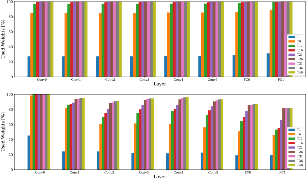
The image displays two vertically stacked grouped bar charts. Both charts share identical axes and legends but present distinct data patterns. The charts visualize the percentage of "Used Weights" across different layers of a neural network (Conv0 through FC1) for various threshold categories (T1 through T40). The top chart shows a pattern where most categories have near-maximum usage, while the bottom chart shows a progressive, staircase-like increase in usage across categories within each layer.
### Components/Axes
* **Chart Type:** Grouped Bar Chart (two subplots).
* **Y-Axis (Both Charts):** Label: "Used Weights [%]". Scale: 0 to 100, with major tick marks at 0, 20, 40, 60, 80, 100.
* **X-Axis (Both Charts):** Label: "Layer". Categories (from left to right): `Conv0`, `Conv1`, `Conv2`, `Conv3`, `Conv4`, `Conv5`, `FC0`, `FC1`.
* **Legend (Right side of each subplot):** A vertical list of 9 categories, each associated with a unique color.
* `T1`: Blue
* `T6`: Orange
* `T11`: Green
* `T16`: Red
* `T21`: Purple
* `T26`: Brown
* `T31`: Pink
* `T36`: Gray
* `T40`: Olive/Yellow-Green
* **Spatial Layout:** The two charts are stacked vertically. The legend is positioned to the right of the plot area in each chart. Each layer group on the x-axis contains 9 bars, one for each legend category, ordered from left (T1) to right (T40).
### Detailed Analysis
**Top Chart Analysis:**
* **Trend:** For every layer, the `T1` (blue) bar is significantly shorter than all others. The `T6` (orange) bar is substantially taller than `T1` but shorter than the remaining bars. Categories `T11` through `T40` all show bars reaching or nearly reaching the 100% mark.
* **Data Points (Approximate Values):**
* **Conv0:** T1 ~27%, T6 ~85%, T11 ~98%, T16-T40 ~100%.
* **Conv1-Conv5:** Very similar pattern. T1 ~27-28%, T6 ~85%, T11 ~98-99%, T16-T40 ~100%.
* **FC0:** T1 ~28%, T6 ~86%, T11 ~99%, T16-T40 ~100%.
* **FC1:** T1 ~31%, T6 ~89%, T11 ~100%, T16-T40 ~100%.
**Bottom Chart Analysis:**
* **Trend:** Within each layer group, there is a clear, progressive increase in bar height from `T1` (shortest) to `T40` (tallest). This creates a "staircase" effect. The overall height of the staircase varies by layer, with `Conv0` having the highest starting point and `FC1` the lowest.
* **Data Points (Approximate Values):**
* **Conv0:** T1 ~45%, T6 ~60%, T11 ~70%, T16 ~80%, T21 ~85%, T26 ~90%, T31 ~95%, T36 ~98%, T40 ~100%.
* **Conv1:** T1 ~24%, T6 ~82%, T11 ~85%, T16 ~88%, T21 ~92%, T26 ~94%, T31 ~95%, T36 ~96%, T40 ~96%.
* **Conv2:** T1 ~24%, T6 ~61%, T11 ~70%, T16 ~75%, T21 ~80%, T26 ~85%, T31 ~88%, T36 ~90%, T40 ~91%.
* **Conv3:** T1 ~22%, T6 ~61%, T11 ~75%, T16 ~80%, T21 ~85%, T26 ~90%, T31 ~93%, T36 ~94%, T40 ~95%.
* **Conv4:** T1 ~21%, T6 ~61%, T11 ~77%, T16 ~82%, T21 ~86%, T26 ~92%, T31 ~95%, T36 ~96%, T40 ~97%.
* **Conv5:** T1 ~22%, T6 ~57%, T11 ~72%, T16 ~79%, T21 ~85%, T26 ~90%, T31 ~92%, T36 ~93%, T40 ~94%.
* **FC0:** T1 ~19%, T6 ~51%, T11 ~64%, T16 ~70%, T21 ~78%, T26 ~83%, T31 ~86%, T36 ~87%, T40 ~88%.
* **FC1:** T1 ~20%, T6 ~45%, T11 ~54%, T16 ~56%, T21 ~66%, T26 ~81%, T31 ~82%, T36 ~82%, T40 ~82%.
### Key Observations
1. **Dichotomy in Patterns:** The two charts demonstrate fundamentally different behaviors. The top chart shows a binary-like response (low for T1, high for T6, saturated for T11+), while the bottom chart shows a graded, near-linear response across the threshold categories.
2. **Layer Sensitivity:** In the bottom chart, the "Used Weights" percentage is generally highest in the early convolutional layer (`Conv0`) and decreases in later layers, particularly in the fully connected layers (`FC0`, `FC1`). The `FC1` layer shows the lowest overall usage and a plateau for the highest thresholds (T26-T40).
3. **T1 as an Outlier:** In both charts, `T1` consistently represents the lowest percentage of used weights, indicating it is the most restrictive threshold.
4. **Saturation Point:** In the top chart, saturation (near 100% usage) is reached by `T11` in most layers. In the bottom chart, saturation is only approached by `T40` in the earliest layers.
### Interpretation
This data likely compares two different methods or configurations for neural network pruning or weight quantization, where `T1` to `T40` represent increasing threshold values for retaining weights.
* **Top Chart Interpretation:** This pattern suggests a method with a very sharp transition. A low threshold (`T1`) prunes most weights. A moderate threshold (`T6`) retains a large majority. Any threshold from `T11` upwards retains virtually all weights, indicating the method has little effect beyond a certain point. This could be characteristic of a global, unstructured pruning method with a steep magnitude distribution.
* **Bottom Chart Interpretation:** This pattern suggests a more granular, layer-sensitive method. The progressive increase shows that each increment in threshold (`T` value) meaningfully increases the proportion of weights retained. The decreasing usage in later layers (especially FC layers) implies these layers are more sensitive to pruning or have a different weight magnitude distribution, making them sparser under the same thresholding rule. The plateau in `FC1` suggests a limit to how many weights can be retained in that layer regardless of the threshold.
* **Overall Implication:** The visualization contrasts a "cliff-edge" pruning behavior (top) with a "graded" or "layer-adaptive" pruning behavior (bottom). The bottom method offers finer control over the sparsity-accuracy trade-off across different network depths.