TECHNICAL ASSET FINGERPRINT
7799e88d71d876208fe12ff3
Click to view fullscreen
Press ESC or click to close
FOUND IN PAPERS
EXPERT: gemini-2.0-flash VERSION 1
RUNTIME: nugit/gemini/gemini-2.0-flash
INTEL_VERIFIED
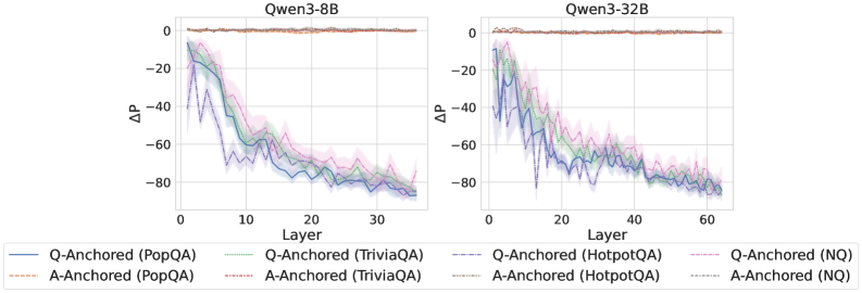
## Line Graphs: Qwen3-8B and Qwen3-32B Performance
### Overview
The image contains two line graphs comparing the performance of Qwen3-8B and Qwen3-32B models across different layers and question-answering datasets. The y-axis represents ΔP (Delta P), and the x-axis represents the layer number. Each graph plots the performance of question-anchored (Q-Anchored) and answer-anchored (A-Anchored) versions of the models on four datasets: PopQA, TriviaQA, HotpotQA, and NQ.
### Components/Axes
**Left Graph (Qwen3-8B):**
* **Title:** Qwen3-8B
* **X-axis:** Layer, with ticks at 0, 10, 20, and 30. The x-axis ranges from 0 to approximately 35.
* **Y-axis:** ΔP, with ticks at 0, -20, -40, -60, and -80. The y-axis ranges from 0 to -80.
* **Legend (bottom):**
* Blue solid line: Q-Anchored (PopQA)
* Brown dashed line: A-Anchored (PopQA)
* Green dotted line: Q-Anchored (TriviaQA)
* Light green dash-dotted line: A-Anchored (TriviaQA)
* Purple dash-dotted line: Q-Anchored (NQ)
* Pink dashed line: A-Anchored (NQ)
* Dark Green dash-dotted line: Q-Anchored (HotpotQA)
* Grey dotted line: A-Anchored (HotpotQA)
**Right Graph (Qwen3-32B):**
* **Title:** Qwen3-32B
* **X-axis:** Layer, with ticks at 0, 20, 40, and 60. The x-axis ranges from 0 to approximately 65.
* **Y-axis:** ΔP, with ticks at 0, -20, -40, -60, and -80. The y-axis ranges from 0 to -80.
* **Legend (bottom):**
* Blue solid line: Q-Anchored (PopQA)
* Brown dashed line: A-Anchored (PopQA)
* Green dotted line: Q-Anchored (TriviaQA)
* Light green dash-dotted line: A-Anchored (TriviaQA)
* Purple dash-dotted line: Q-Anchored (NQ)
* Pink dashed line: A-Anchored (NQ)
* Dark Green dash-dotted line: Q-Anchored (HotpotQA)
* Grey dotted line: A-Anchored (HotpotQA)
### Detailed Analysis
**Qwen3-8B:**
* **Q-Anchored (PopQA) (Blue solid line):** Starts at approximately -15, decreases rapidly to around -70 by layer 10, and then plateaus around -75 to -80.
* **A-Anchored (PopQA) (Brown dashed line):** Remains relatively constant around 0.
* **Q-Anchored (TriviaQA) (Green dotted line):** Starts at approximately -10, decreases to around -55 by layer 10, and then plateaus around -60 to -70.
* **A-Anchored (TriviaQA) (Light green dash-dotted line):** Starts at approximately -15, decreases to around -50 by layer 10, and then plateaus around -60 to -70.
* **Q-Anchored (NQ) (Purple dash-dotted line):** Starts at approximately -15, decreases rapidly to around -70 by layer 10, and then plateaus around -75 to -80.
* **A-Anchored (NQ) (Pink dashed line):** Starts at approximately -15, decreases to around -50 by layer 10, and then plateaus around -60 to -70.
* **Q-Anchored (HotpotQA) (Dark Green dash-dotted line):** Starts at approximately -10, decreases to around -55 by layer 10, and then plateaus around -60 to -70.
* **A-Anchored (HotpotQA) (Grey dotted line):** Starts at approximately -15, decreases to around -50 by layer 10, and then plateaus around -60 to -70.
**Qwen3-32B:**
* **Q-Anchored (PopQA) (Blue solid line):** Starts at approximately -15, decreases rapidly to around -70 by layer 20, and then plateaus around -75 to -80.
* **A-Anchored (PopQA) (Brown dashed line):** Remains relatively constant around 0.
* **Q-Anchored (TriviaQA) (Green dotted line):** Starts at approximately -10, decreases to around -55 by layer 20, and then plateaus around -60 to -70.
* **A-Anchored (TriviaQA) (Light green dash-dotted line):** Starts at approximately -15, decreases to around -50 by layer 20, and then plateaus around -60 to -70.
* **Q-Anchored (NQ) (Purple dash-dotted line):** Starts at approximately -15, decreases rapidly to around -70 by layer 20, and then plateaus around -75 to -80.
* **A-Anchored (NQ) (Pink dashed line):** Starts at approximately -15, decreases to around -50 by layer 20, and then plateaus around -60 to -70.
* **Q-Anchored (HotpotQA) (Dark Green dash-dotted line):** Starts at approximately -10, decreases to around -55 by layer 20, and then plateaus around -60 to -70.
* **A-Anchored (HotpotQA) (Grey dotted line):** Starts at approximately -15, decreases to around -50 by layer 20, and then plateaus around -60 to -70.
### Key Observations
* The A-Anchored (PopQA) performance remains consistently near 0 across all layers for both models.
* The Q-Anchored lines generally show a rapid decrease in ΔP in the initial layers, followed by a plateau.
* The Qwen3-32B model shows a similar trend to Qwen3-8B, but the decrease in ΔP occurs over a larger number of layers.
* The performance on PopQA and NQ datasets (Q-Anchored) appears to be slightly worse (lower ΔP) than on TriviaQA and HotpotQA.
### Interpretation
The graphs illustrate the performance of Qwen3-8B and Qwen3-32B models on different question-answering datasets, with a focus on how the performance changes across different layers of the model. The A-Anchored (PopQA) consistently performing near 0 suggests that the answer anchoring strategy is not effective for the PopQA dataset. The rapid decrease in ΔP for Q-Anchored lines indicates that the model's performance improves significantly in the initial layers, but the improvement plateaus as the model goes deeper. The Qwen3-32B model, with its larger size, shows a similar trend but over a larger number of layers, suggesting that it takes more layers for the model to reach its optimal performance. The difference in performance between datasets suggests that the model is better suited for some types of questions than others.
DECODING INTELLIGENCE...
EXPERT: gemma-3-27b-it-free VERSION 1
RUNTIME: google-free/gemma-3-27b-it
INTEL_VERIFIED
\n
## Line Chart: ΔP vs. Layer for Qwen Models
### Overview
The image presents two line charts, side-by-side, displaying the change in probability (ΔP) as a function of layer number for two different Qwen models: Qwen3-8B and Qwen3-32B. Each chart contains multiple lines representing different anchoring and question-answering (QA) datasets. The charts visually compare how ΔP changes across layers for each model and dataset combination.
### Components/Axes
* **X-axis:** Layer (ranging from 0 to approximately 35 for Qwen3-8B and 0 to approximately 60 for Qwen3-32B).
* **Y-axis:** ΔP (ranging from approximately -90 to 0).
* **Models:** Qwen3-8B (left chart), Qwen3-32B (right chart).
* **Datasets/Anchoring:**
* PopQA
* TriviaQA
* HotpotQA
* NQ (Natural Questions)
* **Anchoring Types:**
* Q-Anchored
* A-Anchored
* **Legend:** Located at the bottom of the image, providing color-coded labels for each line.
### Detailed Analysis or Content Details
**Qwen3-8B (Left Chart)**
* **Q-Anchored (PopQA):** A solid blue line. Starts at approximately -10 at Layer 0, decreases steeply to approximately -80 at Layer 10, and then plateaus around -80 to -70 from Layer 20 to 35.
* **A-Anchored (PopQA):** A light orange dashed line. Starts at approximately -5 at Layer 0, decreases to approximately -60 at Layer 10, and then plateaus around -60 to -50 from Layer 20 to 35.
* **Q-Anchored (TriviaQA):** A solid purple line. Starts at approximately -15 at Layer 0, decreases steeply to approximately -70 at Layer 10, and then plateaus around -70 to -60 from Layer 20 to 35.
* **A-Anchored (TriviaQA):** A light purple dashed line. Starts at approximately -10 at Layer 0, decreases to approximately -60 at Layer 10, and then plateaus around -60 to -50 from Layer 20 to 35.
* **Q-Anchored (HotpotQA):** A solid green line. Starts at approximately -20 at Layer 0, decreases steeply to approximately -70 at Layer 10, and then plateaus around -70 to -60 from Layer 20 to 35.
* **A-Anchored (HotpotQA):** A light green dashed line. Starts at approximately -15 at Layer 0, decreases to approximately -60 at Layer 10, and then plateaus around -60 to -50 from Layer 20 to 35.
* **Q-Anchored (NQ):** A solid teal line. Starts at approximately -5 at Layer 0, decreases to approximately -40 at Layer 10, and then plateaus around -40 to -30 from Layer 20 to 35.
* **A-Anchored (NQ):** A light teal dashed line. Starts at approximately 0 at Layer 0, decreases to approximately -30 at Layer 10, and then plateaus around -30 to -20 from Layer 20 to 35.
**Qwen3-32B (Right Chart)**
* **Q-Anchored (PopQA):** A solid blue line. Starts at approximately -10 at Layer 0, decreases steeply to approximately -80 at Layer 10, and then plateaus around -80 to -70 from Layer 20 to 60.
* **A-Anchored (PopQA):** A light orange dashed line. Starts at approximately -5 at Layer 0, decreases to approximately -60 at Layer 10, and then plateaus around -60 to -50 from Layer 20 to 60.
* **Q-Anchored (TriviaQA):** A solid purple line. Starts at approximately -15 at Layer 0, decreases steeply to approximately -70 at Layer 10, and then plateaus around -70 to -60 from Layer 20 to 60.
* **A-Anchored (TriviaQA):** A light purple dashed line. Starts at approximately -10 at Layer 0, decreases to approximately -60 at Layer 10, and then plateaus around -60 to -50 from Layer 20 to 60.
* **Q-Anchored (HotpotQA):** A solid green line. Starts at approximately -20 at Layer 0, decreases steeply to approximately -70 at Layer 10, and then plateaus around -70 to -60 from Layer 20 to 60.
* **A-Anchored (HotpotQA):** A light green dashed line. Starts at approximately -15 at Layer 0, decreases to approximately -60 at Layer 10, and then plateaus around -60 to -50 from Layer 20 to 60.
* **Q-Anchored (NQ):** A solid teal line. Starts at approximately -5 at Layer 0, decreases to approximately -40 at Layer 10, and then plateaus around -40 to -30 from Layer 20 to 60.
* **A-Anchored (NQ):** A light teal dashed line. Starts at approximately 0 at Layer 0, decreases to approximately -30 at Layer 10, and then plateaus around -30 to -20 from Layer 20 to 60.
### Key Observations
* All lines exhibit a steep decrease in ΔP within the first 10 layers, regardless of the model, dataset, or anchoring type.
* After the initial decrease, ΔP plateaus, indicating diminishing changes in probability with increasing layer depth.
* Q-Anchored lines generally have lower ΔP values than A-Anchored lines for the same dataset.
* The NQ dataset consistently shows the smallest decrease in ΔP compared to other datasets.
* The Qwen3-32B model shows a similar trend to Qwen3-8B, but extends to a greater layer depth (60 layers vs. 35 layers).
### Interpretation
The charts demonstrate how the change in probability (ΔP) evolves across layers in the Qwen models when evaluated on different question-answering datasets. The initial steep decline in ΔP suggests that the early layers of the models are responsible for capturing the most significant changes in probability related to the QA tasks. The subsequent plateau indicates that deeper layers contribute less to these changes.
The difference between Q-Anchored and A-Anchored lines suggests that the anchoring method influences the model's probability distribution. Q-Anchoring, which likely involves anchoring on the question itself, leads to a more pronounced decrease in ΔP, potentially indicating a stronger focus on the question's context.
The relatively small decrease in ΔP for the NQ dataset might suggest that this dataset is easier for the models to process or that the models already have a strong understanding of the concepts involved in NQ questions.
The similarity in trends between the two models (Qwen3-8B and Qwen3-32B) suggests that the underlying architecture and learning process are consistent, despite the difference in model size. The extended layer depth in Qwen3-32B allows for a more prolonged plateau, potentially indicating a greater capacity for nuanced representation.
DECODING INTELLIGENCE...
EXPERT: healer-alpha-free VERSION 1
RUNTIME: free/openrouter/healer-alpha
INTEL_VERIFIED
## Line Charts: Layer-wise ΔP for Q-Anchored vs. A-Anchored Methods on Qwen3 Models
### Overview
The image displays two side-by-side line charts comparing the performance metric ΔP across model layers for two different large language models: **Qwen3-8B** (left chart) and **Qwen3-32B** (right chart). Each chart plots multiple data series representing different experimental methods ("Q-Anchored" and "A-Anchored") applied to four distinct question-answering datasets. The charts share a common legend and axis labels.
### Components/Axes
* **Chart Titles:**
* Left Chart: `Qwen3-8B`
* Right Chart: `Qwen3-32B`
* **X-Axis (Both Charts):**
* Label: `Layer`
* Scale (Qwen3-8B): 0 to ~35, with major ticks at 0, 10, 20, 30.
* Scale (Qwen3-32B): 0 to ~65, with major ticks at 0, 20, 40, 60.
* **Y-Axis (Both Charts):**
* Label: `ΔP` (Delta P)
* Scale: Approximately -90 to +5, with major ticks at -80, -60, -40, -20, 0.
* **Legend (Bottom, spanning both charts):**
* The legend is positioned at the bottom of the figure, below both charts.
* It defines 8 data series using a combination of line color and style (solid vs. dashed).
* **Q-Anchored (Solid Lines):**
* Blue solid line: `Q-Anchored (PopQA)`
* Green solid line: `Q-Anchored (TriviaQA)`
* Purple solid line: `Q-Anchored (HotpotQA)`
* Pink solid line: `Q-Anchored (NQ)`
* **A-Anchored (Dashed Lines):**
* Orange dashed line: `A-Anchored (PopQA)`
* Red dashed line: `A-Anchored (TriviaQA)`
* Gray dashed line: `A-Anchored (HotpotQA)`
* Light blue dashed line: `A-Anchored (NQ)`
* **Visual Elements:** Each data series is plotted as a line with a shaded region around it, likely representing a confidence interval or standard deviation.
### Detailed Analysis
**Qwen3-8B Chart (Left):**
* **Q-Anchored Series (Solid Lines):** All four solid lines (PopQA, TriviaQA, HotpotQA, NQ) exhibit a strong, consistent downward trend.
* They start at Layer 1 with ΔP values between approximately -10 and -20.
* They decline steeply until around Layer 15-20, reaching values between -60 and -70.
* The decline continues at a slower rate, ending near Layer 35 with values clustered around -80.
* The lines are tightly grouped, with the blue (PopQA) and purple (HotpotQA) lines often at the lower edge of the cluster.
* **A-Anchored Series (Dashed Lines):** All four dashed lines remain very close to the ΔP = 0 baseline across all layers (0 to ~35). They show minimal fluctuation, staying within a narrow band roughly between -5 and +5.
**Qwen3-32B Chart (Right):**
* **Q-Anchored Series (Solid Lines):** The pattern is similar to the 8B model but extended over more layers.
* They start near Layer 1 with ΔP values between -10 and -25.
* A steep decline occurs until approximately Layer 25-30, where values reach between -60 and -75.
* The decline persists, ending near Layer 65 with values tightly clustered around -80.
* The grouping of lines is very tight, making individual series difficult to distinguish in the later layers.
* **A-Anchored Series (Dashed Lines):** Identical to the 8B chart, these lines hover consistently near ΔP = 0 across the entire layer range (0 to ~65).
### Key Observations
1. **Fundamental Dichotomy:** There is a stark, categorical difference between the behavior of Q-Anchored and A-Anchored methods. Q-Anchored methods show a large, layer-dependent negative ΔP, while A-Anchored methods show a ΔP near zero that is layer-invariant.
2. **Layer-Dependent Degradation:** For Q-Anchored methods, the metric ΔP degrades (becomes more negative) significantly as information propagates through deeper layers of the network. The most rapid change occurs in the first half of the layers.
3. **Model Scale Invariance of Pattern:** The qualitative pattern is identical between the 8B and 32B parameter models. The 32B model simply extends the trend over a greater number of layers.
4. **Dataset Similarity:** Within each anchoring method (Q or A), the performance across the four different datasets (PopQA, TriviaQA, HotpotQA, NQ) is remarkably similar. The lines for different datasets are tightly clustered, suggesting the observed effect is robust across these QA benchmarks.
5. **Convergence:** By the final layers, the Q-Anchored lines for all datasets converge to a very similar, low ΔP value (approx. -80).
### Interpretation
This visualization presents a technical analysis of internal model behavior, likely probing how different "anchoring" techniques affect a model's internal probability distributions (ΔP) across its layers.
* **What the data suggests:** The "A-Anchored" method appears to stabilize the model's internal representations, maintaining a consistent probability shift (ΔP ≈ 0) regardless of depth. In contrast, the "Q-Anchored" method leads to a progressive and substantial negative shift in probabilities as information moves from early to late layers. This could indicate that anchoring on the question (Q) causes the model to increasingly suppress or alter certain probability distributions in deeper processing stages, while anchoring on the answer (A) preserves the initial distribution.
* **How elements relate:** The side-by-side comparison of two model sizes demonstrates that this is a fundamental property of the anchoring methods themselves, not an artifact of a specific model scale. The consistency across four datasets reinforces that the finding is generalizable within the domain of question answering.
* **Notable anomalies/trends:** The most striking "anomaly" is the perfect separation between the two method families. There is no overlap or ambiguity. The trend is not merely a gradual decline for Q-Anchored methods; it is a steep, monotonic drop that accounts for nearly the entire y-axis range. The tight clustering of datasets suggests the underlying mechanism being measured is highly consistent.
* **Peircean investigative reading:** The charts function as an *index* pointing to a causal relationship: the choice of anchoring technique (Q vs. A) directly causes a drastic difference in the layer-wise evolution of the model's internal state (ΔP). The consistency across models and datasets makes this a reliable sign of a core mechanistic difference. A researcher would infer that "A-Anchoring" acts as a regularizer or stabilizer for internal probabilities, while "Q-Anchoring" allows or induces a significant transformation of those probabilities during deep processing. This has implications for understanding model interpretability and designing probing experiments.
DECODING INTELLIGENCE...
EXPERT: nemotron-free VERSION 2
RUNTIME: free/nvidia/nemotron-nano-12b-v2-vl:free
INTEL_VERIFIED
## Line Graphs: ΔP Trends Across Layers for Qwen3-8B and Qwen3-32B Models
### Overview
The image contains two line graphs comparing the performance of Qwen3-8B and Qwen3-32B models across layers (0–30 and 0–60, respectively) using different anchoring strategies (Q-Anchored vs. A-Anchored) and datasets (PopQA, TriviaQA, HotpotQA, NQ). The y-axis represents ΔP (change in performance), and the x-axis represents model layers. Shaded regions indicate variability/confidence intervals.
---
### Components/Axes
- **X-Axis (Layer)**:
- Qwen3-8B: 0 to 30 (intervals of 10)
- Qwen3-32B: 0 to 60 (intervals of 20)
- **Y-Axis (ΔP)**:
- Range: -80 to 0 (negative values indicate performance degradation)
- Units: Not explicitly labeled, but ΔP implies relative change.
- **Legends**:
- **Qwen3-8B**:
- Solid lines: Q-Anchored (PopQA, TriviaQA, HotpotQA, NQ)
- Dashed lines: A-Anchored (PopQA, TriviaQA, HotpotQA, NQ)
- **Qwen3-32B**:
- Solid lines: Q-Anchored (PopQA, TriviaQA, HotpotQA, NQ)
- Dashed lines: A-Anchored (PopQA, TriviaQA, HotpotQA, NQ)
- Colors:
- Blue: PopQA
- Green: TriviaQA
- Purple: HotpotQA
- Red: NQ
---
### Detailed Analysis
#### Qwen3-8B Graph
- **Q-Anchored (Solid Lines)**:
- **PopQA**: Starts near 0, drops sharply to ~-80 by layer 30.
- **TriviaQA**: Begins at ~-20, declines to ~-70.
- **HotpotQA**: Starts at ~-10, falls to ~-75.
- **NQ**: Starts at ~-5, declines to ~-70.
- **A-Anchored (Dashed Lines)**:
- **PopQA**: Starts at 0, declines to ~-60.
- **TriviaQA**: Begins at ~-10, drops to ~-65.
- **HotpotQA**: Starts at ~-5, falls to ~-60.
- **NQ**: Starts at ~-2, declines to ~-60.
#### Qwen3-32B Graph
- **Q-Anchored (Solid Lines)**:
- **PopQA**: Starts near 0, drops to ~-80 by layer 60.
- **TriviaQA**: Begins at ~-20, declines to ~-75.
- **HotpotQA**: Starts at ~-10, falls to ~-70.
- **NQ**: Starts at ~-5, declines to ~-70.
- **A-Anchored (Dashed Lines)**:
- **PopQA**: Starts at 0, declines to ~-60.
- **TriviaQA**: Begins at ~-10, drops to ~-65.
- **HotpotQA**: Starts at ~-5, falls to ~-60.
- **NQ**: Starts at ~-2, declines to ~-60.
---
### Key Observations
1. **Q-Anchored vs. A-Anchored**:
- Q-Anchored models (solid lines) show steeper declines in ΔP across layers compared to A-Anchored (dashed lines), suggesting stronger dependency on question anchoring for performance.
- A-Anchored models exhibit more gradual declines, indicating greater stability in answer anchoring.
2. **Dataset Variability**:
- **PopQA** (blue) consistently shows the steepest decline for Q-Anchored models, implying higher sensitivity to question anchoring.
- **NQ** (red) datasets (e.g., Natural Questions) show moderate declines, suggesting intermediate reliance on anchoring strategies.
3. **Model Size**:
- Qwen3-32B (larger model) exhibits similar trends to Qwen3-8B but with slightly less variability in ΔP, possibly due to increased capacity to mitigate anchoring effects.
4. **Shaded Regions**:
- Wider shaded areas in Qwen3-8B suggest higher uncertainty in smaller models, while Qwen3-32B shows tighter confidence intervals.
---
### Interpretation
- **Anchoring Strategy Impact**: Q-Anchored models degrade more rapidly with increasing layers, highlighting their reliance on question-level context. A-Anchored models, which anchor to answers, show more consistent performance, suggesting answer-level grounding is more robust.
- **Dataset Complexity**: PopQA (simple QA) and NQ (complex QA) exhibit distinct trends, with PopQA being more sensitive to anchoring shifts. This may reflect differences in task structure (e.g., direct vs. multi-hop reasoning).
- **Model Scaling**: Larger models (Qwen3-32B) maintain performance better across layers, indicating that increased parameter count helps stabilize anchoring effects. However, the fundamental trend (Q-Anchored > A-Anchored decline) persists, emphasizing architectural trade-offs in grounding strategies.
---
### Spatial Grounding & Cross-Reference
- **Legend Position**: Bottom of both graphs, aligned with x-axis.
- **Color Consistency**:
- Q-Anchored: Solid lines (blue, green, purple, red).
- A-Anchored: Dashed lines (blue, green, purple, red).
- Dataset colors match across both graphs (e.g., blue = PopQA in both 8B and 32B).
---
### Conclusion
The graphs demonstrate that anchoring strategy (Q vs. A) significantly influences layer-wise performance degradation, with Q-Anchored models being more sensitive. Dataset complexity and model size further modulate these effects, providing insights into the design of question-answering architectures.
DECODING INTELLIGENCE...