## Line Chart: Comparison: Symbolic Drift vs. Logarithmic Approximation
### Overview
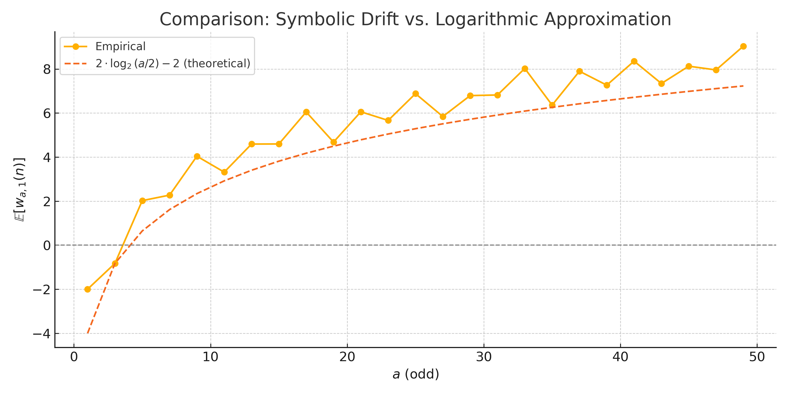
The chart compares two data series: an empirical dataset (orange line) and a theoretical logarithmic approximation (red dashed line). The x-axis represents odd integers labeled "a (odd)" ranging from 0 to 50, while the y-axis measures "E[w_{a,1}(n)]" with values from -4 to 8. The legend is positioned in the top-left corner, with orange representing empirical data and red dashed representing the theoretical model.
---
### Components/Axes
- **X-axis**: Labeled "a (odd)" with ticks at 0, 10, 20, 30, 40, 50.
- **Y-axis**: Labeled "E[w_{a,1}(n)]" with ticks at -4, -2, 0, 2, 4, 6, 8.
- **Legend**: Top-left corner, orange = Empirical, red dashed = Theoretical.
- **Grid**: Dotted lines for reference.
---
### Detailed Analysis
#### Empirical Data (Orange Line)
- **Trend**: Starts at (0, -2), rises sharply to (2, 2), then fluctuates with peaks and troughs.
- **Key Points**:
- (0, -2)
- (2, 2)
- (10, 4)
- (12, 3)
- (15, 6)
- (18, 5)
- (20, 6)
- (25, 7)
- (30, 6)
- (35, 8)
- (40, 7)
- (45, 8)
- (48, 7.5)
- (50, 9)
#### Theoretical Approximation (Red Dashed Line)
- **Trend**: Smooth upward curve starting at (0, -4), increasing steadily to (50, 7).
- **Key Points**:
- (0, -4)
- (10, 2)
- (20, 4)
- (30, 5.5)
- (40, 6.5)
- (50, 7)
---
### Key Observations
1. **Divergence at Low a Values**: The empirical line starts higher than the theoretical line at a=0 (-2 vs. -4) and remains above it until a=10.
2. **Fluctuations in Empirical Data**: The empirical line exhibits irregular peaks and troughs (e.g., a=12, a=18, a=48), while the theoretical line is monotonically increasing.
3. **Convergence at High a Values**: Both lines trend upward, but the empirical line consistently exceeds the theoretical line by ~1–2 units at higher a values (e.g., a=50: 9 vs. 7).
4. **Theoretical Model Behavior**: The red dashed line follows a logarithmic growth pattern, as indicated by its steady slope.
---
### Interpretation
- **Empirical vs. Theoretical**: The empirical data shows greater variability, suggesting real-world factors (e.g., noise, unmodeled variables) influence the results. The theoretical model provides a simplified logarithmic approximation but underestimates the empirical values at higher a.
- **Model Limitations**: The divergence at high a values implies the theoretical formula may need refinement (e.g., adjusting coefficients or incorporating additional terms).
- **Practical Implications**: The chart highlights the importance of validating theoretical models against empirical data, especially in systems with inherent variability.
---
### Spatial Grounding
- **Legend**: Top-left corner, clearly distinguishing orange (empirical) and red dashed (theoretical).
- **Data Points**: Orange markers align with the empirical line; red dashed line has no markers.
- **Grid**: Dotted lines help align data points with axis ticks.
---
### Content Details
- **X-axis Labels**: "a (odd)" with discrete odd integers (0, 2, 10, ..., 50).
- **Y-axis Labels**: "E[w_{a,1}(n)]" with integer increments.
- **Theoretical Formula**: Explicitly labeled as "2 · log₂(a/2) − 2" in the legend.
---
### Notable Anomalies
- **Empirical Dip at a=12**: A sharp drop from 4 (a=10) to 3 (a=12) suggests a potential outlier or measurement error.
- **Theoretical Line Smoothness**: The red dashed line lacks fluctuations, indicating it is a deterministic model.
---
### Final Notes
The chart underscores the gap between theoretical predictions and empirical observations, emphasizing the need for iterative model refinement. The empirical data’s irregularities highlight the complexity of the underlying system, which may require advanced modeling techniques.