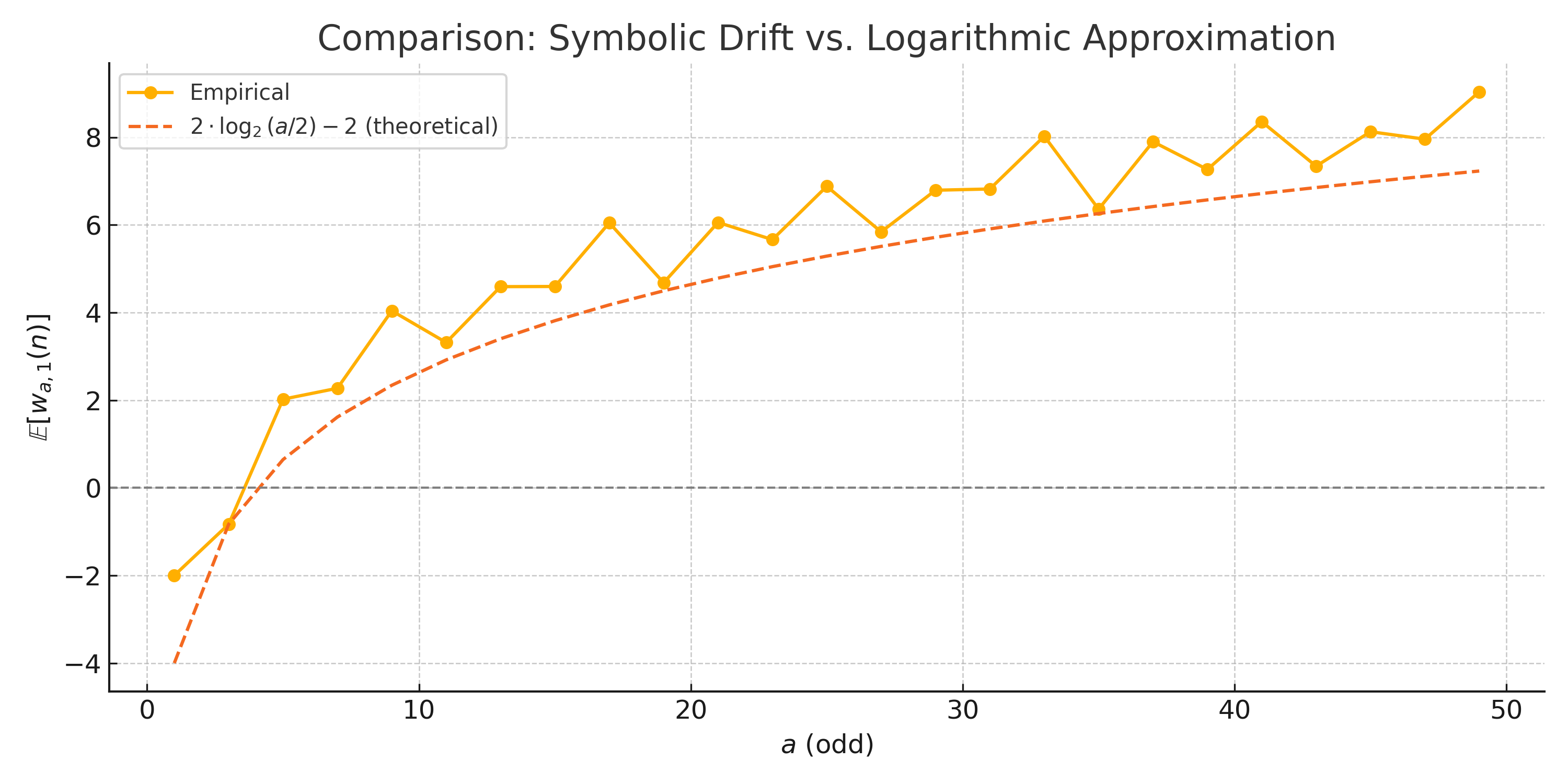
## Chart: Comparison of Symbolic Drift vs. Logarithmic Approximation
### Overview
The image is a line chart comparing empirical data with a theoretical logarithmic approximation. The x-axis represents 'a (odd)' ranging from 0 to 50, and the y-axis represents 'E[Wa,1(n)]' ranging from -4 to 8. The chart displays two data series: an empirical series represented by a solid orange line with circular markers, and a theoretical series represented by a dashed orange line.
### Components/Axes
* **Title:** Comparison: Symbolic Drift vs. Logarithmic Approximation
* **X-axis:**
* Label: a (odd)
* Scale: 0 to 50, with tick marks at intervals of 10 (0, 10, 20, 30, 40, 50)
* **Y-axis:**
* Label: E[Wa,1(n)]
* Scale: -4 to 8, with tick marks at intervals of 2 (-4, -2, 0, 2, 4, 6, 8)
* **Legend:** Located in the top-left corner.
* Empirical: Solid orange line with circular markers.
* 2 * log₂(a/2) - 2 (theoretical): Dashed orange line.
* A horizontal dashed grey line is present at y=0.
### Detailed Analysis
* **Empirical Data (Solid Orange Line with Circular Markers):**
* Trend: The empirical data generally increases with fluctuations. It starts at approximately -2 at a=1, rises sharply to around 2 at a=5, then continues to increase with oscillations, reaching approximately 8.5 at a=50.
* Data Points:
* a=1: E[Wa,1(n)] ≈ -2
* a=5: E[Wa,1(n)] ≈ 2
* a=10: E[Wa,1(n)] ≈ 4
* a=15: E[Wa,1(n)] ≈ 4.5
* a=20: E[Wa,1(n)] ≈ 6
* a=25: E[Wa,1(n)] ≈ 5.7
* a=30: E[Wa,1(n)] ≈ 7
* a=35: E[Wa,1(n)] ≈ 6.5
* a=40: E[Wa,1(n)] ≈ 7.7
* a=45: E[Wa,1(n)] ≈ 7.5
* a=50: E[Wa,1(n)] ≈ 8.5
* **Theoretical Data (Dashed Orange Line):**
* Trend: The theoretical data increases logarithmically. It starts at approximately -4 at a=1, rises to around 3 at a=10, and continues to increase, reaching approximately 7.5 at a=50.
* Data Points (Approximate):
* a=1: 2 * log₂(1/2) - 2 = -4
* a=10: 2 * log₂(5) - 2 ≈ 2.6
* a=20: 2 * log₂(10) - 2 ≈ 4.6
* a=30: 2 * log₂(15) - 2 ≈ 5.9
* a=40: 2 * log₂(20) - 2 ≈ 6.6
* a=50: 2 * log₂(25) - 2 ≈ 7.3
### Key Observations
* The empirical data fluctuates around the theoretical logarithmic approximation.
* The theoretical approximation underestimates the empirical data, especially at lower values of 'a'.
* The empirical data exhibits oscillations, suggesting variability not captured by the theoretical model.
### Interpretation
The chart compares the empirical symbolic drift with a theoretical logarithmic approximation. The empirical data shows a general increasing trend, but with significant oscillations. The theoretical approximation provides a smoothed, logarithmic representation of this trend. The discrepancy between the two suggests that the theoretical model captures the overall trend but fails to account for the variability present in the empirical data. This could be due to factors not included in the theoretical model, such as specific properties of the symbolic sequences being analyzed. The oscillations in the empirical data might represent periodic behaviors or dependencies that are not captured by the logarithmic approximation.