\n
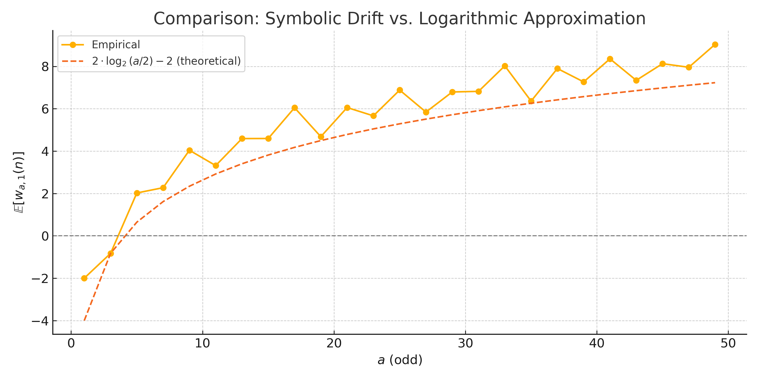
## Chart: Comparison: Symbolic Drift vs. Logarithmic Approximation
### Overview
The image presents a line chart comparing "Empirical" data against a "Logarithmic Approximation" (theoretical) across a range of values for 'a (odd)'. The chart visualizes the relationship between these two measures, specifically *E[Wa,1(n)]* which appears to be a weighted average.
### Components/Axes
* **Title:** Comparison: Symbolic Drift vs. Logarithmic Approximation
* **X-axis:** a (odd) - ranging from approximately 0 to 50, with tick marks at intervals of 10.
* **Y-axis:** *E[Wa,1(n)]* - ranging from approximately -4 to 8, with tick marks at intervals of 2.
* **Legend:** Located at the top-left corner.
* Empirical (Solid Orange Line)
* 2 * log₂(a/2) - 2 (theoretical) (Dashed Brown Line)
* **Gridlines:** Horizontal and vertical gridlines are present to aid in reading values.
### Detailed Analysis
The chart displays two data series: an empirical line and a theoretical logarithmic approximation.
**Empirical Line (Solid Orange):**
The empirical line starts at approximately -1.5 when a = 0. It exhibits an increasing trend, with fluctuations.
* a = 0: *E[Wa,1(n)]* ≈ -1.5
* a = 10: *E[Wa,1(n)]* ≈ 4.5
* a = 20: *E[Wa,1(n)]* ≈ 6.2
* a = 30: *E[Wa,1(n)]* ≈ 6.8
* a = 40: *E[Wa,1(n)]* ≈ 7.2
* a = 50: *E[Wa,1(n)]* ≈ 7.5
**Logarithmic Approximation Line (Dashed Brown):**
The logarithmic approximation line starts at approximately -4 when a = 0. It increases rapidly initially, then plateaus.
* a = 0: *E[Wa,1(n)]* ≈ -4
* a = 10: *E[Wa,1(n)]* ≈ 2.3
* a = 20: *E[Wa,1(n)]* ≈ 4.6
* a = 30: *E[Wa,1(n)]* ≈ 5.6
* a = 40: *E[Wa,1(n)]* ≈ 6.3
* a = 50: *E[Wa,1(n)]* ≈ 6.7
The empirical line consistently remains above the logarithmic approximation line after a = 10. The gap between the two lines appears to widen as 'a' increases.
### Key Observations
* The empirical data initially diverges significantly from the theoretical logarithmic approximation.
* Both lines demonstrate an increasing trend, but the empirical line exhibits more variability.
* The logarithmic approximation appears to underestimate the *E[Wa,1(n)]* value for larger values of 'a'.
* The empirical line appears to be approaching a plateau, while the logarithmic approximation continues to increase, albeit at a decreasing rate.
### Interpretation
The chart suggests that the logarithmic approximation provides a reasonable, but imperfect, model for the observed empirical behavior. The divergence between the two lines indicates that other factors, not captured by the simple logarithmic function, are influencing the *E[Wa,1(n)]* value, particularly as 'a' increases. The empirical data's fluctuations suggest the presence of noise or other complexities in the underlying system. The fact that the empirical line consistently exceeds the theoretical line implies a systematic overestimation by the logarithmic model. This could be due to the limitations of the approximation or the influence of additional variables not accounted for in the theoretical formula. The plateauing of the empirical line suggests a saturation effect or a limit to the growth of *E[Wa,1(n)]*. Further investigation would be needed to determine the specific reasons for these discrepancies and to refine the theoretical model.