## Scatter Plot: Accuracy vs. Time-to-Answer for Different Methods
### Overview
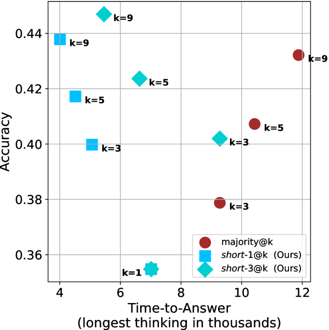
The image is a scatter plot comparing the performance of three different methods (`majority@k`, `short-1@k (Ours)`, and `short-3@k (Ours)`) across two metrics: **Accuracy** (y-axis) and **Time-to-Answer** (x-axis). The plot visualizes the trade-off between answer quality and computational cost (thinking time) for different values of a parameter `k`.
### Components/Axes
* **X-Axis:** Labeled **"Time-to-Answer (longest thinking in thousands)"**. The scale runs from approximately 4 to 12, with major gridlines at 4, 6, 8, 10, and 12. The unit is implied to be thousands of some time unit (e.g., tokens, steps, or milliseconds).
* **Y-Axis:** Labeled **"Accuracy"**. The scale runs from approximately 0.35 to 0.45, with major gridlines at 0.36, 0.38, 0.40, 0.42, and 0.44.
* **Legend:** Located in the bottom-right quadrant of the chart area. It defines three data series:
* **Red Circle:** `majority@k`
* **Blue Square:** `short-1@k (Ours)`
* **Cyan Diamond:** `short-3@k (Ours)`
* **Data Point Labels:** Each marker is annotated with its corresponding `k` value (e.g., `k=9`, `k=5`, `k=3`, `k=1`).
### Detailed Analysis
The plot contains nine distinct data points, three for each method, corresponding to `k` values of 3, 5, and 9. An additional point for `short-3@k` exists at `k=1`.
**1. Data Series: `majority@k` (Red Circles)**
* **Trend:** This series shows a clear positive correlation. As Time-to-Answer increases, Accuracy also increases. The line connecting these points would slope upward from left to right.
* **Data Points (Approximate):**
* `k=3`: Time-to-Answer ≈ 9.5, Accuracy ≈ 0.378
* `k=5`: Time-to-Answer ≈ 10.5, Accuracy ≈ 0.408
* `k=9`: Time-to-Answer ≈ 11.8, Accuracy ≈ 0.432
**2. Data Series: `short-1@k (Ours)` (Blue Squares)**
* **Trend:** This series shows a negative correlation. As Time-to-Answer increases, Accuracy decreases. The line connecting these points would slope downward from left to right.
* **Data Points (Approximate):**
* `k=3`: Time-to-Answer ≈ 5.0, Accuracy ≈ 0.400
* `k=5`: Time-to-Answer ≈ 4.5, Accuracy ≈ 0.418
* `k=9`: Time-to-Answer ≈ 4.0, Accuracy ≈ 0.438
**3. Data Series: `short-3@k (Ours)` (Cyan Diamonds)**
* **Trend:** This series also shows a negative correlation, similar to `short-1@k`. As Time-to-Answer increases, Accuracy decreases. The line slopes downward from left to right.
* **Data Points (Approximate):**
* `k=1`: Time-to-Answer ≈ 7.0, Accuracy ≈ 0.355 (This is the lowest accuracy point on the chart).
* `k=3`: Time-to-Answer ≈ 9.2, Accuracy ≈ 0.402
* `k=5`: Time-to-Answer ≈ 6.8, Accuracy ≈ 0.424
* `k=9`: Time-to-Answer ≈ 5.5, Accuracy ≈ 0.448 (This is the highest accuracy point on the chart).
### Key Observations
1. **Performance Frontier:** The proposed methods (`short-1@k` and `short-3@k`) occupy the top-left region of the plot, indicating they achieve higher accuracy with lower time-to-answer compared to the `majority@k` baseline for most `k` values.
2. **Inverse Relationship for Proposed Methods:** Both "Ours" methods demonstrate an inverse relationship between time and accuracy. Increasing `k` for these methods leads to higher accuracy but *lower* time-to-Answer, which is a highly desirable efficiency characteristic.
3. **Baseline Trade-off:** The `majority@k` method shows a direct, positive trade-off: higher accuracy requires significantly more time.
4. **Outlier Point:** The `short-3@k` point at `k=1` is an outlier. It has the lowest accuracy (~0.355) and a moderate time-to-answer (~7.0), breaking the smooth downward trend of its series. This suggests `k=1` may be a suboptimal configuration for this method.
5. **Peak Performance:** The single highest accuracy point (~0.448) is achieved by `short-3@k` at `k=9`, and it does so with a relatively low time-to-answer (~5.5).
### Interpretation
This chart presents a compelling case for the efficiency of the authors' proposed methods (`short-1@k` and `short-3@k`). The core finding is that these methods invert the typical accuracy-speed trade-off seen in the `majority@k` baseline.
* **What the data suggests:** The proposed methods are not just faster; they become *more efficient* (higher accuracy per unit of time) as the parameter `k` increases. This is evidenced by the data points moving up and to the left as `k` grows. In contrast, the baseline method requires a linear increase in time to gain accuracy.
* **How elements relate:** The `k` parameter acts as a control knob. For the authors' methods, turning it up (`k=9`) optimizes both metrics simultaneously. For the baseline, turning it up improves one metric (accuracy) at the direct expense of the other (time).
* **Notable Implications:** The results imply that the "short" strategies (likely involving some form of early exiting or conditional computation) are fundamentally more scalable. The `short-3@k` method at `k=9` represents the optimal point in this evaluation, offering the best accuracy at a competitive speed. The poor performance at `k=1` for `short-3@k` indicates a minimum threshold of "short" paths or votes is needed for the method to be effective. This visualization strongly supports the adoption of the proposed methods over the majority-vote baseline for tasks where both accuracy and response time are critical.