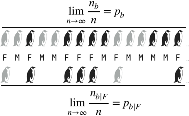
## Diagram: Conditional Probability Illustration with Penguin Icons
### Overview
The image is a technical diagram illustrating the concept of conditional probability using visual representations of penguins and mathematical limit expressions. It demonstrates the relationship between an overall proportion and a conditional proportion within a subset, using penguin color (black vs. gray) and sex (Female/Male) as variables.
### Components/Axes
The diagram is composed of three distinct horizontal sections, arranged from top to bottom:
1. **Top Section (Overall Proportion):**
* **Mathematical Expression:** `lim (n→∞) n_b / n = p_b`
* **Visual Element:** A single row of 16 penguin icons.
* **Labels:** Directly beneath each penguin icon is a single letter label: either "F" (Female) or "M" (Male).
2. **Middle Section (Subset Illustration):**
* **Visual Element:** A second, shorter row of 7 penguin icons, visually separated from the top row by a horizontal line.
* **Labels:** Directly beneath each penguin icon in this row is also a single letter label: either "F" or "M".
3. **Bottom Section (Conditional Proportion):**
* **Mathematical Expression:** `lim (n→∞) n_b|F / n = p_b|F`
**Legend/Key (Implied):**
* **Penguin Color:** Two colors are used for the penguin icons.
* **Black:** Represents penguins with the attribute "b" (likely "black" or a specific type).
* **Gray:** Represents penguins without the attribute "b".
* **Text Labels:**
* **F:** Denotes a female penguin.
* **M:** Denotes a male penguin.
* **Mathematical Symbols:**
* `n`: Total number of penguins in the population/sample.
* `n_b`: Number of penguins with attribute "b".
* `p_b`: Theoretical proportion of penguins with attribute "b" in the overall population.
* `n_b|F`: Number of penguins with attribute "b" *given* they are female.
* `p_b|F`: Theoretical conditional proportion of penguins with attribute "b" among females.
### Detailed Analysis
**Top Row (16 Penguins - Overall Population Sample):**
Sequence from left to right (Color, Label):
1. Gray, F
2. Gray, M
3. Gray, F
4. Black, M
5. Gray, M
6. Black, F
7. Black, F
8. Black, M
9. Gray, F
10. Gray, M
11. Gray, F
12. Black, M
13. Black, F
14. Black, M
15. Black, M
16. Black, F
* **Count Summary (Top Row):**
* Total Penguins (n): 16
* Black Penguins (n_b): 9 (Positions 4, 6, 7, 8, 12, 13, 14, 15, 16)
* Gray Penguins: 7
* Female Penguins (F): 8 (Positions 1, 3, 6, 7, 9, 11, 13, 16)
* Male Penguins (M): 8 (Positions 2, 4, 5, 8, 10, 12, 14, 15)
* Black & Female (n_b|F): 4 (Positions 6, 7, 13, 16)
**Bottom Row (7 Penguins - Female Subset):**
Sequence from left to right (Color, Label):
1. Gray, F
2. Black, M
3. Black, F
4. Black, F
5. Black, M
6. Gray, F
7. Black, M
* **Count Summary (Bottom Row):**
* Total Penguins in this row: 7
* Black Penguins: 5 (Positions 2, 3, 4, 5, 7)
* Gray Penguins: 2 (Positions 1, 6)
* Female Penguins (F): 3 (Positions 1, 4, 6)
* Male Penguins (M): 4 (Positions 2, 3, 5, 7)
* **Important Note:** This row is labeled with both F and M, but the bottom equation `p_b|F` suggests the focus is on the female subset. The presence of males in this visual row may be for illustrative contrast or could be a diagrammatic error if the intent was to show *only* the female subset.
### Key Observations
1. **Spatial Grounding:** The mathematical expressions are centered at the very top and very bottom of the diagram. The two rows of penguins are centered horizontally between them. The F/M labels are precisely aligned beneath their corresponding penguin icons.
2. **Trend Verification:** This is not a time-series chart, so "trend" refers to the conceptual relationship. The diagram visually separates the overall population (top row) from a subset (bottom row) to illustrate the shift from a global proportion (`p_b`) to a conditional proportion (`p_b|F`).
3. **Component Isolation:**
* **Header:** The top limit expression defines the overall probability.
* **Main Chart Area:** Contains the two rows of penguin icons with labels, serving as the visual data.
* **Footer:** The bottom limit expression defines the conditional probability.
4. **Potential Inconsistency:** The bottom row of penguins includes both "F" and "M" labels. If this row is meant to represent the subset of *only* female penguins (as implied by `n_b|F`), the inclusion of male-labeled penguins is contradictory. It may instead represent a different sample or be a visual error.
### Interpretation
This diagram is a pedagogical tool explaining **conditional probability** and the **Law of Large Numbers**.
* **What it demonstrates:** It shows that as the sample size (`n`) approaches infinity, the observed proportion of black penguins (`n_b / n`) converges to the true population proportion (`p_b`). Similarly, when we restrict our view to only female penguins, the proportion of black penguins within that female subset (`n_b|F / n`) converges to the true conditional probability (`p_b|F`).
* **Relationship between elements:** The top row provides the "big picture" data. The bottom row and equation zoom in on a specific characteristic (being female) to ask a more nuanced question: "Given that a penguin is female, what is the probability it is black?" The visual separation with a line emphasizes this shift in perspective from the whole to a part.
* **Notable Anomaly:** The presence of male penguins ("M") in the bottom row, which is associated with the female-conditional equation (`p_b|F`), is confusing. A clearer diagram would either show only female penguins in the bottom row or use a different visual method (like circling the females in the top row) to indicate the subset. This ambiguity requires the viewer to rely more on the mathematical notation than the visual aid for precise understanding.
* **Underlying Message:** The core message is that probabilities can change when we have additional information. The chance a randomly selected penguin is black (`p_b`) may be different from the chance a randomly selected *female* penguin is black (`p_b|F`). The diagram uses a concrete, countable example (penguins) to make this abstract statistical concept more accessible.