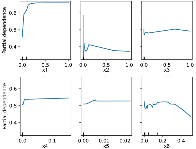
## Charts: Partial Dependence Plots
### Overview
The image presents six partial dependence plots, arranged in a 2x3 grid. Each plot visualizes the marginal effect of one feature (x1 through x6) on the predicted outcome, holding all other features constant. The y-axis represents "Partial Dependence," and the x-axis represents the feature value. The plots show how the predicted outcome changes as the value of each feature varies from approximately 0 to 1 (except for x5 which ranges to 0.02 and x6 which ranges to 0.4).
### Components/Axes
* **Y-axis (all plots):** "Partial Dependence" - Scale ranges from approximately 0.3 to 0.7.
* **X-axis:**
* Plot 1: "x1" - Scale ranges from 0.0 to 1.0.
* Plot 2: "x2" - Scale ranges from 0.0 to 1.0.
* Plot 3: "x3" - Scale ranges from 0.0 to 1.0.
* Plot 4: "x4" - Scale ranges from 0.0 to 0.1.
* Plot 5: "x5" - Scale ranges from 0.0 to 0.02.
* Plot 6: "x6" - Scale ranges from 0.0 to 0.4.
* **Data Series:** Each plot contains a single blue line representing the partial dependence.
* **Grid:** The plots are arranged in a 2x3 grid.
### Detailed Analysis
**Plot 1 (x1):** The blue line shows a steep increase in partial dependence from approximately 0.35 at x1=0.0 to around 0.65 at x1=0.2. After this rapid increase, the line plateaus, remaining relatively constant at around 0.65 for the rest of the x1 range.
**Plot 2 (x2):** The line exhibits a sharp drop in partial dependence from approximately 0.6 at x2=0.0 to around 0.3 at x2=0.1. It then gradually increases to approximately 0.38 at x2=1.0. There is a significant oscillation between x2=0.1 and x2=0.3.
**Plot 3 (x3):** The line shows a slight initial increase from approximately 0.45 at x3=0.0 to around 0.48 at x3=0.2. It then fluctuates around this level, with a slight downward trend, ending at approximately 0.46 at x3=1.0.
**Plot 4 (x4):** The line is relatively flat, starting at approximately 0.55 at x4=0.0 and decreasing slightly to around 0.53 at x4=0.1.
**Plot 5 (x5):** The line shows a steady increase in partial dependence from approximately 0.5 at x5=0.0 to around 0.58 at x5=0.02.
**Plot 6 (x6):** The line initially fluctuates, then decreases from approximately 0.52 at x6=0.0 to around 0.45 at x6=0.4. There is a noticeable oscillation in the beginning of the curve.
### Key Observations
* **Strongest Effect:** x1 appears to have the strongest positive effect on the predicted outcome, as indicated by the rapid increase in partial dependence.
* **Non-monotonic Relationship:** x2 exhibits a non-monotonic relationship, with a decrease followed by a slight increase.
* **Weakest Effect:** x4 and x3 show the weakest effects, with relatively flat lines.
* **Oscillations:** Plots 2 and 6 show significant oscillations, suggesting complex interactions or noise in the data.
### Interpretation
These partial dependence plots reveal the individual influence of each feature on the model's predictions. The plots suggest that x1 is a strong predictor, with increasing values leading to higher predicted outcomes. x2 has a more complex relationship, initially decreasing the predicted outcome but then slightly increasing it. x4 and x3 have minimal impact. The oscillations observed in x2 and x6 could indicate non-linear relationships or interactions with other features that are not captured by the partial dependence plot alone. The limited range of x4 and x5 suggests these features may be less informative or have a restricted influence within the observed data. These plots are valuable for understanding the model's behavior and identifying important features. They can also help in feature engineering and model refinement.