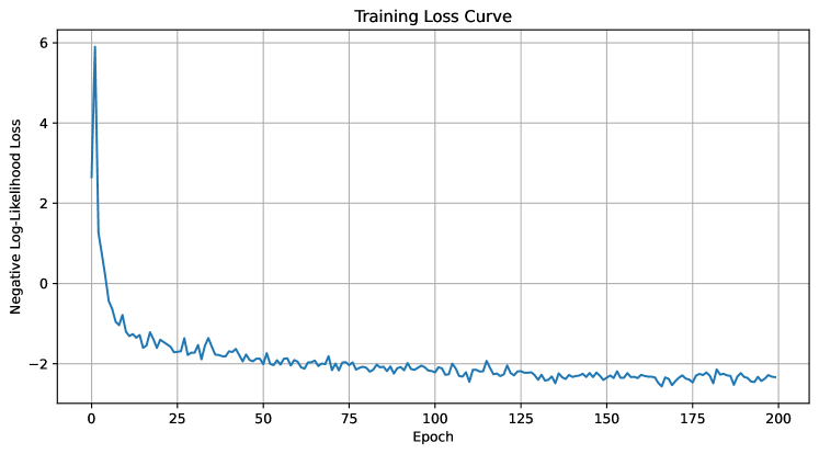
## Line Chart: Training Loss Curve
### Overview
The image is a line chart displaying the training loss curve of a model. The x-axis represents the epoch number, and the y-axis represents the negative log-likelihood loss. The chart shows how the loss decreases over the training epochs.
### Components/Axes
* **Title:** Training Loss Curve
* **X-axis:**
* Label: Epoch
* Scale: 0 to 200, with major ticks at intervals of 25 (0, 25, 50, 75, 100, 125, 150, 175, 200)
* **Y-axis:**
* Label: Negative Log-Likelihood Loss
* Scale: -2 to 6, with major ticks at intervals of 2 (-2, 0, 2, 4, 6)
* **Data Series:** A single blue line representing the training loss.
### Detailed Analysis
* **Data Series Trend:** The blue line starts at a high value (approximately 6) and rapidly decreases in the initial epochs. It then gradually decreases and stabilizes around -2 after approximately 50 epochs. The line fluctuates slightly around -2 for the remaining epochs.
* **Data Points:**
* Epoch 0: Negative Log-Likelihood Loss ≈ 6
* Epoch 25: Negative Log-Likelihood Loss ≈ -1.5
* Epoch 50: Negative Log-Likelihood Loss ≈ -2
* Epoch 100: Negative Log-Likelihood Loss ≈ -2
* Epoch 150: Negative Log-Likelihood Loss ≈ -2.2
* Epoch 200: Negative Log-Likelihood Loss ≈ -2.3
### Key Observations
* The most significant decrease in loss occurs within the first 25 epochs.
* The loss stabilizes after approximately 50 epochs, indicating that the model has learned most of the patterns in the data.
* The fluctuations in the loss after stabilization suggest that the model is still making minor adjustments, but the overall performance is relatively consistent.
### Interpretation
The training loss curve demonstrates the learning process of the model. The rapid decrease in loss during the initial epochs indicates that the model is quickly adapting to the training data. The stabilization of the loss after 50 epochs suggests that the model has converged to a local minimum. The fluctuations in the loss after stabilization could be due to the learning rate or the complexity of the data. Overall, the curve indicates that the model has learned effectively and is performing well on the training data.