# Technical Document Extraction: Chart Analysis
## Chart (a)
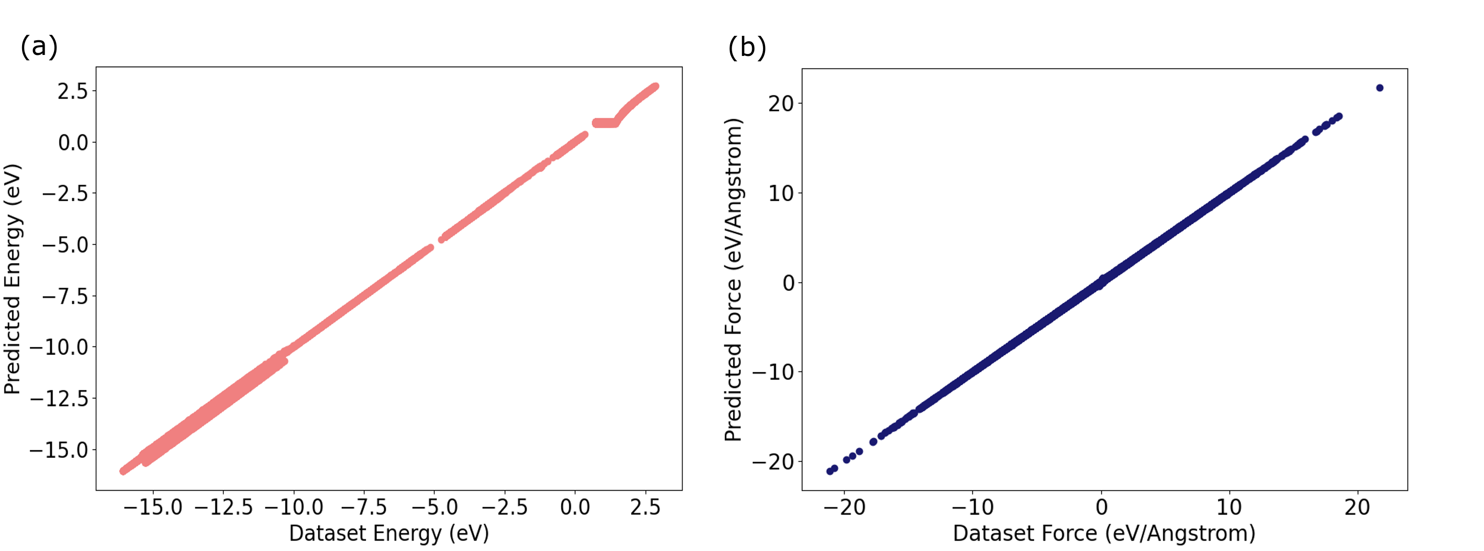
- **Title**: (a)
- **Axes**:
- **Y-Axis**: "Predicted Energy (eV)"
- **X-Axis**: "Dataset Energy (eV)"
- **Line**:
- **Color**: Red
- **Trend**: Linear, ascending from bottom-left to top-right
- **Data Points**: Plotted along the line, indicating a direct correlation between predicted and dataset energy values.
- **Shaded Region**:
- **Color**: Red (matching the line)
- **Purpose**: Likely represents prediction intervals or confidence bands (uncertainty in predictions).
- **Key Observations**:
- Predicted energy values closely align with dataset energy values across the range.
- The shaded region widens slightly at higher dataset energy values, suggesting increased variability in predictions at extreme values.
## Chart (b)
- **Title**: (b)
- **Axes**:
- **Y-Axis**: "Predicted Force (eV/Angstrom)"
- **X-Axis**: "Dataset Force (eV/Angstrom)"
- **Line**:
- **Color**: Blue
- **Trend**: Linear, ascending from bottom-left to top-right
- **Data Points**: Plotted along the line, indicating a direct correlation between predicted and dataset force values.
- **Shaded Region**:
- **Color**: Blue (matching the line)
- **Purpose**: Likely represents prediction intervals or confidence bands (uncertainty in predictions).
- **Key Observations**:
- Predicted force values closely align with dataset force values across the range.
- The shaded region widens slightly at higher dataset force values, suggesting increased variability in predictions at extreme values.
## Cross-Chart Analysis
- **Similarities**:
- Both charts exhibit linear relationships between predicted and dataset values.
- Both include shaded regions to indicate prediction uncertainty.
- Both use distinct line colors (red for energy, blue for force) to differentiate variables.
- **Differences**:
- Chart (a) focuses on energy (eV), while chart (b) focuses on force (eV/Angstrom).
- The range of dataset values differs: energy spans -15.0 to 2.5 eV, while force spans -20 to 20 eV/Angstrom.
## Conclusion
Both charts demonstrate strong linear correlations between predicted and dataset values for energy and force, respectively. The shaded regions highlight prediction uncertainty, which increases at the extremes of the dataset ranges. These visualizations suggest that the predictive model performs well within the observed ranges but may require refinement for extrapolation beyond these limits.