\n
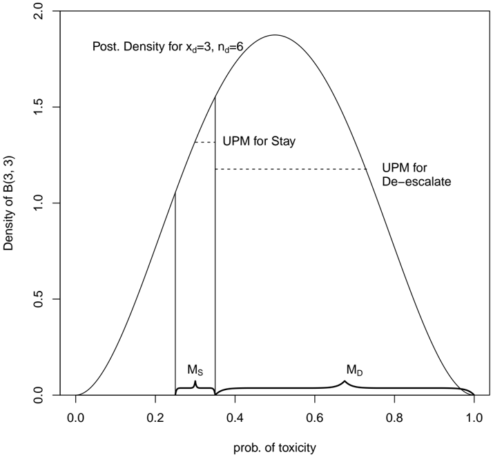
## Chart: Posterior Density Plot
### Overview
The image presents a posterior density plot, visualizing the probability distribution of a variable related to toxicity. The plot shows a single, unimodal distribution with a peak around a probability of toxicity of approximately 0.6. Two vertical lines, labeled "UPM for Stay" and "UPM for De-escalate", indicate thresholds on the probability scale. The plot is titled "Post. Density for x<sub>d</sub>=3, n<sub>d</sub>=6".
### Components/Axes
* **X-axis:** "prob. of toxicity" ranging from 0.0 to 1.0.
* **Y-axis:** "Density of B(3, 3)" ranging from 0.0 to 2.0.
* **Title:** "Post. Density for x<sub>d</sub>=3, n<sub>d</sub>=6" positioned at the top-center of the chart.
* **Vertical Lines:** Two dashed vertical lines are present.
* The first line, labeled "UPM for Stay", is positioned at approximately 0.2 on the x-axis.
* The second line, labeled "UPM for De-escalate", is positioned at approximately 0.45 on the x-axis.
* **Labels:** "Ms" is positioned at approximately 0.2 on the x-axis, and "M<sub>D</sub>" is positioned at approximately 0.8 on the x-axis.
### Detailed Analysis
The density curve rises from 0.0 at x=0.0, reaches a maximum density of approximately 1.8 at x=0.6, and then declines back to 0.0 at x=1.0.
* **UPM for Stay:** The line is located at approximately 0.2 on the x-axis. The density at this point is approximately 1.1.
* **UPM for De-escalate:** The line is located at approximately 0.45 on the x-axis. The density at this point is approximately 0.8.
* **Ms:** Located at approximately 0.2 on the x-axis.
* **M<sub>D</sub>:** Located at approximately 0.8 on the x-axis.
The curve is approximately symmetrical, but slightly skewed to the right.
### Key Observations
* The highest probability density is associated with a probability of toxicity around 0.6.
* The "UPM for Stay" threshold is at a lower probability of toxicity (0.2) than the "UPM for De-escalate" threshold (0.45).
* The labels Ms and M<sub>D</sub> appear to mark points on the x-axis, potentially representing means or medians.
### Interpretation
This plot likely represents a Bayesian analysis of the probability of toxicity, given observed data (x<sub>d</sub>=3, n<sub>d</sub>=6). The posterior density function shows the distribution of plausible values for the probability of toxicity. The "UPM for Stay" and "UPM for De-escalate" lines represent decision thresholds. A probability of toxicity below 0.2 might trigger a "Stay" action, while a probability between 0.2 and 0.45 might trigger a "De-escalate" action. The values of x<sub>d</sub> and n<sub>d</sub> suggest that 3 out of 6 observations were indicative of toxicity. The labels Ms and M<sub>D</sub> likely represent the mean or median of the distribution for "Stay" and "De-escalate" respectively. The shape of the distribution suggests that toxicity is more likely to be in the range of 0.4 to 0.8. The plot demonstrates a probabilistic approach to decision-making, where actions are based on the likelihood of an event (toxicity) rather than a definitive determination.