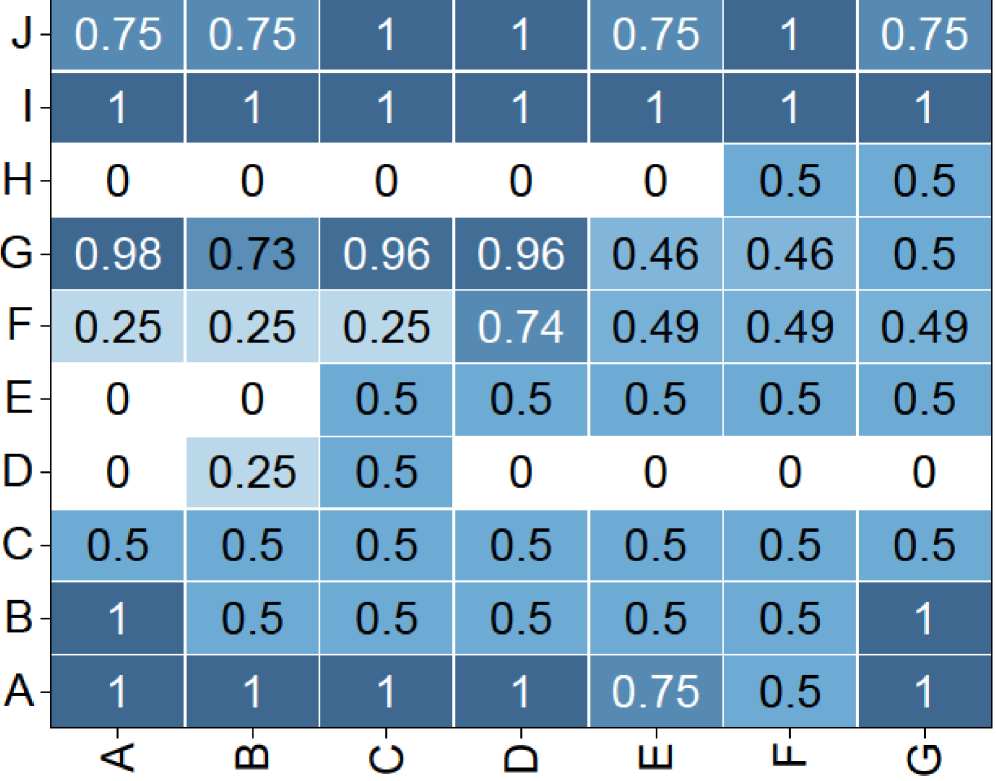
## Heatmap: Grid of Numerical Values (Rows A-J, Columns A-G)
### Overview
The image displays a heatmap or grid chart with 10 rows (labeled A through J from bottom to top) and 7 columns (labeled A through G from left to right). Each cell contains a numerical value, primarily between 0 and 1, and is shaded in varying intensities of blue. Darker blues correspond to higher values, while lighter blues or white correspond to lower values. The chart presents a matrix of data without an explicit title or legend for the color scale.
### Components/Axes
- **Vertical Axis (Rows):** Labeled from bottom to top as A, B, C, D, E, F, G, H, I, J.
- **Horizontal Axis (Columns):** Labeled from left to right as A, B, C, D, E, F, G.
- **Cell Values:** Each cell contains a decimal number, typically with two decimal places (e.g., 0.25, 0.5, 0.75, 0.98).
- **Color Coding:** Cells are filled with shades of blue. The intensity correlates with the numerical value: higher values (e.g., 1, 0.98) are dark blue, mid-range values (e.g., 0.5) are medium blue, and lower values (e.g., 0.25, 0) are light blue or white.
### Detailed Analysis
The following table reconstructs the grid's data, with rows listed from top (J) to bottom (A) for readability. All values are transcribed directly from the image.
| Row | Col A | Col B | Col C | Col D | Col E | Col F | Col G |
|-----|-------|-------|-------|-------|-------|-------|-------|
| **J** | 0.75 | 0.75 | 1 | 1 | 0.75 | 1 | 0.75 |
| **I** | 1 | 1 | 1 | 1 | 1 | 1 | 1 |
| **H** | 0 | 0 | 0 | 0 | 0 | 0.5 | 0.5 |
| **G** | 0.98 | 0.73 | 0.96 | 0.96 | 0.46 | 0.46 | 0.5 |
| **F** | 0.25 | 0.25 | 0.25 | 0.74 | 0.49 | 0.49 | 0.49 |
| **E** | 0 | 0 | 0.5 | 0.5 | 0.5 | 0.5 | 0.5 |
| **D** | 0 | 0.25 | 0.5 | 0 | 0 | 0 | 0 |
| **C** | 0.5 | 0.5 | 0.5 | 0.5 | 0.5 | 0.5 | 0.5 |
| **B** | 1 | 0.5 | 0.5 | 0.5 | 0.5 | 0.5 | 1 |
| **A** | 1 | 1 | 1 | 1 | 0.75 | 0.5 | 1 |
**Visual Trend Verification:**
- **Row I:** Uniformly dark blue across all columns, indicating consistently maximum values (1).
- **Row H:** Mostly white (0) in columns A-E, shifting to light blue (0.5) in columns F-G.
- **Row G:** Dark blue in columns A-D (values 0.98, 0.73, 0.96, 0.96), transitioning to lighter blue in columns E-G (0.46, 0.46, 0.5).
- **Row F:** Light blue in columns A-C (0.25), a darker patch at column D (0.74), then medium blue in columns E-G (0.49).
- **Row E:** White (0) in columns A-B, then uniform medium blue (0.5) from columns C-G.
- **Row D:** White (0) in columns A, D-G, with light blue patches at B (0.25) and C (0.5).
- **Row C:** Uniform medium blue (0.5) across all columns.
- **Row B:** Dark blue at the edges (columns A and G, value 1), with medium blue (0.5) in between.
- **Row A:** Dark blue in columns A-D and G (value 1), with a slight dip at E (0.75) and F (0.5).
### Key Observations
1. **Uniform Rows:** Row I is entirely 1s. Row C is entirely 0.5s. This suggests these categories (I and C) have consistent, high or mid-range values across all measured columns.
2. **Edge Effects:** In rows B and A, the first and last columns (A and G) often have higher values (1) compared to the middle columns, indicating a potential "edge" or boundary effect.
3. **Value Clustering:** High values (≥0.96) cluster in the top-left quadrant (rows G-J, columns A-D). Low values (0 or 0.25) cluster in the middle-left area (rows D-H, columns A-E).
4. **Color-Value Consistency:** The color coding accurately reflects the numerical values. For example, the darkest blue cells (value 1) are in rows I, B (columns A,G), and A (columns A-D,G). The lightest cells (value 0) are in rows H, E, and D.
5. **Missing Context:** There is no chart title, axis descriptions, or legend explaining what the rows, columns, or values represent. The data is presented in isolation.
### Interpretation
The heatmap displays a structured matrix of normalized data, likely representing scores, probabilities, correlations, or some metric scaled between 0 and 1. The patterns suggest underlying groupings or relationships:
- **Row I** represents a category with perfect or maximum scores across all measured dimensions (columns A-G).
- **Row C** represents a category with consistent, moderate performance across all dimensions.
- The **high-value cluster** in the top-left (rows G-J, columns A-D) indicates that categories G through J perform particularly well on dimensions A through D.
- The **low-value cluster** in the middle-left (rows D-H, columns A-E) suggests these categories have minimal or zero scores on those dimensions, except for specific exceptions (e.g., row G's high values).
- The **edge effect** in rows A and B (high values at columns A and G) might indicate that the first and last measured dimensions are more strongly associated with these categories, or it could be an artifact of the data structure.
Without additional context, the data implies a system where certain categories (like I, G, J) are strongly associated with certain dimensions (like A, B, C, D), while others (like H, D, E) show weak or selective associations. The uniformity in rows I and C suggests these are control groups, benchmarks, or categories with inherent consistency. The heatmap effectively visualizes a complex set of relationships, highlighting contrasts between high-performance and low-performance clusters.