## Pie Chart: Text Quality Distribution
### Overview
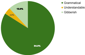
This image displays a pie chart illustrating the distribution of text quality across three categories: Grammatical, Understandable, and Gibberish. The chart visually represents the proportion of each category.
### Components/Axes
* **Chart Type**: Pie Chart
* **Data Categories**:
* Grammatical
* Understandable
* Gibberish
* **Legend**: Located in the top-right portion of the image.
* Green circle: Grammatical
* Yellow circle: Understandable
* Light green circle: Gibberish
* **Data Labels**: Percentages are displayed directly on the chart segments.
* 84.0%
* 4.0%
* 12.0%
### Detailed Analysis or Content Details
The pie chart is divided into three segments, each representing a category of text quality:
* **Grammatical**: This segment is the largest, occupying 84.0% of the pie. It is colored dark green.
* **Understandable**: This segment is the smallest, representing 4.0% of the pie. It is colored yellow.
* **Gibberish**: This segment represents 12.0% of the pie and is colored light green.
### Key Observations
* The vast majority of the text (84.0%) is classified as Grammatical.
* A small portion (4.0%) is classified as Understandable.
* A notable portion (12.0%) is classified as Gibberish, which is three times larger than the 'Understandable' category.
### Interpretation
The pie chart demonstrates a strong prevalence of grammatically correct text. The data suggests that the system or dataset from which this distribution was derived is highly effective at producing or identifying grammatically sound text. However, the presence of 12.0% 'Gibberish' indicates that a significant minority of the text is nonsensical or unintelligible, which could be an area for improvement or further investigation. The 'Understandable' category, at 4.0%, is relatively small, suggesting that text that is not strictly grammatical but still comprehensible is less common than either purely grammatical text or complete gibberish. This distribution could be indicative of a language model's output, a text classification task, or a quality assessment of user-generated content. The relatively high percentage of 'Gibberish' compared to 'Understandable' might suggest that the threshold for being classified as 'Understandable' is quite strict, or that errors in generation tend to result in complete incoherence rather than merely imperfect grammar.