\n
## Pie Chart: Classification of Textual Responses
### Overview
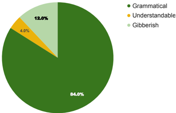
The image displays a pie chart illustrating the proportional distribution of three categories of textual responses: "Grammatical," "Understandable," and "Gibberish." The chart is presented on a plain white background with a legend positioned to its right.
### Components/Axes
* **Chart Type:** Pie Chart.
* **Legend:** Located to the right of the pie chart. It contains three color-coded entries listed vertically:
* **Grammatical:** Represented by a dark green circle.
* **Understandable:** Represented by a yellow circle.
* **Gibberish:** Represented by a light green circle.
* **Data Labels:** Percentage values are displayed directly on each corresponding pie slice.
* **Title:** No chart title is visible within the image frame.
### Detailed Analysis
The pie chart is divided into three segments, each corresponding to a category from the legend. The data is as follows:
1. **Grammatical (Dark Green):**
* **Visual Trend:** This is the dominant segment, occupying the vast majority of the chart area.
* **Data Point:** 84.0%
* **Spatial Grounding:** This large, dark green slice starts from the top (12 o'clock position) and extends clockwise, covering most of the circle.
2. **Gibberish (Light Green):**
* **Visual Trend:** This is the second-largest segment.
* **Data Point:** 12.0%
* **Spatial Grounding:** This light green slice is positioned in the upper-left quadrant of the pie, adjacent to the start of the large dark green segment.
3. **Understandable (Yellow):**
* **Visual Trend:** This is the smallest segment.
* **Data Point:** 4.0%
* **Spatial Grounding:** This thin yellow slice is wedged between the "Gibberish" (light green) and "Grammatical" (dark green) segments in the upper-left area of the chart.
**Cross-Reference Verification:** The color of each data point label matches its corresponding legend entry exactly. The dark green "84.0%" label is on the dark green slice, the light green "12.0%" label is on the light green slice, and the yellow "4.0%" label is on the yellow slice.
### Key Observations
* **Overwhelming Majority:** The "Grammatical" category constitutes a significant majority (84.0%) of the total, indicating that most of the analyzed text was grammatically correct.
* **Minority Categories:** "Gibberish" (12.0%) represents a notable minority, while "Understandable" (4.0%) is a very small fraction.
* **Summation Check:** The percentages sum to 100.0% (84.0 + 12.0 + 4.0), confirming the data's internal consistency.
### Interpretation
This chart provides a quantitative breakdown of text quality or comprehension levels. The data suggests that within the evaluated dataset, the overwhelming preponderance of content is grammatically sound. However, a non-trivial portion (12%) is classified as "Gibberish," which could indicate errors, noise, spam, or intentionally nonsensical input. The very small "Understandable" slice (4%) is intriguing; it implies a category of text that, while perhaps not perfectly grammatical, still conveys clear meaning. This could represent informal language, minor errors, or colloquialisms that do not impede comprehension.
The stark contrast between the large "Grammatical" segment and the much smaller others highlights a potential focus for quality control or filtering processes: addressing the 12% gibberish content. The chart effectively communicates that grammatical correctness is the norm, but exceptions exist in measurable quantities.