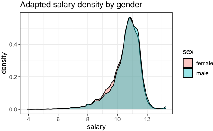
## Chart Type: Density Plot - Adapted Salary Density by Gender
### Overview
This image displays a density plot illustrating the distribution of "adapted salary" across two gender categories: female and male. The plot uses two overlapping, filled density curves to represent the probability density function of adapted salary for each gender, allowing for a visual comparison of their salary distributions. The x-axis represents the adapted salary, and the y-axis represents the density.
### Components/Axes
The chart is structured with a main plotting area, a title at the top, axis labels, and a legend on the right.
* **Title**: Located at the top-left of the image, the title is "Adapted salary density by gender".
* **X-axis**: Positioned at the bottom of the plot, labeled "salary". The numerical scale ranges from approximately 4 to 13, with major tick marks and labels at 4, 6, 8, 10, and 12.
* **Y-axis**: Positioned on the left side of the plot, labeled "density". The numerical scale ranges from 0.0 to approximately 0.5, with major tick marks and labels at 0.0, 0.2, and 0.4.
* **Legend**: Located in the top-right quadrant of the main plot area.
* The legend title is "sex".
* It contains two entries:
* A light red (pink) square corresponding to "female".
* A light blue (teal) square corresponding to "male".
### Detailed Analysis
The plot shows two overlapping density curves, each outlined in black, representing the distribution of adapted salary for females and males. Both distributions are unimodal and appear to be right-skewed, with a longer tail extending towards lower salary values. The adapted salary values range from approximately 4 to 13.
**Female (light red/pink curve):**
* **Trend**: The female density curve starts near a salary of 4 with a density close to 0.0. It gradually increases, showing a low density of approximately 0.05 at a salary of 8. The density then rises more steeply, reaching approximately 0.2 at a salary of 9.5. The curve continues to ascend, peaking at an approximate salary of 10.8 with a density of about 0.45. After the peak, the density rapidly decreases, falling to approximately 0.2 at a salary of 11.5 and approaching 0.0 around a salary of 12.5.
* **Specific points**:
* Salary ~8.0: Density ~0.05
* Salary ~9.0: Density ~0.15
* Salary ~9.5: Density ~0.22
* Salary ~10.0: Density ~0.30
* Salary ~10.5: Density ~0.40
* Salary ~10.8 (peak): Density ~0.45
* Salary ~11.0: Density ~0.44
* Salary ~11.5: Density ~0.20
* Salary ~12.0: Density ~0.05
**Male (light blue/teal curve):**
* **Trend**: The male density curve also starts near a salary of 4 with a density close to 0.0. It follows a similar initial upward trend, showing a low density of approximately 0.05 at a salary of 8. The density then rises more steeply, reaching approximately 0.2 at a salary of 10.0. The curve continues to ascend, peaking at an approximate salary of 11.0 with a density of about 0.47. After the peak, the density rapidly decreases, falling to approximately 0.2 at a salary of 11.8 and approaching 0.0 around a salary of 12.8.
* **Specific points**:
* Salary ~8.0: Density ~0.05
* Salary ~9.0: Density ~0.10
* Salary ~9.5: Density ~0.18
* Salary ~10.0: Density ~0.28
* Salary ~10.5: Density ~0.38
* Salary ~11.0 (peak): Density ~0.47
* Salary ~11.5: Density ~0.28
* Salary ~12.0: Density ~0.08
**Comparison between genders:**
* **Lower Salary Range (approx. 4 to 10.5)**: The female density (pink) is generally higher than or very close to the male density (teal). This is particularly noticeable between salaries of approximately 9.0 and 10.5, where the pink area is visibly above the teal area, indicating a higher density of females at these adapted salary levels.
* **Peak Salary Range (approx. 10.5 to 11.0)**: The female density peaks slightly earlier and at a slightly lower adapted salary (around 10.8) compared to males. The male density peaks at a slightly higher adapted salary (around 11.0) and with a slightly higher density value (0.47 vs 0.45).
* **Higher Salary Range (approx. 10.5 to 12.0)**: The male density (teal) becomes consistently higher than the female density (pink). This is evident from approximately salary 10.5 onwards, where the teal area is visibly above the pink area, indicating a higher density of males at these higher adapted salary levels.
* **Extremes**: Both distributions approach zero density at the lowest (around 4) and highest (around 13) adapted salary values, with very little difference between genders in these extreme tails.
### Key Observations
* Both adapted salary distributions are unimodal and right-skewed.
* Females show a higher density at lower-to-mid adapted salary ranges (approximately 4 to 10.5).
* Males show a higher density at mid-to-higher adapted salary ranges (approximately 10.5 to 12.0).
* The peak density for females occurs at a slightly lower adapted salary (around 10.8) than for males (around 11.0).
* The peak density for males is slightly higher (around 0.47) than for females (around 0.45).
### Interpretation
The density plot suggests a discernible difference in the distribution of adapted salaries between genders. The term "adapted salary" implies a transformation of raw salary data, possibly to normalize it or to analyze a specific aspect of salary.
The data indicates that, relative to their respective distributions, females are more concentrated in the lower-to-mid range of adapted salaries. This is evidenced by the female density curve being higher than the male curve in the range of approximately 4 to 10.5. Conversely, males show a higher concentration in the mid-to-higher range of adapted salaries, with their density curve surpassing the female curve from approximately 10.5 to 12.0.
The fact that the male density peak is slightly higher and occurs at a slightly greater adapted salary value suggests that, on average, males in this dataset tend to have slightly higher adapted salaries compared to females. The right-skewness of both distributions implies that for both genders, there are more individuals at the lower end of the adapted salary scale, with fewer individuals earning very high adapted salaries.
In essence, the plot visually represents a "salary gap" or difference in salary distribution, where females appear to be more prevalent at lower adapted salary levels, and males at higher adapted salary levels, within the observed range. This could point to systemic differences in compensation, career progression, or job roles that influence adapted salary outcomes between genders.