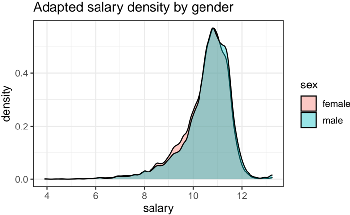
## Density Plot: Adapted Salary Density by Gender
### Overview
The image is a density plot comparing the distribution of adapted salaries for males and females. The x-axis represents salary, and the y-axis represents density. The plot shows the probability density of salaries for each gender.
### Components/Axes
* **Title:** Adapted salary density by gender
* **X-axis:**
* Label: salary
* Scale: 4 to 12, with tick marks at each integer value.
* **Y-axis:**
* Label: density
* Scale: 0.0 to 0.4, with tick marks at 0.0, 0.2, and 0.4.
* **Legend (top-right):**
* Title: sex
* female: Represented by a light pink filled area.
* male: Represented by a light blue filled area.
* **Plot Area:** The plot area contains two density curves, one for each gender, with a black outline.
### Detailed Analysis
* **Male Salary Density (light blue):** The male salary density curve starts near 0 at a salary of 4, gradually increases, and then rises sharply around a salary of 9. It peaks around a salary of 11, reaching a density of approximately 0.5. After the peak, the density decreases rapidly, approaching 0 around a salary of 13.
* **Female Salary Density (light pink):** The female salary density curve starts near 0 at a salary of 4, gradually increases, and then rises sharply around a salary of 9. It peaks around a salary of 11, reaching a density of approximately 0.45. After the peak, the density decreases rapidly, approaching 0 around a salary of 13.
* **Overlap:** The two density curves overlap significantly, especially at higher salary ranges. The female density is slightly lower than the male density between salaries of approximately 9 and 11.
### Key Observations
* Both male and female salary densities are unimodal, with a single peak.
* The peak salary density for males is slightly higher than that for females.
* The distributions are right-skewed, indicating that there are more individuals with salaries below the peak than above it.
* The median salary appears to be around 10.5 for both genders.
### Interpretation
The density plot suggests that, on average, males tend to have slightly higher adapted salaries than females. The distributions are similar, but the peak density for males is higher, indicating a larger proportion of males earning salaries around the peak value. The right-skewness of the distributions suggests that a larger proportion of individuals earn salaries below the average. The overlap in the distributions indicates that there is a significant range of salaries where the densities for males and females are similar. The "adapted salary" is not defined, so it is difficult to interpret the absolute values.