\n
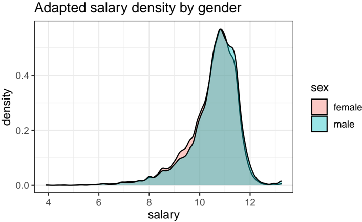
## Density Plot: Adapted Salary Density by Gender
### Overview
The image presents a density plot illustrating the distribution of salaries, differentiated by gender (male and female). The plot visualizes the probability density of salaries, allowing for a comparison of salary distributions between the two genders.
### Components/Axes
* **Title:** "Adapted salary density by gender" - positioned at the top-center of the image.
* **X-axis:** "salary" - ranging approximately from 4 to 12 (units not specified, assumed to be thousands of dollars or similar).
* **Y-axis:** "density" - ranging from 0.0 to 0.4.
* **Legend:** Located in the top-right corner.
* "sex" - label for the legend.
* "female" - represented by a light red color.
* "male" - represented by a light blue/cyan color.
* **Data Series:** Two overlapping density curves, one for each gender. A black line represents the combined density.
### Detailed Analysis
The plot shows two overlapping density curves. The male density curve (light blue) is generally higher than the female density curve (light red) across most of the salary range.
* **Female Density Curve (light red):**
* Starts at approximately salary 8, with a density of approximately 0.05.
* Increases to a peak density of approximately 0.35 at a salary of approximately 10.2.
* Decreases to approximately 0.1 at a salary of 11.5.
* Approaches 0 at a salary of 12.
* **Male Density Curve (light blue):**
* Starts at approximately salary 7.5, with a density of approximately 0.02.
* Increases to a peak density of approximately 0.4 at a salary of approximately 10.5.
* Decreases to approximately 0.2 at a salary of 11.8.
* Approaches 0 at a salary of 12.
* **Combined Density Curve (black):**
* Starts at approximately salary 7.5, with a density of approximately 0.02.
* Increases to a peak density of approximately 0.4 at a salary of approximately 10.5.
* Decreases to approximately 0.15 at a salary of 12.
### Key Observations
* The peak salary density for both genders is around a salary of 10.5.
* The male salary density is consistently higher than the female salary density across most of the salary range, suggesting a higher concentration of males at higher salary levels.
* The female salary distribution appears to be slightly skewed to the left compared to the male distribution.
* There is a noticeable overlap between the two distributions, indicating that some females earn salaries comparable to males, and vice versa.
### Interpretation
The data suggests a potential gender disparity in salary distribution. While both genders have a peak salary density around 10.5, the male distribution is shifted towards higher salaries, indicating that males are more likely to earn higher salaries than females. The higher density of males at higher salary levels suggests a possible wage gap or unequal opportunities. The overlap in distributions indicates that the disparity is not absolute, and some females do achieve high salaries. The plot does not provide information about the *causes* of this disparity, only that it *exists* in the observed data. Further investigation would be needed to determine the underlying factors contributing to this difference. The "Adapted" in the title suggests that the data may have been modified or processed in some way, which should be considered when interpreting the results.