\n
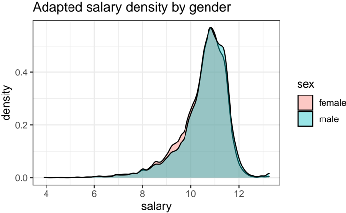
## Density Plot: Adapted Salary Density by Gender
### Overview
The image is a density plot comparing the distribution of adapted salaries between females and males. The plot visualizes the probability density of salary values for each gender group, showing where salaries are concentrated.
### Components/Axes
* **Chart Title:** "Adapted salary density by gender" (located at the top-left).
* **X-Axis:**
* **Label:** "salary"
* **Scale:** Linear scale with major tick marks and labels at 4, 6, 8, 10, and 12.
* **Y-Axis:**
* **Label:** "density"
* **Scale:** Linear scale with major tick marks and labels at 0.0, 0.2, and 0.4.
* **Legend:**
* **Title:** "sex"
* **Position:** Centered vertically on the right side of the plot area.
* **Categories:**
* "female" - represented by a pink/salmon color.
* "male" - represented by a teal/cyan color.
### Detailed Analysis
The plot displays two overlapping density curves, one for each gender.
* **Female Distribution (Pink):**
* **Trend:** The curve starts near zero density at a salary of 4, rises very gradually until about 8, then increases more steeply to a sharp peak.
* **Peak:** The highest density (mode) occurs at a salary value of approximately **10.5**. The peak density value is slightly above 0.5.
* **Shape:** The distribution is strongly left-skewed (negatively skewed), with a long tail extending toward lower salaries and a steep drop-off after the peak toward higher salaries.
* **Male Distribution (Teal):**
* **Trend:** Follows a very similar shape to the female distribution. It also starts near zero at salary 4, rises gradually, then steeply to a peak.
* **Peak:** The highest density occurs at a salary value of approximately **11.0**, slightly to the right of the female peak. The peak density is marginally higher than the female peak, reaching approximately **0.55**.
* **Shape:** Also strongly left-skewed, with a long lower tail and a sharp decline after the peak.
* **Comparison:**
* The two distributions are highly overlapping, especially in the lower salary range (4 to 9).
* The male density curve is consistently slightly above the female curve in the peak region (approximately salary 10 to 11.5), indicating a higher concentration of males at these salary levels.
* The female curve shows a slightly higher density than the male curve in the range of approximately salary 9.5 to 10.2.
* Both curves converge to near-zero density at the high end (around salary 13) and the low end (around salary 4).
### Key Observations
1. **Concentration:** The vast majority of adapted salaries for both genders are concentrated in a relatively narrow band between approximately 9 and 12.
2. **Left Skew:** Both distributions are heavily left-skewed, meaning there is a long tail of lower salaries, but the bulk of the data is clustered at the higher end of the observed range.
3. **Peak Discrepancy:** The modal (most common) salary for males (~11.0) is slightly higher than for females (~10.5).
4. **Density at Peak:** The peak density for males is slightly higher than for females, suggesting a slightly tighter clustering of male salaries around their mode.
5. **Low-End Similarity:** There is minimal visible difference between the genders in the density of lower salaries (below 9).
### Interpretation
This density plot suggests a **gender pay gap** within the context of "adapted salaries." While the overall shape of the salary distribution is similar for both genders—indicating they share a similar range and skew—the key difference lies in the central tendency.
* The rightward shift of the male peak indicates that the most common salary for men is higher than the most common salary for women.
* The higher peak density for men suggests their salaries are more consistently clustered around this higher value, whereas female salaries show slightly more variation around their (lower) peak.
* The significant left skew for both groups implies that while high salaries are common, there exists a subset of individuals (of both genders) earning substantially less, pulling the distribution's tail to the left.
* The high degree of overlap, especially at lower salaries, indicates that the disparity is most pronounced at the modal and upper-middle salary ranges, rather than at the extremes.
**Note on "Adapted Salary":** The term "adapted" is critical. It implies the raw salary data has been transformed (e.g., log-transformed, normalized, or adjusted for factors like experience, role, or location). Therefore, this plot likely shows a *controlled* comparison, aiming to isolate the gender effect after accounting for other variables. The values on the x-axis (4-12) are likely on this transformed scale, not raw currency values.