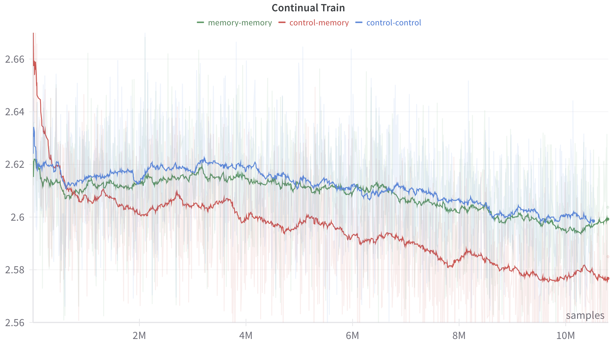
## Line Chart: Continual Train Performance Comparison
### Overview
This image is a technical line chart titled "Continual Train." It displays the performance of three distinct experimental configurations or models over a training period of more than 10 million samples. The chart plots a smoothed trend line for each configuration, overlaid on top of highly volatile, semi-transparent background data (likely raw batch metrics or variance). The overall trajectory for all three series is downward, suggesting the y-axis represents an error or loss metric where lower values indicate better performance.
### Components/Axes
**Header Region (Top):**
* **Title:** "Continual Train" (Centered at the top, bold text).
* **Legend:** Located horizontally just below the title. It maps colors to specific model configurations:
* Green dash: `memory-memory`
* Red dash: `control-memory`
* Blue dash: `control-control`
**Y-Axis (Left side):**
* **Label:** None explicitly provided, but represents the measured metric (likely Loss).
* **Scale:** Linear, ranging from 2.56 to 2.66+.
* **Markers:** 2.56, 2.58, 2.6, 2.62, 2.64, 2.66.
* **Gridlines:** Faint horizontal gray lines extend across the chart at each 0.02 interval.
**X-Axis (Bottom):**
* **Label:** "samples" (Located in the bottom-right corner, just above the axis line).
* **Scale:** Linear, representing training duration.
* **Markers:** 2M, 4M, 6M, 8M, 10M (where 'M' denotes Millions). Tick marks indicate these specific intervals.
### Detailed Analysis
The chart displays two layers of data for each series: a faint, highly variable background trace (raw data) and a bold, solid line (smoothed moving average). The analysis below focuses on the smoothed trend lines.
**1. Red Series: `control-memory`**
* **Visual Trend:** This line exhibits the most dramatic change. It begins with a steep downward slope, crossing below the other two lines very early in the training process. After the initial plunge, it maintains a steady, gradual downward slope with minor fluctuations, remaining the lowest line on the graph for the remainder of the training.
* **Data Points (Approximate):**
* Start (0 samples): ~2.67 (Highest starting point on the chart).
* Initial Drop (~0.5M samples): Plummets to ~2.61.
* 2M samples: ~2.60.
* 5M samples: ~2.595.
* 8M samples: ~2.585.
* End (>10M samples): ~2.575. The line terminates with a distinct circular dot.
**2. Green Series: `memory-memory`**
* **Visual Trend:** This line starts lower than the red line but higher than the blue line's initial dip. It slopes downward gently, intertwining closely with the blue line for the first half of the chart. Around the 6M mark, it begins to separate, trending slightly lower than the blue line but remaining significantly higher than the red line.
* **Data Points (Approximate):**
* Start (0 samples): ~2.62.
* 2M samples: ~2.615.
* 5M samples: ~2.61.
* 8M samples: ~2.605.
* End (>10M samples): ~2.60. The line terminates with a distinct circular dot.
**3. Blue Series: `control-control`**
* **Visual Trend:** This line starts with a sharp, brief dip, recovers quickly, and then establishes a slow, gradual downward trend. For the majority of the chart (from ~1M samples onward), it remains the highest of the three lines, indicating the poorest performance if the y-axis represents loss.
* **Data Points (Approximate):**
* Start (0 samples): ~2.635.
* 2M samples: ~2.618.
* 5M samples: ~2.615.
* 8M samples: ~2.608.
* End (>10M samples): ~2.60. The line terminates with a distinct circular dot.
### Key Observations
* **The Crossover:** The most notable event is the rapid improvement of the `control-memory` (red) model. Despite starting with the worst (highest) metric, it overtakes both other models before reaching 1 million samples and maintains a dominant lead.
* **Grouping:** The `memory-memory` (green) and `control-control` (blue) models exhibit very similar learning trajectories, staying within a tight margin of ~0.005 of each other for the entire run, whereas the `control-memory` model separates itself by a margin of ~0.025 by the end of the run.
* **Volatility:** The faint background spikes indicate that the step-by-step training process is highly noisy for all three configurations, with raw values frequently spiking up to 2.66 and dropping down to 2.56 across the entire timeline.
### Interpretation
Assuming this is a standard machine learning training graph where the y-axis represents a loss function (error rate), the data demonstrates a clear hierarchy in model architecture efficacy for this specific "Continual Train" task.
The nomenclature (`control-control`, `control-memory`, `memory-memory`) suggests an ablation study or comparison of architectural components, likely involving a baseline ("control") and an augmented feature ("memory").
* **`control-control` (Blue):** Likely the baseline model. It shows standard, slow learning.
* **`memory-memory` (Green):** Shows marginal improvement over the baseline, suggesting that whatever the "memory" component is, applying it uniformly does not yield significant gains.
* **`control-memory` (Red):** This hybrid configuration is the clear winner. The data suggests that combining a "control" component with a "memory" component creates a highly effective synergy. While it suffers from high initial instability (starting at 2.67), it adapts rapidly and achieves a significantly lower loss state than the other configurations, proving to be the most optimal architecture for long-term continual training in this experiment.