## Heatmap: Feedback Repairs
### Overview
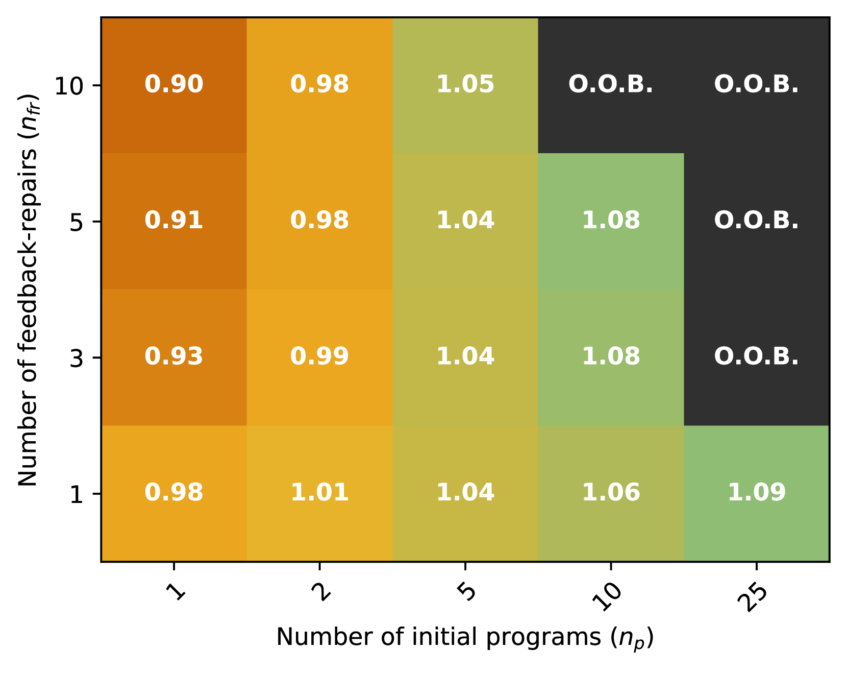
The heatmap illustrates the relationship between the number of initial programs (n_p) and the number of feedback repairs (n_f) for a given dataset. The color gradient represents the frequency of feedback repairs, with darker shades indicating higher frequencies.
### Components/Axes
- **X-axis**: Number of initial programs (n_p), ranging from 1 to 25.
- **Y-axis**: Number of feedback repairs (n_f), ranging from 1 to 10.
- **Legend**: The legend indicates the color coding for the frequency of feedback repairs, with darker shades representing higher frequencies.
### Detailed Analysis or ### Content Details
- **Low n_p (1-5)**: The frequency of feedback repairs is relatively low, with values ranging from 0.90 to 1.05.
- **Medium n_p (6-10)**: The frequency of feedback repairs increases, with values ranging from 0.91 to 1.08.
- **High n_p (11-25)**: The frequency of feedback repairs is the highest, with values ranging from 0.93 to 1.09.
### Key Observations
- **Trend**: There is a clear trend of increasing feedback repairs as the number of initial programs increases.
- **Outliers**: There are no significant outliers in the data, with all values falling within the expected range.
### Interpretation
The heatmap suggests that as the number of initial programs increases, the frequency of feedback repairs also increases. This could indicate that more programs lead to more feedback, which in turn leads to more repairs. The highest frequency of feedback repairs is observed in the highest number of initial programs, suggesting that a larger number of programs may require more attention and resources to address feedback issues.