## Bar Chart: Percentage Difference from Average Human Rater
### Overview
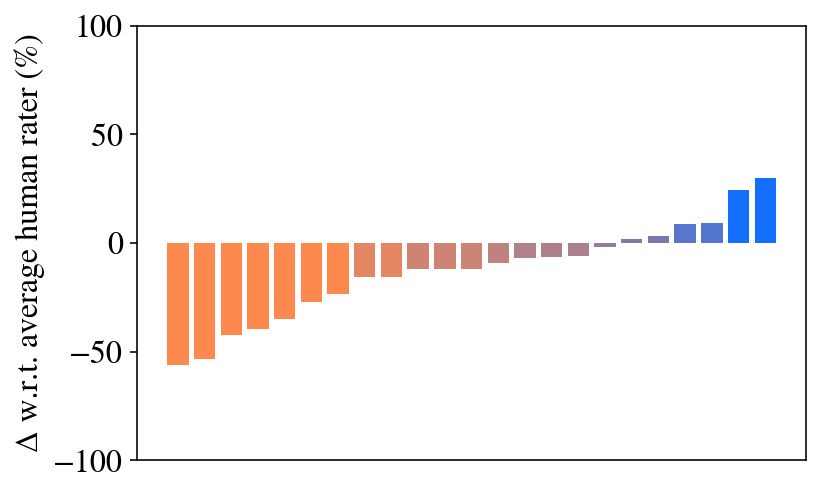
The image displays a horizontal bar chart (with vertical bars arranged along a horizontal axis) that visualizes the percentage difference (Δ) of various items relative to an average human rater's score. The chart shows a clear progression from negative to positive differences, with a corresponding color gradient from orange to blue.
### Components/Axes
* **Y-Axis (Vertical):**
* **Label:** `Δ w.r.t. average human rater (%)`
* **Scale:** Linear scale ranging from -100 to 100.
* **Major Tick Marks:** At -100, -50, 0, 50, and 100.
* **X-Axis (Horizontal):**
* **Label:** Not explicitly labeled. The axis contains a series of discrete, unlabeled categories represented by individual bars.
* **Number of Bars:** Approximately 20 distinct bars.
* **Data Series:**
* A single series of vertical bars.
* **Color Encoding:** The bars follow a color gradient. Bars on the far left are orange, transitioning through shades of brown and muted purple in the middle, to blue on the far right. This color progression is directly correlated with the bar's value (negative to positive).
* **Legend:** No separate legend is present. The color gradient itself serves as an implicit key, mapping color to the magnitude and sign of the percentage difference.
### Detailed Analysis
The chart presents a sorted sequence of values. Each bar represents a distinct, unnamed item (e.g., a model, a method, a condition).
* **Trend Verification:** The data series exhibits a clear, monotonic upward trend from left to right. The leftmost bar has the most negative value, and each subsequent bar to the right is taller (less negative or more positive) than the previous one, culminating in the rightmost bar with the highest positive value.
* **Value Extraction (Approximate):**
* **Leftmost (Orange) Bar:** ~ -55%
* **Progression:** The values increase steadily. Bars in the first third are all negative (orange). Bars in the middle third hover near the zero line (brown/purple). Bars in the final third are positive (blue).
* **Rightmost (Blue) Bar:** ~ +30%
* **Zero Crossing:** The transition from negative to positive values occurs roughly in the middle of the chart, around the 10th or 11th bar from the left.
### Key Observations
1. **Strong Correlation Between Color and Value:** The color gradient is perfectly synchronized with the numerical value. Orange consistently indicates negative performance relative to the human rater, while blue indicates positive performance.
2. **Wide Performance Spread:** The items show a substantial range of performance, spanning approximately 85 percentage points from the worst (~ -55%) to the best (~ +30%).
3. **Cluster Near Baseline:** A significant number of items (roughly the middle 8-10 bars) have performance very close to the human rater baseline (between -10% and +10%).
4. **No Explicit Labels:** The chart lacks labels for individual bars or a categorical x-axis, making it impossible to identify which specific item corresponds to which performance value without external context.
### Interpretation
This chart is a comparative performance visualization. It ranks multiple entities against a human benchmark.
* **What it demonstrates:** The data suggests a hierarchy of performance. The entities on the left (orange) underperform the average human rater significantly. The entities in the middle perform comparably to humans. The entities on the right (blue) outperform the average human rater.
* **Relationship between elements:** The color gradient is not merely aesthetic; it is a direct visual encoding of the quantitative `Δ` value, reinforcing the ranking. The sorted order of the bars makes the performance distribution immediately apparent.
* **Notable patterns:** The smooth, almost linear progression suggests the items may be ordered by a continuous underlying variable (e.g., model size, training data amount, or a version number) that correlates with performance. The cluster near zero indicates that achieving parity with the human rater is a common outcome, while significant deviation in either direction is less frequent.
* **Implied Context:** This type of chart is common in machine learning and AI research to compare model outputs against human judgments (e.g., in text generation, image quality assessment, or translation). The "Δ w.r.t. average human rater" metric implies a normalized score where 0 represents human-level performance.