\n
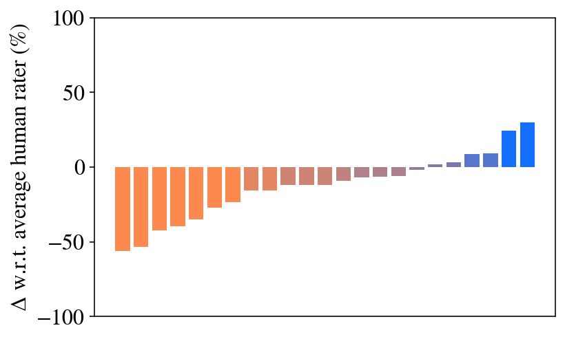
## Bar Chart: Delta w.r.t. Average Human Rater
### Overview
The image presents a bar chart illustrating the delta (Δ) with respect to an average human rater, expressed as a percentage. The chart displays a series of bars, transitioning from negative values to positive values. The x-axis is not explicitly labeled, implying a categorical or sequential index.
### Components/Axes
* **Y-axis:** "Δ w.r.t. average human rater (%)" - Represents the percentage difference from the average human rater score. The scale ranges from approximately -100% to 100%.
* **X-axis:** Unlabeled. Represents the index of the data points.
* **Bars:** The chart consists of a series of vertical bars, color-coded to indicate the magnitude and direction of the delta. The bars transition from orange to red to pink to blue.
### Detailed Analysis
The chart shows a progression of values. The initial bars (orange) are significantly negative, around -50%. As we move across the x-axis, the bars gradually increase in height, approaching zero. Around the middle of the chart, the bars are close to zero, fluctuating around 0%. The final bars (blue) show a sharp increase into positive territory, reaching approximately +30%.
Here's a breakdown of approximate values, reading from left to right:
* Bar 1: Approximately -55% (orange)
* Bar 2: Approximately -50% (orange)
* Bar 3: Approximately -45% (orange)
* Bar 4: Approximately -40% (orange)
* Bar 5: Approximately -35% (orange)
* Bar 6: Approximately -30% (orange)
* Bar 7: Approximately -25% (orange)
* Bar 8: Approximately -20% (orange)
* Bar 9: Approximately -15% (orange)
* Bar 10: Approximately -10% (red)
* Bar 11: Approximately -5% (red)
* Bar 12: Approximately 0% (pink)
* Bar 13: Approximately +5% (pink)
* Bar 14: Approximately +10% (pink)
* Bar 15: Approximately +15% (blue)
* Bar 16: Approximately +20% (blue)
* Bar 17: Approximately +25% (blue)
* Bar 18: Approximately +30% (blue)
### Key Observations
* The chart demonstrates a clear trend from negative to positive delta values.
* The transition from negative to positive occurs gradually, with a steeper increase at the end.
* The initial values are substantially negative, indicating a significant difference from the average human rater.
* The final values are positive, suggesting that the system or method being evaluated outperforms the average human rater in those instances.
### Interpretation
The data suggests an improvement in performance or accuracy as one moves along the x-axis. Initially, the system or method under evaluation performs significantly worse than the average human rater. However, as the index increases, the performance improves, eventually surpassing the average human rater. This could represent a learning curve, an optimization process, or the application of a refined algorithm. The sharp increase at the end suggests a critical threshold or a particularly effective adjustment was made. The unlabeled x-axis implies that the index represents a sequence of steps, iterations, or categories. Without knowing what the x-axis represents, it's difficult to provide a more specific interpretation. The chart highlights the potential for a system to improve and eventually outperform human performance, but also emphasizes the initial gap in performance.