TECHNICAL ASSET FINGERPRINT
7b75f693fccd153822bd8f39
Click to view fullscreen
Press ESC or click to close
FOUND IN PAPERS
EXPERT: healer-alpha-free VERSION 1
RUNTIME: free/openrouter/healer-alpha
INTEL_VERIFIED
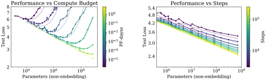
## Performance vs Compute Budget and Performance vs Steps: Dual Chart Analysis
### Overview
The image displays two side-by-side line charts comparing the performance (measured by Test Loss) of machine learning models against two different scaling factors: compute budget (left chart) and training steps (right chart). Both charts plot Test Loss against model size (Parameters, non-embedding) on logarithmic scales. Multiple data series, differentiated by color and marker style, represent different experimental conditions or model configurations.
### Components/Axes
**Left Chart: "Performance vs Compute Budget"**
* **Title:** Performance vs Compute Budget
* **Y-axis:** Label: "Test Loss". Scale: Linear, ranging from 2 to 8.
* **X-axis:** Label: "Parameters (non-embedding)". Scale: Logarithmic, with major ticks at 10⁴, 10⁶, and 10⁸.
* **Color Bar (Legend):** Located on the right side of the chart. Label: "PF-days". Scale: Logarithmic, with values from 10⁻⁵ (dark purple) to 10⁰ (bright yellow). This indicates the computational budget in PetaFLOP-days.
* **Data Series:** Approximately 8-10 distinct lines, each with a unique color corresponding to the "PF-days" color bar and marked with different symbols (circles, triangles, squares, diamonds, etc.). The lines connect data points showing the relationship between model size and test loss for a fixed compute budget.
**Right Chart: "Performance vs Steps"**
* **Title:** Performance vs Steps
* **Y-axis:** Label: "Test Loss". Scale: Linear, ranging from 2.4 to 5.4.
* **X-axis:** Label: "Parameters (non-embedding)". Scale: Logarithmic, with major ticks at 10⁶, 10⁷, 10⁸, and 10⁹.
* **Color Bar (Legend):** Located on the right side of the chart. Label: "Steps". Scale: Logarithmic, with values from 10⁴ (dark purple) to 10⁵ (bright yellow). This indicates the number of training steps.
* **Data Series:** Approximately 8-10 distinct lines, each with a unique color corresponding to the "Steps" color bar and marked with different symbols. The lines connect data points showing the relationship between model size and test loss for a fixed number of training steps.
### Detailed Analysis
**Left Chart: Performance vs Compute Budget**
* **Trend Verification:** The general trend for most series is that Test Loss decreases as the number of parameters increases, reaching a minimum before often increasing again, forming a U-shaped or check-mark-shaped curve. This suggests an optimal model size for a given compute budget.
* **Data Points & Series:**
* **High Compute (Yellow/Green lines, ~10⁰ to 10⁻¹ PF-days):** These series start at a Test Loss of ~6.5 for ~10⁴ parameters. They show a steep decline, reaching a minimum Test Loss of approximately 2.5-3.0 at around 10⁷ to 10⁸ parameters. After the minimum, the loss begins to increase slightly for the largest models shown.
* **Medium Compute (Teal/Blue lines, ~10⁻² to 10⁻³ PF-days):** These series follow a similar U-shape but are shifted upward and to the left. Their minima occur at smaller model sizes (between 10⁵ and 10⁷ parameters) and at higher Test Loss values (between 3.5 and 5.0).
* **Low Compute (Purple/Dark Blue lines, ~10⁻⁴ to 10⁻⁵ PF-days):** These series show the highest Test Loss values. Some exhibit a clear U-shape with minima at very small model sizes (~10⁴-10⁵ parameters), while others appear to be only the descending left portion of the curve within the plotted range.
* **Spatial Grounding:** The legend (color bar) is positioned vertically to the right of the plot area. The data points for a given color (e.g., bright yellow for 10⁰ PF-days) are consistently placed along the corresponding line.
**Right Chart: Performance vs Steps**
* **Trend Verification:** The dominant trend is a consistent, nearly linear decrease in Test Loss (on this log-linear plot) as the number of parameters increases for all series. There is no clear U-shape within the plotted range. Lines for higher step counts (lighter colors) are consistently below lines for lower step counts (darker colors).
* **Data Points & Series:**
* **High Steps (Yellow/Green lines, ~10⁵ steps):** These series show the lowest Test Loss. For example, at 10⁹ parameters, the Test Loss is approximately 2.4-2.6.
* **Medium Steps (Teal/Blue lines, ~10⁴·⁵ steps):** These series sit in the middle of the plot. At 10⁹ parameters, their Test Loss is roughly 3.0-3.4.
* **Low Steps (Purple/Dark Blue lines, ~10⁴ steps):** These series have the highest Test Loss. At 10⁹ parameters, their Test Loss is around 3.6-4.0.
* **Spatial Grounding:** The legend (color bar) is positioned vertically to the right of the plot area. The vertical ordering of the lines is consistent with the color bar: darker (lower step) lines are on top, and lighter (higher step) lines are below.
### Key Observations
1. **Divergent Scaling Laws:** The two charts reveal fundamentally different relationships. Performance scales with compute budget in a U-shaped manner (indicating an optimal model size per budget), while performance scales with training steps in a consistently improving, power-law-like manner with model size.
2. **Compute Efficiency:** The left chart implies that for a fixed compute budget (PF-days), simply making a model larger is not always beneficial. There is a "sweet spot" in model size. Exceeding it wastes compute and can even degrade performance.
3. **Training Duration Benefit:** The right chart shows that for a fixed number of training steps, larger models are consistently better. Furthermore, training for more steps (lighter colors) consistently yields lower loss across all model sizes.
4. **Convergence at Scale:** In the right chart, the lines for different step counts appear to be converging slightly as model size increases towards 10⁹ parameters, suggesting the performance gap between different training durations may narrow for very large models.
### Interpretation
This pair of charts provides a sophisticated view of neural scaling laws, moving beyond a simple "bigger is better" narrative.
* **The Compute Budget Chart (Left)** is crucial for **practical resource allocation**. It answers: "Given I have X amount of compute (PF-days), what is the optimal model size to train?" The U-shaped curves demonstrate the principle of **compute-optimal training**. Training a very small model with a huge budget is inefficient (wasted compute on too few parameters), and training a very large model with a small budget is also inefficient (the model cannot be trained sufficiently). The minima of the curves trace the "compute-optimal frontier."
* **The Training Steps Chart (Right)** illustrates the **fundamental relationship between model capacity and learnability**. It shows that, given sufficient training steps (i.e., not compute-limited), larger models have a greater capacity to reduce loss, following a predictable power law. The vertical separation between lines shows the direct benefit of increased training duration.
* **Synthesis:** Together, they suggest that state-of-the-art performance requires co-optimizing three factors: **model size (parameters)**, **training data/compute (PF-days)**, and **training duration (steps)**. The left chart is about efficient allocation of a fixed resource, while the right chart reveals the underlying scaling potential when that resource constraint is relaxed. The absence of a U-shape in the right chart indicates that within the explored range, the models are not yet large enough to overfit or become untrainable given the fixed number of steps. The data strongly supports the development of large-scale models but emphasizes that their training must be carefully calibrated to the available computational resources to be efficient.
DECODING INTELLIGENCE...