## Line Charts: Average Power Rate vs. Number of Variables by Density
### Overview
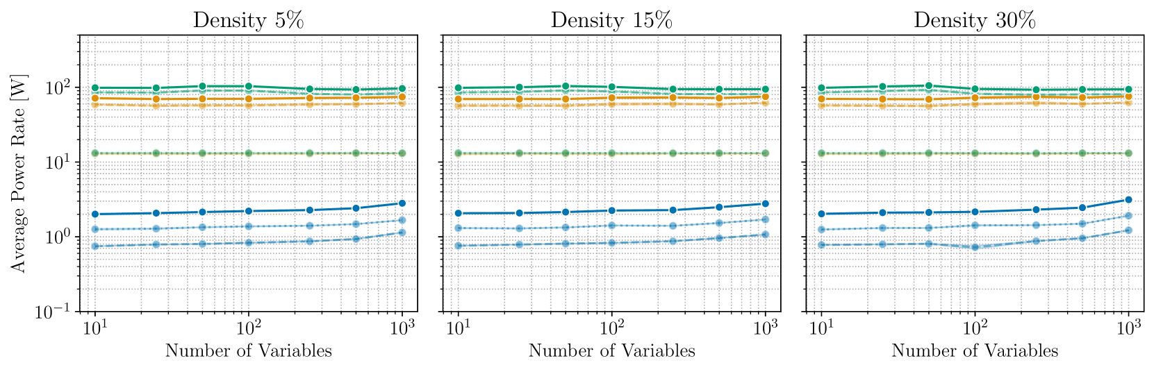
The image displays three side-by-side line charts comparing the "Average Power Rate [W]" against the "Number of Variables" across three different "Density" configurations: 5%, 15%, and 30%. The charts utilize a logarithmic scale for both the X and Y axes. The data indicates that power consumption is stratified into distinct tiers, with some tiers remaining constant regardless of the number of variables, while others show a slight upward trend as the number of variables increases.
### Components/Axes
* **Layout:** Three identical chart frames arranged horizontally.
* **X-Axis:** Labeled "Number of Variables" at the bottom of each chart. The scale is logarithmic, ranging from $10^1$ (10) to $10^3$ (1000).
* **Y-Axis:** Labeled "Average Power Rate [W]" on the far left. The scale is logarithmic, ranging from $10^{-1}$ (0.1) to $10^2$ (100).
* **Titles:**
* Left Chart: "Density 5%"
* Center Chart: "Density 15%"
* Right Chart: "Density 30%"
* **Data Series (No legend provided; identified by visual characteristics):**
* **Tier 1 (High Power):**
* Dark Teal (Solid line, circle markers): Top-most line.
* Orange (Solid line, circle markers): Second from top.
* Light Orange (Dashed line, circle markers): Third from top.
* **Tier 2 (Medium Power):**
* Green (Dashed line, circle markers): Fourth from top.
* **Tier 3 (Low Power):**
* Dark Blue (Solid line, circle markers): Fifth from top.
* Light Blue (Dashed line, circle markers): Sixth from top.
* Faded Blue (Dashed line, circle markers): Bottom-most line.
### Detailed Analysis
The data patterns are consistent across all three density charts (5%, 15%, and 30%).
**Trend Verification:**
* **Tier 1 & 2 (Top four lines):** These lines (Dark Teal, Orange, Light Orange, Green) exhibit a flat, horizontal trend. The power rate remains constant regardless of the increase in the number of variables.
* **Tier 3 (Bottom three lines):** These lines (Dark Blue, Light Blue, Faded Blue) exhibit a positive slope, particularly visible between $10^2$ and $10^3$ variables, indicating that power consumption increases as the number of variables increases.
**Approximate Data Points (Consistent across all three charts):**
* **Dark Teal (Solid):** Remains constant at approximately $10^2$ W (100 W).
* **Orange (Solid):** Remains constant at approximately $70-80$ W.
* **Light Orange (Dashed):** Remains constant at approximately $60$ W.
* **Green (Dashed):** Remains constant at approximately $13$ W.
* **Dark Blue (Solid):** Starts at $\approx 2$ W at $10^1$ variables, rising to $\approx 3$ W at $10^3$ variables.
* **Light Blue (Dashed):** Starts at $\approx 1.3$ W at $10^1$ variables, rising to $\approx 2$ W at $10^3$ variables.
* **Faded Blue (Dashed):** Starts at $\approx 0.8$ W at $10^1$ variables, rising to $\approx 1.2$ W at $10^3$ variables.
### Key Observations
* **Density Invariance:** The "Density" parameter (5%, 15%, 30%) appears to have no significant impact on the power consumption profiles, as the charts are visually identical.
* **Power Stratification:** The system power consumption is clearly divided into three distinct operational tiers. The high-power tiers (above 10W) appear to represent fixed overhead or background processes that do not scale with the workload (number of variables).
* **Scaling Behavior:** Only the low-power tier (below 3W) shows sensitivity to the "Number of Variables." This suggests that the components represented by the blue lines are the only ones performing work that scales with the input size.
### Interpretation
The data suggests a system architecture where the majority of power consumption is driven by static, non-scaling components (the high-power tiers).
* **Fixed Overhead:** The fact that the top four lines are flat suggests these represent system-level components (e.g., cooling, idle CPU cores, memory controllers, or background services) that consume a constant amount of power regardless of the computational load.
* **Workload Scaling:** The bottom three lines represent the only components that scale with the "Number of Variables." This is likely the primary compute unit or the specific algorithm being tested.
* **Efficiency Implications:** If the goal is to reduce power consumption, optimizing the "Number of Variables" will yield diminishing returns because the high-power, non-scaling components dominate the total power budget. To significantly reduce total power, one would need to address the high-power tiers (the 10W-100W range) rather than the scaling components.
* **Anomaly/Outlier:** There is a slight dip in the Faded Blue line at $10^2$ variables in the "Density 30%" chart, which is not present in the other charts. This could be a minor measurement artifact or a specific system state transition at that density.