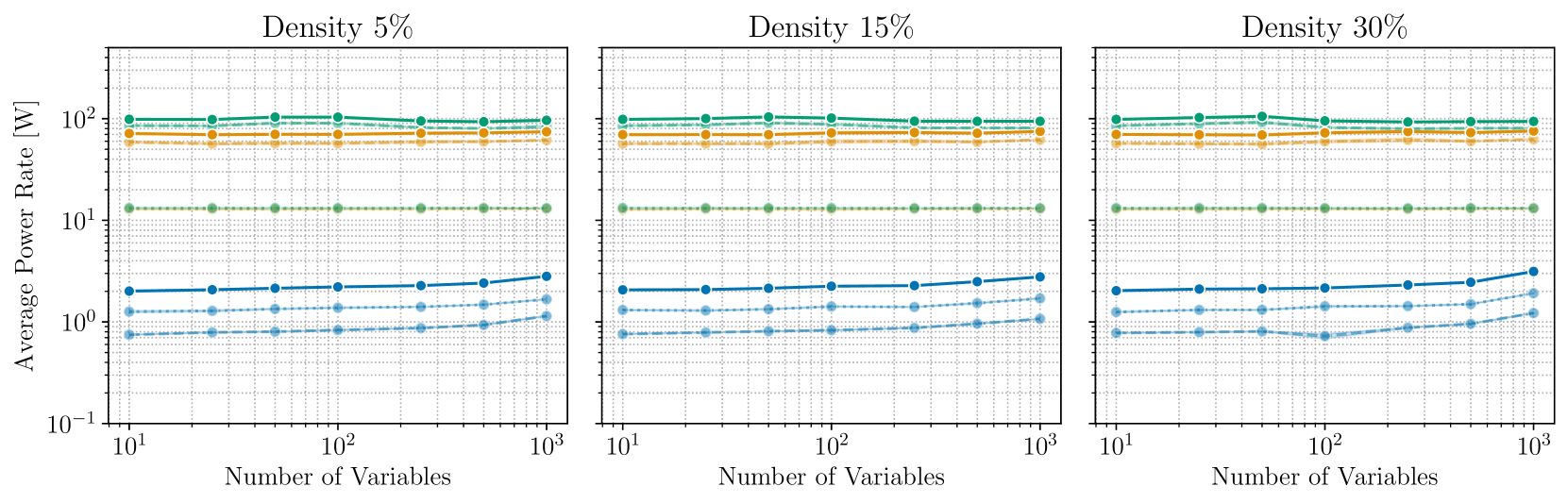
## Line Charts: Average Power Rate vs. Number of Variables at Different Densities
### Overview
The image displays three horizontally arranged line charts, each plotting "Average Power Rate [W]" against "Number of Variables" on logarithmic scales. The charts are differentiated by a "Density" parameter, labeled as 5%, 15%, and 30% from left to right. Each chart contains multiple data series represented by lines of different colors and styles (solid and dashed).
### Components/Axes
* **Chart Titles (Top of each panel):**
* Left Panel: "Density 5%"
* Center Panel: "Density 15%"
* Right Panel: "Density 30%"
* **Y-Axis (Vertical, shared across all panels):**
* **Label:** "Average Power Rate [W]"
* **Scale:** Logarithmic, ranging from 10⁻¹ (0.1) to 10² (100).
* **Major Ticks:** 10⁻¹, 10⁰, 10¹, 10².
* **X-Axis (Horizontal, per panel):**
* **Label:** "Number of Variables"
* **Scale:** Logarithmic, ranging from 10¹ (10) to 10³ (1000).
* **Major Ticks:** 10¹, 10², 10³.
* **Data Series (Legend inferred from visual coding):**
* There is no explicit legend box. The series are distinguished by color and line style.
* **Colors:** Teal/Green, Orange/Yellow, Blue (in three shades: dark, medium, light).
* **Line Styles:** Solid lines and dashed lines for each color group.
* **Spatial Grounding:** In all three charts, the lines are stacked vertically. From top to bottom, the general order is: solid teal, dashed teal, solid orange, dashed orange, solid dark blue, dashed medium blue, dashed light blue. This order is consistent across all density panels.
### Detailed Analysis
**General Trend Across All Charts:**
All data series show relatively flat trends across the range of variables (10 to 1000). The average power rate for each series remains largely constant, with only very slight variations. The vertical ordering of the series is consistent.
**Panel 1: Density 5%**
* **Top Series (Solid Teal):** Positioned just above 10² W (~100 W). The line is nearly horizontal.
* **Second Series (Dashed Teal):** Positioned slightly below the solid teal line, also near 10² W.
* **Third Series (Solid Orange):** Positioned between 10¹ and 10² W, approximately at 70-80 W. The line is flat.
* **Fourth Series (Dashed Orange):** Positioned just below the solid orange line, also in the 70-80 W range. Flat.
* **Fifth Series (Solid Dark Blue):** Positioned just above 10⁰ W (~1-2 W). The line shows a very slight upward slope from left to right.
* **Sixth Series (Dashed Medium Blue):** Positioned around 10⁰ W (~1 W). The line is flat.
* **Seventh Series (Dashed Light Blue):** Positioned just below 10⁰ W (~0.8-0.9 W). The line is flat.
**Panel 2: Density 15%**
* The visual pattern is nearly identical to the Density 5% chart.
* The vertical positions and flat trends of all seven series are preserved. The solid dark blue line again shows a very slight upward trend.
**Panel 3: Density 30%**
* The pattern remains largely consistent with the previous two charts.
* **Notable Variation:** The lowest series (dashed light blue) shows a slight dip around 10² variables before recovering, creating a shallow "V" shape not present in the other panels. All other series maintain their flat trajectories.
### Key Observations
1. **Consistency Across Density:** The most striking observation is the high degree of similarity between the three charts. Changing the density parameter from 5% to 30% has a minimal visual impact on the average power rate for most series.
2. **Stratified Power Consumption:** The data reveals clear, distinct tiers of power consumption. The teal and orange series operate in the high-power regime (tens to hundreds of Watts), while the blue series operate in the low-power regime (around 1 Watt or less).
3. **Stability with Scale:** For nearly all configurations, the average power rate is independent of the number of variables within the tested range (10 to 1000). This suggests the system's power draw is dominated by factors other than the variable count.
4. **Minor Anomaly:** The only deviation from perfect flatness is the slight increase in the solid dark blue line and the slight dip in the dashed light blue line at Density 30%.
### Interpretation
This technical visualization likely compares the power consumption of different algorithms, hardware configurations, or system components (represented by the colored lines) as the problem size (Number of Variables) scales. The "Density" parameter could refer to problem sparsity, network connectivity, or material density in a simulation.
The data suggests that:
* The system's power consumption is **highly stratified** and **predictable** based on the component/algorithm in use (color group).
* Power consumption is **largely insensitive** to both the number of variables and the density parameter within the explored ranges. This is a desirable property for scalability.
* The high-power components (teal/orange) consume orders of magnitude more power than the low-power components (blue). This could indicate a mix of active processing units (high power) and control or memory units (low power).
* The slight upward trend in the solid blue line might indicate a minor, but measurable, scaling overhead for that specific component. The dip in the light blue line at 30% density is an outlier that may warrant investigation into a specific interaction at that configuration.
**In summary, the charts demonstrate a system with stable, tiered power characteristics that are robust to changes in scale and density, with one minor exception.**