## Chart Analysis: Station Data Completeness
### Overview
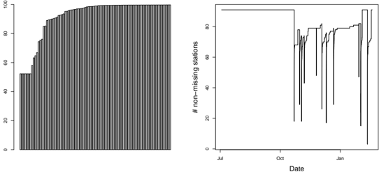
The image presents two charts side-by-side, both related to the completeness of station data over time. The left chart is a bar chart showing the cumulative number of stations reaching a certain level of data completeness. The right chart is a line graph showing the number of non-missing stations over time.
### Components/Axes
**Left Chart (Cumulative Station Completeness):**
* **X-axis:** Represents individual stations, but is not explicitly labeled.
* **Y-axis:** Represents the percentage of data completeness, ranging from 0 to 100.
* The chart consists of a series of vertical bars, each representing a station. The height of the bar indicates the percentage of data completeness for that station.
**Right Chart (Non-Missing Stations Over Time):**
* **X-axis:** Represents time, labeled "Date," with markers for "Jul," "Oct," and "Jan."
* **Y-axis:** Represents the number of non-missing stations, labeled "# non-missing stations," ranging from 0 to 100.
* The chart consists of a line graph showing the number of stations with non-missing data over time.
### Detailed Analysis
**Left Chart (Cumulative Station Completeness):**
* The bars are arranged in ascending order of data completeness.
* The initial bars are relatively short, indicating a significant number of stations with low data completeness.
* The bars gradually increase in height, indicating an increasing number of stations with higher data completeness.
* The majority of the bars reach a height of approximately 100, indicating that most stations have nearly complete data.
**Right Chart (Non-Missing Stations Over Time):**
* From July to October, the number of non-missing stations remains relatively constant at approximately 90.
* Around October, there is a sharp drop in the number of non-missing stations, reaching a low of approximately 20.
* From October to January, the number of non-missing stations fluctuates significantly, with several sharp drops and increases.
* The number of non-missing stations generally increases over time, but with considerable variability.
* The line graph shows two distinct lines that are very close to each other, indicating two similar data series.
### Key Observations
* The left chart shows the distribution of data completeness across all stations, while the right chart shows how the number of stations with non-missing data changes over time.
* The right chart indicates a period of significant data loss around October, followed by a period of recovery and fluctuation.
* The two lines on the right chart suggest that there might be two different datasets or categories of stations being tracked.
### Interpretation
The data suggests that while most stations have a high degree of data completeness overall (as shown in the left chart), there are periods of significant data loss for some stations (as shown in the right chart). The drop in the number of non-missing stations around October could be due to a system outage, data corruption, or other factors. The subsequent recovery and fluctuation suggest that the data loss was not permanent, but that there may be ongoing issues with data availability. The presence of two lines on the right chart could indicate that the data is being tracked for two different groups of stations, or that there are two different data sources being used. Further investigation would be needed to determine the exact cause of the data loss and the meaning of the two lines.