## Dual Chart Analysis: Data Completeness Over Time
### Overview
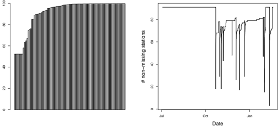
The image displays two separate but related charts side-by-side, both analyzing aspects of data completeness, likely for a network of monitoring stations over a period of several months. The left chart is a bar chart showing a cumulative distribution, while the right chart is a time-series line graph tracking the count of stations with non-missing data.
### Components/Axes
**Left Chart (Bar Chart):**
* **Type:** Vertical bar chart.
* **Y-Axis:** Labeled with numerical values: 0, 20, 40, 60, 80, 100. The axis title is not visible, but the scale strongly suggests a percentage or proportion (0-100%).
* **X-Axis:** No visible label. It consists of a large number of thin, closely packed bars, suggesting each bar represents an individual station or a small time unit, sorted by completeness.
* **Data Series:** A single series of dark gray/black bars.
**Right Chart (Line Chart):**
* **Type:** Time-series line graph.
* **Y-Axis:** Labeled "# non-missing stations". The scale runs from 0 to 80, with major ticks at 0, 20, 40, 60, 80.
* **X-Axis:** Labeled "Date". Major tick marks are labeled "Jul", "Oct", "Jan", indicating a timeline spanning from approximately July to January of the following year.
* **Data Series:** A single, jagged black line tracking the daily or periodic count of stations reporting valid data.
### Detailed Analysis
**Left Chart - Cumulative Completeness:**
* **Trend:** The bars show a steep, near-vertical increase at the far left, indicating a small number of stations have very low completeness. The curve then rises sharply and begins to plateau. The majority of the bars (from roughly the 10th percentile onward) are at or very near the 100 mark.
* **Key Data Points (Approximate):**
* The first few bars start below 20.
* A significant jump occurs, with bars quickly reaching 60, then 80.
* Approximately 80-90% of the bars appear to be at the 100 level.
* The final bar on the far right is at 100.
**Right Chart - Station Count Over Time:**
* **Trend:** The line shows significant volatility. It starts at a high, stable plateau, experiences a dramatic drop, recovers with high variability, and ends with another sharp decline.
* **Key Data Points & Periods (Approximate):**
1. **July to late September:** The line is flat at the maximum value, approximately 90 stations (just above the 80 tick mark).
2. **Early October:** A precipitous drop occurs, falling from ~90 to a trough of approximately 15-20 stations.
3. **October to December:** The line recovers but remains highly unstable, fluctuating rapidly between ~40 and ~80 stations. There are multiple sharp dips and recoveries within this period.
4. **Late December/Early January:** The line stabilizes briefly near 80 stations.
5. **Mid-January:** A second severe drop occurs, plummeting to near 0 stations (the line touches or goes below the 0 tick mark).
6. **Late January:** A partial recovery to approximately 60-70 stations is visible at the far right edge.
### Key Observations
1. **High Overall Completeness vs. Temporal Gaps:** The left chart suggests that *across the entire dataset*, most stations have very high (near 100%) data completeness. However, the right chart reveals that this completeness is not uniform over time; there are specific periods where the number of reporting stations collapses.
2. **Two Major Failure Events:** The right chart clearly identifies two major system-wide events causing massive data loss: one in early October and another in mid-January. The October event appears to be a single, sharp drop followed by a noisy recovery. The January event is a drop to near-zero.
3. **Period of Instability:** The period between October and December is characterized by high-frequency volatility, suggesting persistent issues, intermittent station failures, or perhaps a change in data collection/processing that introduced noise.
4. **Spatial Grounding:** The charts are placed side-by-side. The left chart occupies the left ~45% of the image, the right chart the right ~55%. There is no shared legend; each chart is self-contained.
### Interpretation
This pair of charts tells a story of a monitoring network that is generally robust but vulnerable to catastrophic, network-wide outages.
* **The Left Chart (Cumulative Distribution)** answers the question: "How complete is the dataset for each station overall?" The answer is: overwhelmingly complete for the vast majority of stations. This is a positive indicator for long-term data reliability per station.
* **The Right Chart (Time Series)** answers the question: "How many stations were reporting at any given time?" The answer reveals critical vulnerabilities. The network does not degrade gracefully; it experiences sudden, severe failures affecting almost all stations simultaneously (the drops in Oct and Jan). This pattern is indicative of central system failures—such as a data processing server going down, a network outage, or a software update bug—rather than independent, random station failures.
* **The Anomaly:** The most striking anomaly is the period of extreme volatility from October to December. After the first major crash, the system never returns to its pre-October stability. This could indicate that the October event caused lasting damage, that a less reliable backup system was activated, or that the nature of the data collection changed permanently.
* **Conclusion:** While individual stations are reliable (left chart), the system's central data aggregation or processing pipeline is a single point of failure, as evidenced by the time-series data (right chart). The investigation should focus on the root causes of the October and January outages and the persistent instability thereafter.