## Line Graphs: Non-Missing Stations Over Time
### Overview
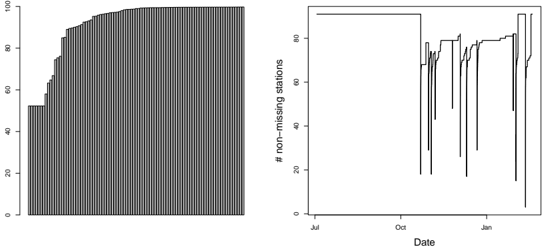
The image contains two line graphs side-by-side. The left graph shows a vertical bar chart with a gradual increase in values over time, while the right graph displays a line chart with sharp fluctuations and a notable drop in values around October. Both graphs share the same y-axis label ("# non-missing stations") but differ in x-axis representation (time intervals vs. specific dates).
### Components/Axes
#### Left Graph (Bar Chart)
- **Y-Axis**: Labeled "# non-missing stations" with a scale from 0 to 100 in increments of 20.
- **X-Axis**: Unlabeled time intervals represented by vertical bars. No explicit date markers, but the progression suggests sequential time steps.
- **Data Series**: Single series of vertical bars increasing from ~50 to ~100.
#### Right Graph (Line Chart)
- **Y-Axis**: Identical to the left graph ("# non-missing stations", 0–100).
- **X-Axis**: Labeled "Date" with markers for July, October, and January.
- **Data Series**: Single line starting at 100, dropping sharply to ~60 in October, fluctuating between ~60–80, and spiking to ~90 in January.
### Detailed Analysis
#### Left Graph
- **Trend**: Bars rise steadily from ~50 (bottom) to ~100 (top), with minor fluctuations in the middle range.
- **Key Data Points**:
- Initial value: ~50 (bottom bar).
- Final value: ~100 (top bar).
- Intermediate values: Gradual increments (~60, ~70, ~80, ~90) with slight dips.
#### Right Graph
- **Trend**:
1. **July**: Starts at 100 (flat line).
2. **October**: Sharp drop to ~60 (vertical decline).
3. **Post-October**: Fluctuates between ~60–80 with irregular peaks and troughs.
4. **January**: Final spike to ~90.
- **Key Data Points**:
- July: 100 (stable).
- October: ~60 (lowest point).
- January: ~90 (highest post-drop value).
### Key Observations
1. **Left Graph**: Consistent upward trend suggests a cumulative increase in non-missing stations over time.
2. **Right Graph**:
- October anomaly: Sharp decline (~40% drop from 100 to 60).
- January spike: Partial recovery to ~90, but not reaching the initial 100.
- Post-October volatility: Unpredictable fluctuations between ~60–80.
### Interpretation
- **Left Graph**: Likely represents a cumulative metric (e.g., total non-missing stations added over time). The steady rise implies systematic improvement or expansion.
- **Right Graph**: The October drop and January spike suggest external events (e.g., maintenance, data collection errors, or operational changes). The failure to recover to the initial 100 value indicates persistent issues or incomplete resolution.
- **Cross-Graph Comparison**: The left graph’s gradual increase contrasts with the right graph’s volatility, implying different measurement scopes (cumulative vs. time-specific).
- **Anomalies**: The October collapse in the right graph is the most significant outlier, warranting investigation into causation (e.g., system failures, data anomalies).
### Spatial Grounding & Verification
- **Legend**: No legend present; both graphs use black lines/bars, so color matching is not applicable.
- **Positioning**:
- Left graph: Bars aligned vertically, increasing left-to-right.
- Right graph: Line follows x-axis chronologically (July → October → January).
### Conclusion
The data highlights a divergence between long-term growth (left graph) and short-term instability (right graph). The October anomaly in the right graph may reflect a critical event disrupting the otherwise upward trend, emphasizing the need for root-cause analysis.