\n
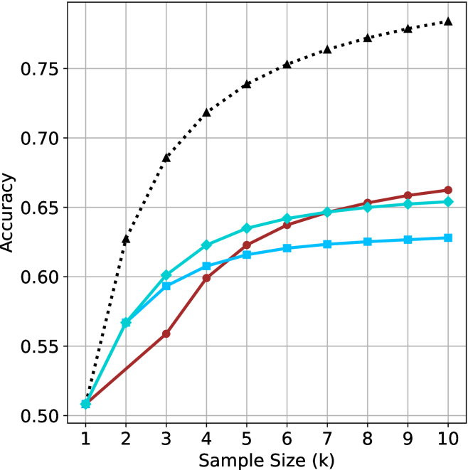
## Line Chart: Accuracy vs. Sample Size (k)
### Overview
The image is a line chart comparing the performance (Accuracy) of four different methods or models as a function of increasing sample size (k). The chart demonstrates how accuracy improves for each method as more samples are used, with one method (black dotted line) consistently outperforming the others.
### Components/Axes
* **X-Axis:** Labeled "Sample Size (k)". It is a linear scale with major tick marks and labels at integer values from 1 to 10.
* **Y-Axis:** Labeled "Accuracy". It is a linear scale with major tick marks and labels at 0.05 intervals, ranging from 0.50 to 0.75. Grid lines extend horizontally from these major ticks.
* **Legend:** Positioned in the top-left corner of the chart area. It contains four entries, each associating a line style/color with a label:
1. A black dotted line with upward-pointing triangle markers (▲).
2. A solid red line with circle markers (●).
3. A solid cyan line with diamond markers (◆).
4. A solid cyan line with square markers (■).
* **Grid:** A light gray grid is present, with both horizontal and vertical lines aligning with the major axis ticks.
### Detailed Analysis
The chart plots four data series. Below is an analysis of each, including approximate data points extracted by visual inspection. Values are approximate (±0.005).
**1. Black Dotted Line (▲)**
* **Trend:** Shows the steepest initial increase and maintains the highest accuracy throughout. The slope is very steep from k=1 to k=4, then becomes more gradual but continues to rise steadily.
* **Approximate Data Points:**
* k=1: 0.51
* k=2: 0.63
* k=3: 0.69
* k=4: 0.72
* k=5: 0.74
* k=6: 0.755
* k=7: 0.765
* k=8: 0.77
* k=9: 0.775
* k=10: 0.78
**2. Red Solid Line (●)**
* **Trend:** Starts as the lowest-performing method at k=1. It shows a steady, nearly linear increase, eventually crossing above both cyan lines between k=5 and k=6.
* **Approximate Data Points:**
* k=1: 0.51
* k=2: 0.54
* k=3: 0.56
* k=4: 0.60
* k=5: 0.625
* k=6: 0.64
* k=7: 0.65
* k=8: 0.655
* k=9: 0.66
* k=10: 0.665
**3. Cyan Solid Line (◆)**
* **Trend:** Starts tied for lowest at k=1 but rises quickly, outperforming the red line until k=5. After k=6, its growth rate slows significantly, showing diminishing returns.
* **Approximate Data Points:**
* k=1: 0.51
* k=2: 0.57
* k=3: 0.60
* k=4: 0.625
* k=5: 0.635
* k=6: 0.645
* k=7: 0.65
* k=8: 0.652
* k=9: 0.653
* k=10: 0.655
**4. Cyan Solid Line (■)**
* **Trend:** Follows a very similar trajectory to the cyan diamond (◆) line but consistently performs slightly worse after k=2. It also exhibits strong diminishing returns after k=5.
* **Approximate Data Points:**
* k=1: 0.51
* k=2: 0.57
* k=3: 0.595
* k=4: 0.61
* k=5: 0.62
* k=6: 0.625
* k=7: 0.628
* k=8: 0.63
* k=9: 0.63
* k=10: 0.63
### Key Observations
1. **Dominant Performance:** The method represented by the black dotted line (▲) is clearly superior, achieving ~0.78 accuracy at k=10, which is over 0.11 points higher than the next best method.
2. **Crossover Event:** The red line (●) starts poorly but demonstrates the most consistent growth rate, eventually surpassing both cyan lines. This suggests it may benefit more from additional data in the long run.
3. **Diminishing Returns:** Both cyan lines (◆ and ■) show a pronounced "knee" in their curves around k=4 or k=5, after which adding more samples yields very small improvements in accuracy.
4. **Convergence at Start:** All four methods begin at approximately the same accuracy (~0.51) when the sample size is minimal (k=1).
### Interpretation
This chart likely compares different machine learning models, algorithms, or training strategies. The data suggests:
* **Sample Efficiency:** The black-dotted method is highly sample-efficient, extracting significant performance gains from the first few samples. This could indicate a more complex model, a better inductive bias for the task, or the use of superior features.
* **Model Behavior:** The red line's steady climb suggests a model whose performance scales more predictably with data, possibly a simpler or more robust algorithm that hasn't yet reached its capacity.
* **Performance Plateau:** The cyan lines represent methods that quickly reach a performance ceiling. This plateau could be due to model simplicity, high bias, or an inherent limitation in the approach that more data cannot overcome.
* **Practical Implication:** If data collection is expensive (low k), the black method is the clear choice. If massive datasets are available (k >> 10), the red method's trajectory suggests it might continue to close the gap, though the black method's lead is substantial. The cyan methods appear best suited for scenarios with limited data (k < 5) where they are competitive, but they are not optimal for leveraging larger datasets.
The chart effectively communicates that not all methods benefit equally from more data, and the choice of algorithm should consider both the expected dataset size and the desired performance ceiling.