## Scatter Plot with Trend Line: Mean Pass Rate vs. Mean Tokens Generated
### Overview
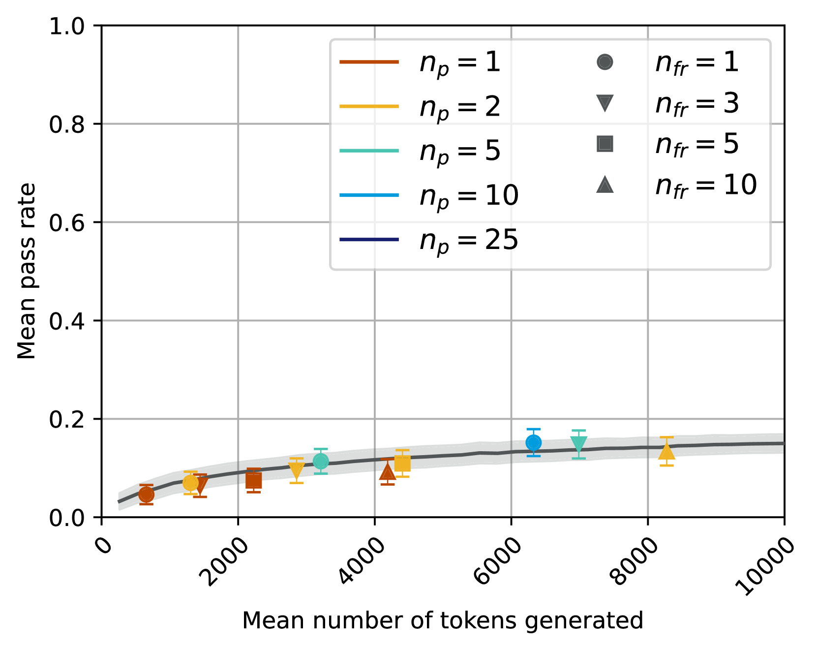
The image is a technical scatter plot chart displaying the relationship between the "Mean number of tokens generated" (x-axis) and the "Mean pass rate" (y-axis). The chart includes multiple data series differentiated by two parameters: `n_p` (represented by color) and `n_fr` (represented by marker shape). A dark gray trend line with a light gray shaded confidence interval runs through the data points.
### Components/Axes
* **X-Axis:** Labeled "Mean number of tokens generated". The scale runs from 0 to 10,000, with major tick marks at 0, 2000, 4000, 6000, 8000, and 10000. The labels are rotated approximately 45 degrees.
* **Y-Axis:** Labeled "Mean pass rate". The scale runs from 0.0 to 1.0, with major tick marks at 0.0, 0.2, 0.4, 0.6, 0.8, and 1.0.
* **Legend (Top-Right Quadrant):** A two-column legend box defines the data series.
* **Left Column (Color for `n_p`):**
* Burnt Orange line: `n_p = 1`
* Golden Yellow line: `n_p = 2`
* Teal line: `n_p = 5`
* Sky Blue line: `n_p = 10`
* Dark Navy Blue line: `n_p = 25`
* **Right Column (Marker Shape for `n_fr`):**
* Circle (●): `n_fr = 1`
* Inverted Triangle (▼): `n_fr = 3`
* Square (■): `n_fr = 5`
* Triangle (▲): `n_fr = 10`
* **Data Series:** Each data point is a combination of a color (from `n_p`) and a marker shape (from `n_fr`), with vertical error bars.
* **Trend Line:** A solid dark gray line with a surrounding light gray shaded area (likely representing a confidence interval or standard error band).
### Detailed Analysis
**Data Points (Approximate Values, reading left to right):**
1. **~500 tokens, ~0.04 pass rate:** Burnt Orange Circle (`n_p=1`, `n_fr=1`).
2. **~1200 tokens, ~0.06 pass rate:** Golden Yellow Inverted Triangle (`n_p=2`, `n_fr=3`).
3. **~2200 tokens, ~0.07 pass rate:** Burnt Orange Square (`n_p=1`, `n_fr=5`).
4. **~2800 tokens, ~0.09 pass rate:** Golden Yellow Inverted Triangle (`n_p=2`, `n_fr=3`).
5. **~3200 tokens, ~0.11 pass rate:** Teal Circle (`n_p=5`, `n_fr=1`).
6. **~4200 tokens, ~0.08 pass rate:** Burnt Orange Triangle (`n_p=1`, `n_fr=10`).
7. **~4500 tokens, ~0.11 pass rate:** Golden Yellow Square (`n_p=2`, `n_fr=5`).
8. **~6300 tokens, ~0.15 pass rate:** Sky Blue Circle (`n_p=10`, `n_fr=1`).
9. **~7000 tokens, ~0.15 pass rate:** Teal Inverted Triangle (`n_p=5`, `n_fr=3`).
10. **~8200 tokens, ~0.13 pass rate:** Golden Yellow Triangle (`n_p=2`, `n_fr=10`).
**Trend Line:** The dark gray trend line starts near (0, 0.03), rises steeply until approximately 2000-3000 tokens, and then continues to rise at a much slower, almost linear rate, reaching approximately 0.15 at 10,000 tokens. The shaded confidence band is narrowest at the start and widens slightly as the token count increases.
### Key Observations
1. **Overall Trend:** There is a positive correlation between the mean number of tokens generated and the mean pass rate. The relationship appears logarithmic or asymptotic, showing strong initial gains that diminish as token count increases.
2. **Parameter Influence:** The data points for higher `n_p` values (Teal `n_p=5`, Sky Blue `n_p=10`) are positioned further to the right (higher token counts) and generally higher on the y-axis (higher pass rates) than points for lower `n_p` values (Burnt Orange `n_p=1`, Golden Yellow `n_p=2`).
3. **Marker (`n_fr`) Distribution:** For a given `n_p` color, different `n_fr` markers are spread along the x-axis. For example, the Golden Yellow (`n_p=2`) series includes an inverted triangle at ~1200 tokens, a square at ~4500 tokens, and a triangle at ~8200 tokens.
4. **Plateau Effect:** The trend line suggests the mean pass rate begins to plateau around 0.15-0.16 after approximately 6000 tokens, indicating diminishing returns for generating additional tokens beyond this point.
5. **Variability:** The error bars on individual data points indicate variability in the mean pass rate measurement for each specific parameter combination.
### Interpretation
This chart likely evaluates the performance of a text generation or code synthesis system, where "pass rate" is a metric of success (e.g., passing unit tests). The "mean number of tokens generated" is a measure of output length or computational cost.
The data suggests a fundamental trade-off: allowing the system to generate more tokens (a longer output) increases its probability of success, but with sharply diminishing returns. The initial increase in pass rate is significant, but after a certain point (~6000 tokens in this context), additional tokens yield minimal improvement.
The parameters `n_p` and `n_fr` appear to be control variables for the generation process. The trend that higher `n_p` values are associated with both longer generations and higher pass rates implies that `n_p` might be a parameter like "number of proposals" or "parallel attempts," where allocating more resources (`n_p`) leads to better but more verbose solutions. The `n_fr` parameter, varied within each `n_p` color group, might represent a different aspect of the process, like "number of refinement steps," whose effect on token count and pass rate is less straightforward from this visualization alone.
The plateau in the trend line is a critical insight for system optimization. It indicates an operational sweet spot: generating beyond ~6000-8000 tokens may waste computational resources for negligible gain in success rate. The chart provides empirical evidence for setting efficient generation limits.