## Line Graph: Mean Pass Rate vs. Mean Number of Tokens Generated
### Overview
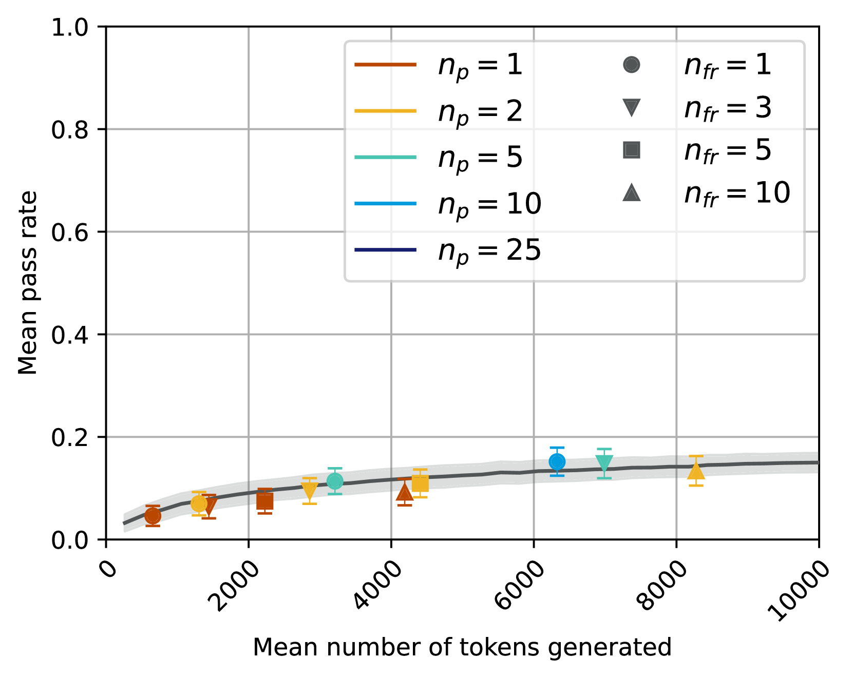
The image is a line graph depicting the relationship between the **mean pass rate** (y-axis) and the **mean number of tokens generated** (x-axis). Multiple data series are plotted, each corresponding to different combinations of parameters `n_p` (number of participants) and `n_fr` (number of free tokens). The graph includes shaded regions representing confidence intervals and a legend in the top-right corner.
---
### Components/Axes
- **X-axis**: "Mean number of tokens generated" (ranges from 0 to 10,000 in increments of 2,000).
- **Y-axis**: "Mean pass rate" (ranges from 0.0 to 1.0 in increments of 0.2).
- **Legend**: Located in the top-right corner, with the following entries:
- `n_p = 1` (red circle)
- `n_p = 2` (orange triangle)
- `n_p = 5` (green square)
- `n_p = 10` (blue diamond)
- `n_p = 25` (dark blue line)
- `n_fr = 1` (red circle)
- `n_fr = 3` (orange triangle)
- `n_fr = 5` (green square)
- `n_fr = 10` (blue diamond)
- **Shaded Regions**: Gray bands around each line, indicating confidence intervals.
---
### Detailed Analysis
#### Data Series Trends
1. **`n_p = 1` (red circle)**:
- At 2,000 tokens: ~0.05 pass rate.
- At 4,000 tokens: ~0.07 pass rate.
- At 6,000 tokens: ~0.09 pass rate.
- At 8,000 tokens: ~0.11 pass rate.
- At 10,000 tokens: ~0.13 pass rate.
- **Trend**: Gradual increase with diminishing returns.
2. **`n_p = 2` (orange triangle)**:
- At 2,000 tokens: ~0.07 pass rate.
- At 4,000 tokens: ~0.09 pass rate.
- At 6,000 tokens: ~0.11 pass rate.
- At 8,000 tokens: ~0.13 pass rate.
- At 10,000 tokens: ~0.15 pass rate.
- **Trend**: Slightly steeper than `n_p = 1`.
3. **`n_p = 5` (green square)**:
- At 4,000 tokens: ~0.11 pass rate.
- At 6,000 tokens: ~0.13 pass rate.
- At 8,000 tokens: ~0.15 pass rate.
- At 10,000 tokens: ~0.17 pass rate.
- **Trend**: Faster growth than lower `n_p` values.
4. **`n_p = 10` (blue diamond)**:
- At 6,000 tokens: ~0.15 pass rate.
- At 8,000 tokens: ~0.17 pass rate.
- At 10,000 tokens: ~0.19 pass rate.
- **Trend**: Steeper than `n_p = 5`.
5. **`n_p = 25` (dark blue line)**:
- At 8,000 tokens: ~0.18 pass rate.
- At 10,000 tokens: ~0.20 pass rate.
- **Trend**: Highest pass rate, with minimal increase at higher token counts.
6. **`n_fr = 1` (red circle)**:
- Matches `n_p = 1` data points.
7. **`n_fr = 3` (orange triangle)**:
- Matches `n_p = 2` data points.
8. **`n_fr = 5` (green square)**:
- Matches `n_p = 5` data points.
9. **`n_fr = 10` (blue diamond)**:
- Matches `n_p = 10` data points.
#### Confidence Intervals
- Shaded regions around each line indicate variability. For example:
- `n_p = 1` has the widest confidence interval (e.g., ±0.02 at 2,000 tokens).
- `n_p = 25` has the narrowest confidence interval (e.g., ±0.01 at 10,000 tokens).
---
### Key Observations
1. **Positive Correlation**: Higher `n_p` values generally correspond to higher mean pass rates.
2. **Diminishing Returns**: Pass rates plateau as the number of tokens increases, especially for lower `n_p` values.
3. **Confidence Intervals**: Larger `n_p` values (e.g., 25) show tighter confidence intervals, suggesting more reliable estimates.
4. **Parameter Relationship**: `n_fr` values are directly tied to `n_p` (e.g., `n_fr = 1` for `n_p = 1`, `n_fr = 10` for `n_p = 10`).
---
### Interpretation
The data suggests that increasing the number of participants (`n_p`) improves the mean pass rate, but the effect diminishes as the number of tokens grows. The shaded confidence intervals highlight that higher `n_p` values (e.g., 25) provide more precise estimates, likely due to reduced sampling variability. The direct mapping of `n_fr` to `n_p` implies a designed relationship between free tokens and participant count, possibly to balance resource allocation. The plateau effect at higher token counts indicates a saturation point where additional tokens yield minimal performance gains.