## Scatter Plot: Timing vs. Guess
### Overview
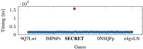
The image is a scatter plot comparing the timing (in nanoseconds) of five different "Guess" inputs. The plot reveals a stark contrast: one data point (associated with the label "SECRET") has a dramatically higher timing value than the other four, which are all clustered near the bottom of the scale.
### Components/Axes
* **Y-Axis:**
* **Title:** `Timing [ns]` (Timing in nanoseconds).
* **Scale:** Linear scale from 0 to 1.5 × 10⁴ (15,000 ns).
* **Major Ticks:** 0, 0.5 × 10⁴ (5,000 ns), 1.0 × 10⁴ (10,000 ns), 1.5 × 10⁴ (15,000 ns).
* **Multiplier:** A `·10⁴` notation is present at the top-left of the axis, indicating the values are multiplied by 10,000.
* **X-Axis:**
* **Title:** `Guess`.
* **Categories (Labels):** Five discrete, alphanumeric labels are listed from left to right:
1. `9Q7Lwt`
2. `1MP6Pv`
3. `SECRET`
4. `0NSQFp`
5. `e4gvLN`
* **Data Series & Legend:**
* There is no explicit legend box. The differentiation is made by color and position.
* **Blue Series:** A dense horizontal cluster of blue data points. Each blue dot corresponds to one of the five x-axis categories. The points for all categories except "SECRET" are blue.
* **Red Series:** A single, distinct red data point. This point is positioned directly above the `SECRET` label on the x-axis.
### Detailed Analysis
* **Trend Verification:**
* The blue data points form a flat, horizontal line with very low variance. This indicates that the timing for the guesses `9Q7Lwt`, `1MP6Pv`, `0NSQFp`, and `e4gvLN` is consistent and low.
* The red data point is a significant outlier, positioned far above the blue cluster, indicating a much higher timing value for the `SECRET` guess.
* **Data Point Values (Approximate):**
* **Blue Cluster (All non-SECRET guesses):** The points are centered around `0.2 × 10⁴ ns` (2,000 ns). The vertical spread is minimal, suggesting a range of approximately `0.15 × 10⁴` to `0.25 × 10⁴ ns` (1,500 to 2,500 ns).
* **Red Point (SECRET guess):** The point is located at approximately `1.5 × 10⁴ ns` (15,000 ns) on the y-axis.
### Key Observations
1. **Extreme Outlier:** The timing for the `SECRET` guess is approximately **7.5 times higher** than the timing for all other guesses.
2. **Consistency of Baseline:** The four non-secret guesses show remarkably consistent and low timing, forming a tight band. This establishes a clear baseline performance level.
3. **Spatial Grounding:** The legend (implied by color) is integrated directly into the plot area. The red dot is spatially isolated in the top-center region of the chart, while the blue dots occupy a narrow band across the bottom.
### Interpretation
This chart strongly suggests a **timing side-channel**. The data demonstrates that the system or algorithm being measured takes significantly longer to process the specific input labeled "SECRET" compared to other, presumably non-secret, inputs.
* **What it means:** The consistent, low timing for the other guesses represents the normal processing time. The dramatic increase for "SECRET" indicates that the processing path for this input is fundamentally different—perhaps involving additional computational steps, memory accesses, or conditional branches that are triggered only by this specific value.
* **Why it matters:** In security contexts, such a measurable timing difference can be exploited by an attacker to infer secret information (like a cryptographic key or a password) by systematically guessing inputs and observing the timing response. The chart provides empirical evidence of such a vulnerability.
* **Peircean Investigation:** The chart presents an **indexical** sign (the red dot's position) pointing to a fact (the high timing). The **symbolic** labels ("SECRET" vs. random strings) provide the context to interpret that fact as a potential security flaw. The pattern is not coincidental; the outlier is directly and uniquely associated with the semantically meaningful label.