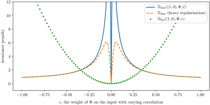
## Line Graph: Invariance Penalty vs. Weight Parameter (c)
### Overview
The image is a technical line graph plotting an "invariance penalty" against a parameter "c," described as "the weight of Φ on the input with varying correlation." It compares three different mathematical functions or models, showing how their penalty values change as the parameter `c` varies from -1.0 to 1.0. The graph demonstrates a symmetric relationship around `c=0`, with distinct behaviors for each plotted series.
### Components/Axes
* **X-Axis:**
* **Label:** `c, the weight of Φ on the input with varying correlation`
* **Scale:** Linear, ranging from -1.00 to 1.00.
* **Major Tick Marks:** At intervals of 0.25 (-1.00, -0.75, -0.50, -0.25, 0.00, 0.25, 0.50, 0.75, 1.00).
* **Y-Axis:**
* **Label:** `invariance penalty`
* **Scale:** Linear, ranging from 0 to 12.
* **Major Tick Marks:** At intervals of 2 (0, 2, 4, 6, 8, 10, 12).
* **Legend (Top-Right Corner):**
* **Blue Solid Line:** `D_dist((1,0), Φ, c)`
* **Orange Dashed Line:** `D_dist (heavy regularization)`
* **Green Dotted Scatter Plot:** `D_lin((1,0), Φ, c)`
### Detailed Analysis
The graph displays three distinct data series, each with a symmetric pattern around the vertical line `c=0`.
1. **Blue Solid Line (`D_dist((1,0), Φ, c)`):**
* **Trend:** This line exhibits a sharp, narrow peak centered at `c=0`. The penalty value increases dramatically as `c` approaches zero from either side, reaching a value that exceeds the chart's upper limit (y=12) at `c=0`. Away from zero, the penalty decays rapidly and then flattens out, approaching a low, constant value (approximately y=1) as `|c|` approaches 1.
* **Approximate Data Points:**
* At `c = ±1.00`, y ≈ 1.0
* At `c = ±0.50`, y ≈ 1.5
* At `c = ±0.25`, y ≈ 3.0
* At `c = ±0.10`, y ≈ 6.0 (estimated, line is very steep)
* At `c = 0.00`, y >> 12 (peak is off-scale)
2. **Orange Dashed Line (`D_dist (heavy regularization)`):**
* **Trend:** This line follows a similar overall shape to the blue line but with a significantly dampened peak. It also peaks at `c=0`, but the maximum value is much lower (around y=6). The decay away from the peak is smoother and less abrupt than the blue line. It converges to the same low, constant value (y≈1) as the blue line for large `|c|`.
* **Approximate Data Points:**
* At `c = ±1.00`, y ≈ 1.0
* At `c = ±0.50`, y ≈ 1.5
* At `c = ±0.25`, y ≈ 2.5
* At `c = ±0.10`, y ≈ 5.5
* At `c = 0.00`, y ≈ 6.0 (local maximum)
3. **Green Dotted Scatter Plot (`D_lin((1,0), Φ, c)`):**
* **Trend:** This series forms a smooth, symmetric U-shaped (parabolic) curve. The penalty is at its minimum (y=0) at `c=0` and increases quadratically as `|c|` increases. The points are densely plotted, creating the appearance of a dotted line.
* **Approximate Data Points:**
* At `c = 0.00`, y = 0.0
* At `c = ±0.25`, y ≈ 1.0
* At `c = ±0.50`, y ≈ 4.0
* At `c = ±0.75`, y ≈ 9.0
* At `c = ±1.00`, y ≈ 16.0 (estimated by extrapolating the curve's trajectory beyond the plotted points, which end near y=12 at |c|≈0.87)
### Key Observations
1. **Symmetry:** All three functions are perfectly symmetric around `c=0`. The penalty for a given positive `c` is identical to that for `-c`.
2. **Divergent Behavior at Origin:** The most striking feature is the behavior at `c=0`. The `D_lin` function has a minimum (0), while both `D_dist` functions have a maximum (a sharp peak for the standard version, a rounded peak for the heavily regularized version).
3. **Convergence at Extremes:** For large absolute values of `c` (approaching ±1), the two `D_dist` functions converge to the same low, non-zero penalty value (~1), while the `D_lin` penalty grows without bound.
4. **Effect of Regularization:** Heavy regularization (orange dashed line) dramatically reduces the peak penalty of the `D_dist` function at `c=0` (from >>12 down to ~6) but does not change its asymptotic behavior for large `|c|`.
### Interpretation
This graph likely illustrates a comparison between a linear invariance measure (`D_lin`) and a distance-based invariance measure (`D_dist`) in a machine learning or statistical context, where `Φ` represents a transformation and `c` controls its influence.
* **Core Insight:** The `D_dist` measure is highly sensitive to the transformation `Φ` when its weight `c` is near zero, assigning a very high "invariance penalty." This suggests that when the transformation has minimal direct influence on the input, the model's output is *not* invariant to it, which is penalized. In contrast, the `D_lin` measure shows the opposite: the penalty is lowest when `c=0`, implying invariance is easiest to achieve when the transformation's weight is minimal.
* **Role of Regularization:** The "heavy regularization" curve demonstrates a common trade-off: it smooths and reduces the extreme sensitivity of the `D_dist` measure at the critical point (`c=0`), making the penalty landscape less severe, which could lead to more stable optimization, albeit at the cost of a less precise penalty signal.
* **Practical Implication:** The choice of invariance measure (`D_lin` vs. `D_dist`) and the use of regularization fundamentally alter what the model considers a "bad" (high-penalty) configuration. A practitioner would need to choose based on whether they want to strongly discourage near-zero transformation weights (using `D_dist`) or encourage them (using `D_lin`). The graph visually justifies why such choices are critical, as they lead to diametrically opposed optimization landscapes around `c=0`.