## Line Chart: Exact Match vs. Data Percentage
### Overview
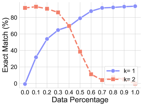
The image displays a line chart comparing the performance of two distinct configurations, labeled $k=1$ and $k=2$, across a range of "Data Percentage" values. The chart illustrates how the "Exact Match (%)" metric evolves as the percentage of data increases from 0.0 to 1.0.
### Components/Axes
* **X-Axis:** Labeled "Data Percentage". The scale ranges from 0.0 to 1.0, with tick marks at 0.1 intervals.
* **Y-Axis:** Labeled "Exact Match (%)". The scale ranges from 0 to approximately 100, with major grid lines at 0, 20, 40, 60, and 80.
* **Legend:** Located in the bottom-right quadrant of the chart area.
* **Blue line with circle markers:** Labeled "k= 1".
* **Red/Orange dashed line with square markers:** Labeled "k= 2".
### Detailed Analysis
**Trend Verification:**
* **k=1 (Blue, solid line):** This series exhibits a monotonic upward trend. It starts at the origin (0,0), rises steeply between 0.0 and 0.4, and then continues to rise at a slower, decelerating rate, plateauing as it approaches 1.0.
* **k=2 (Red, dashed line):** This series exhibits a downward trend after an initial period of stability. It starts high, remains relatively flat between 0.0 and 0.3, drops sharply between 0.4 and 0.6, and then plateaus near zero for the remainder of the range.
**Data Points (Approximate values):**
| Data Percentage (X) | k=1 (Blue) | k=2 (Red) |
| :--- | :--- | :--- |
| 0.0 | ~0% | ~92% |
| 0.1 | ~32% | ~94% |
| 0.2 | ~54% | ~91% |
| 0.3 | ~65% | ~86% |
| 0.4 | ~70% | ~70% |
| 0.5 | ~80% | ~39% |
| 0.6 | ~88% | ~11% |
| 0.7 | ~92% | ~4% |
| 0.8 | ~93% | ~5% |
| 0.9 | ~94% | ~2% |
| 1.0 | ~95% | ~0% |
### Key Observations
* **Intersection Point:** The two data series intersect at approximately X=0.4, where both configurations achieve an "Exact Match" of roughly 70%.
* **Performance Crossover:** Before the 0.4 mark, the $k=2$ configuration significantly outperforms $k=1$. After the 0.4 mark, the $k=1$ configuration becomes the superior performer.
* **Divergence:** The gap between the two lines is widest at the extremes of the X-axis (0.0 and 1.0), indicating that the choice of $k$ is highly sensitive to the amount of data available.
### Interpretation
This chart likely represents the performance of a machine learning model or algorithm (possibly a k-Nearest Neighbors classifier or similar) where $k$ is a hyperparameter.
* **Low Data Regime (0.0 - 0.3):** The $k=2$ configuration is highly effective, suggesting it may be better at generalizing or finding patterns when data is sparse.
* **High Data Regime (0.5 - 1.0):** The $k=1$ configuration is clearly superior. The rapid decline of $k=2$ in this region suggests that as more data is introduced, the $k=2$ configuration may be suffering from increased noise, overfitting, or a fundamental mismatch in how it processes larger datasets compared to $k=1$.
* **Conclusion:** The data demonstrates a clear trade-off. If the system operates with limited data, $k=2$ is the optimal choice. If the system operates with high data availability, $k=1$ is the optimal choice. The "crossover" point at 0.4 represents the critical threshold for deciding which configuration to deploy.