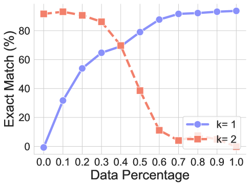
## Line Chart: Exact Match Percentage vs. Data Percentage for Two k-Values
### Overview
The image is a line chart comparing the performance of two models or configurations, labeled `k=1` and `k=2`, as a function of the amount of data used. The performance metric is "Exact Match (%)". The chart demonstrates a clear inverse relationship between the two series as the data percentage increases.
### Components/Axes
* **Chart Type:** Line chart with markers.
* **X-Axis:**
* **Label:** "Data Percentage"
* **Scale:** Linear, ranging from 0.0 to 1.0.
* **Tick Marks:** 0.0, 0.1, 0.2, 0.3, 0.4, 0.5, 0.6, 0.7, 0.8, 0.9, 1.0.
* **Y-Axis:**
* **Label:** "Exact Match (%)"
* **Scale:** Linear, ranging from 0 to approximately 95 (the top grid line is at 80, but data exceeds it).
* **Tick Marks:** 0, 20, 40, 60, 80.
* **Legend:**
* **Position:** Bottom-right corner of the plot area.
* **Series 1:** `k=1` - Represented by a solid blue line with circular markers.
* **Series 2:** `k=2` - Represented by a dashed orange line with square markers.
### Detailed Analysis
**Data Series: k=1 (Blue Line, Circles)**
* **Trend:** Shows a strong, consistent upward trend. Performance improves monotonically as the data percentage increases.
* **Data Points (Approximate):**
* (0.0, 0%)
* (0.1, ~32%)
* (0.2, ~54%)
* (0.3, ~65%)
* (0.4, ~70%)
* (0.5, ~80%)
* (0.6, ~88%)
* (0.7, ~91%)
* (0.8, ~92%)
* (0.9, ~93%)
* (1.0, ~94%)
**Data Series: k=2 (Orange Dashed Line, Squares)**
* **Trend:** Shows an initial high performance that peaks early, followed by a steep, consistent decline. Performance degrades significantly as more data is added beyond a certain point.
* **Data Points (Approximate):**
* (0.0, ~92%)
* (0.1, ~93%) *[Peak]*
* (0.2, ~91%)
* (0.3, ~87%)
* (0.4, ~70%) *[Crossover point with k=1]*
* (0.5, ~39%)
* (0.6, ~11%)
* (0.7, ~4%)
* (0.8, ~1%)
* (0.9, ~0%)
* (1.0, ~0%)
### Key Observations
1. **Inverse Relationship:** The two series exhibit a near-perfect inverse relationship. As `k=1` performance rises, `k=2` performance falls.
2. **Crossover Point:** The lines intersect at a Data Percentage of approximately **0.4**, where both achieve an Exact Match of about **70%**.
3. **Performance Ceiling/Floor:** `k=1` approaches a performance ceiling near 94% with full data. `k=2` approaches a performance floor near 0% with full data.
4. **Early Peak for k=2:** The `k=2` configuration achieves its maximum performance with only 10% of the data.
5. **Steep Degradation:** The decline for `k=2` is particularly steep between 0.4 and 0.6 Data Percentage, dropping from ~70% to ~11%.
### Interpretation
This chart illustrates a fundamental trade-off, likely related to model complexity or capacity, parameterized by `k`.
* **`k=1`** appears to represent a **high-capacity or data-hungry model**. It starts with no capability (0% at 0% data) but effectively learns and generalizes as it is exposed to more data, showing a classic learning curve that plateaus as it approaches the dataset's limit.
* **`k=2`** appears to represent a **low-capacity or highly constrained model**. It performs exceptionally well on very little data (possibly due to strong inductive biases or memorization of a small set), but it cannot scale. As the data volume increases, the model becomes overwhelmed, fails to generalize, and its performance collapses. This is a potential sign of **underfitting** in the face of increasing data complexity or **catastrophic interference**.
The crossover at 40% data is critical. It suggests that for small datasets, the constrained `k=2` approach is superior. However, for any application where more than 40% of the available data can be utilized, the `k=1` approach is decisively better. The choice between them depends entirely on the expected data regime.