## Bar Chart: Solve Rate for Math Word Problems (GSM8K)
### Overview
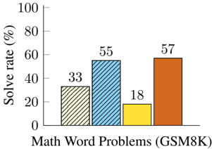
The image is a bar chart comparing the solve rates (in percentage) for different models on Math Word Problems (GSM8K). The x-axis represents the problem type (GSM8K), and the y-axis represents the solve rate in percentage. There are four bars, each representing a different model's performance.
### Components/Axes
* **X-axis:** Math Word Problems (GSM8K)
* **Y-axis:** Solve rate (%)
* Scale: 0 to 100, with increments of 20.
* **Bars:**
* Bar 1 (diagonal lines): Solve rate of 33%
* Bar 2 (blue with diagonal lines): Solve rate of 55%
* Bar 3 (yellow): Solve rate of 18%
* Bar 4 (orange): Solve rate of 57%
### Detailed Analysis
* **Bar 1 (diagonal lines):** The solve rate is 33%.
* **Bar 2 (blue with diagonal lines):** The solve rate is 55%.
* **Bar 3 (yellow):** The solve rate is 18%.
* **Bar 4 (orange):** The solve rate is 57%.
### Key Observations
* The orange bar (57%) has the highest solve rate.
* The yellow bar (18%) has the lowest solve rate.
* The blue bar (55%) and the orange bar (57%) have similar solve rates.
* The solve rates vary significantly across the different models.
### Interpretation
The bar chart illustrates the performance of different models on Math Word Problems (GSM8K), as measured by their solve rates. The significant variation in solve rates suggests that the models have different capabilities in solving these types of problems. The orange model performs the best, while the yellow model performs the worst. The blue model performs nearly as well as the orange model. The diagonal lines model performs better than the yellow model, but worse than the blue and orange models.