## Chart: Overlaps vs. HMC Steps
### Overview
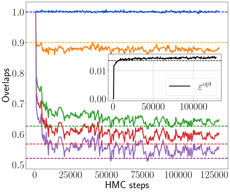
The image is a chart showing the relationship between "Overlaps" and "HMC steps". There are five primary data series plotted, each represented by a different color. Additionally, there is an inset plot showing the behavior of "ε_opt" over HMC steps.
### Components/Axes
* **Main Chart:**
* X-axis: "HMC steps" ranging from 0 to 125000 in increments of 25000.
* Y-axis: "Overlaps" ranging from 0.5 to 1.0 in increments of 0.1.
* Legend: There is no explicit legend, but the data series are distinguished by color.
* Blue: A nearly constant line at approximately 1.0 overlap.
* Orange: A fluctuating line around 0.88 overlap.
* Green: A fluctuating line around 0.67 overlap.
* Red: A fluctuating line around 0.60 overlap.
* Purple: A fluctuating line around 0.55 overlap.
* Horizontal dashed lines indicate approximate average overlap values for each series.
* Blue: 1.0
* Orange: 0.9
* Green: 0.63
* Red: 0.57
* Purple: 0.52
* **Inset Chart:**
* X-axis: "HMC steps" ranging from 0 to 100000 in increments of 50000.
* Y-axis: Values ranging from 0.00 to 0.01 in increments of 0.01.
* Data Series: Black line representing "ε_opt".
* Horizontal dashed line indicates the approximate average value for "ε_opt" at 0.008.
### Detailed Analysis
* **Blue Series:** Starts at 1.0 and remains nearly constant around 1.0 throughout the entire range of HMC steps.
* **Orange Series:** Starts at approximately 0.9 and fluctuates around 0.88.
* **Green Series:** Starts at approximately 0.8 and decreases rapidly before fluctuating around 0.67.
* **Red Series:** Starts at approximately 0.7 and decreases rapidly before fluctuating around 0.60.
* **Purple Series:** Starts at approximately 0.8 and decreases rapidly before fluctuating around 0.55.
* **Inset Chart (ε_opt):** The black line starts at 0 and increases rapidly to approximately 0.008, then fluctuates slightly around this value.
### Key Observations
* The blue series exhibits the highest overlap and remains stable.
* The green, red, and purple series show a significant initial drop in overlap before stabilizing at lower values.
* The inset chart shows that "ε_opt" quickly converges to a stable value.
### Interpretation
The chart illustrates how different configurations or parameters (represented by the colored lines) affect the "Overlaps" during HMC steps. The blue series represents a highly stable configuration with consistently high overlap. The other series (orange, green, red, and purple) represent configurations that initially have high overlap but degrade over the initial HMC steps before stabilizing at lower overlap values. The inset chart suggests that the parameter "ε_opt" quickly converges to an optimal value, which might be related to the stabilization observed in the main chart's data series. The dashed lines likely represent target or expected overlap values for each configuration.