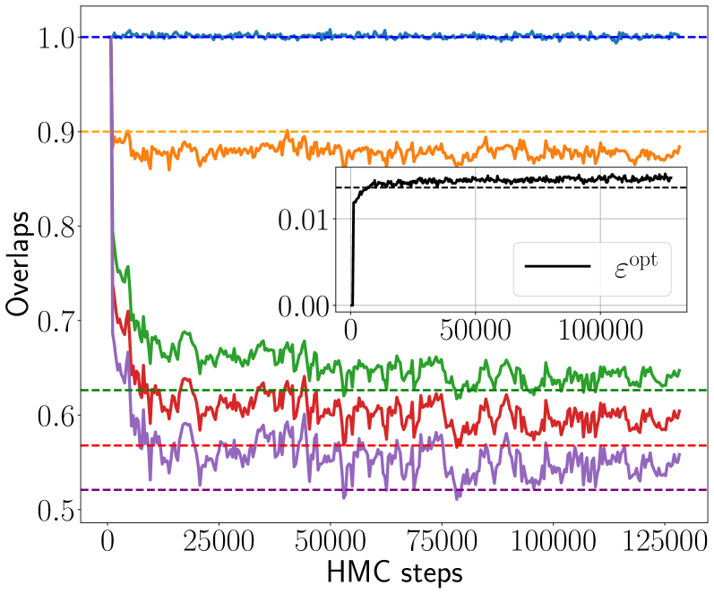
## Chart: Overlaps vs. HMC Steps
### Overview
The image presents a line chart illustrating the relationship between "Overlaps" (y-axis) and "HMC steps" (x-axis). Multiple lines represent different conditions or parameters, showing how overlaps change as the number of HMC steps increases. A small inset chart provides a zoomed-in view of a specific region, with a labeled horizontal bar.
### Components/Axes
* **X-axis:** "HMC steps", ranging from 0 to approximately 125,000.
* **Y-axis:** "Overlaps", ranging from 0.5 to 1.0.
* **Lines:** Five distinct lines, each with a unique color:
* Blue (dashed)
* Red (solid)
* Green (solid)
* Orange (solid)
* Purple (dashed)
* **Inset Chart:** A smaller chart within the main chart, focusing on a region between approximately 40,000 and 120,000 HMC steps. It has its own x-axis scale from 0.00 to 0.01.
* **Horizontal Line:** A dashed horizontal line at approximately 0.85 on the main chart.
* **Label:** "ε<sub>opt</sub>" with a horizontal bar underneath it in the inset chart.
### Detailed Analysis
Let's analyze each line's trend and extract approximate data points.
* **Blue Line:** Starts at approximately 0.98 and remains relatively constant throughout the entire range of HMC steps, with minor fluctuations around 0.99.
* **Red Line:** Starts at approximately 0.92 and exhibits a decreasing trend until around 25,000 HMC steps, reaching a minimum of approximately 0.88. It then fluctuates around 0.90, with some oscillations.
* **Green Line:** Starts at approximately 0.73 and decreases rapidly to around 0.65 by 25,000 HMC steps. It then stabilizes, fluctuating between approximately 0.65 and 0.72.
* **Orange Line:** Starts at approximately 0.91 and decreases slightly to around 0.89 by 25,000 HMC steps. It then remains relatively stable, fluctuating between approximately 0.89 and 0.91.
* **Purple Line:** Starts at approximately 0.62 and exhibits significant fluctuations throughout the entire range of HMC steps, oscillating between approximately 0.55 and 0.68.
**Inset Chart:** The inset chart shows a zoomed-in view of the horizontal axis. The horizontal bar labeled "ε<sub>opt</sub>" spans from approximately 50,000 to 100,000 HMC steps. The x-axis scale is from 0.00 to 0.01.
### Key Observations
* The blue line consistently shows the highest overlap values and remains stable, suggesting a robust condition.
* The purple line exhibits the most significant fluctuations, indicating a potentially unstable or sensitive condition.
* The green line shows a clear initial decrease in overlap, followed by stabilization.
* The horizontal dashed line at 0.85 appears to serve as a threshold or reference point for overlap values.
* The inset chart and the label "ε<sub>opt</sub>" suggest an optimal value or range for a parameter related to HMC steps.
### Interpretation
This chart likely represents the results of a simulation or experiment involving Hybrid Monte Carlo (HMC) steps. The "Overlaps" metric likely indicates the degree of correlation or agreement between different simulation runs or configurations.
The stability of the blue line suggests a well-converged or optimized condition. The fluctuations in the purple line could indicate sensitivity to initial conditions or parameter settings. The initial decrease in the green line might represent a burn-in period where the simulation is reaching equilibrium.
The inset chart and "ε<sub>opt</sub>" label suggest that there is an optimal range of HMC steps (between 50,000 and 100,000) where the simulation performs best, potentially achieving the highest overlap values. The horizontal dashed line at 0.85 could be a target overlap value, and the different lines show how different conditions approach or deviate from this target.
The data suggests that the choice of HMC steps and simulation parameters significantly impacts the overlap and stability of the results. Further investigation into the conditions represented by each line could reveal insights into optimizing the simulation process.