## Line Graph: Overlap Performance Across HMC Steps
### Overview
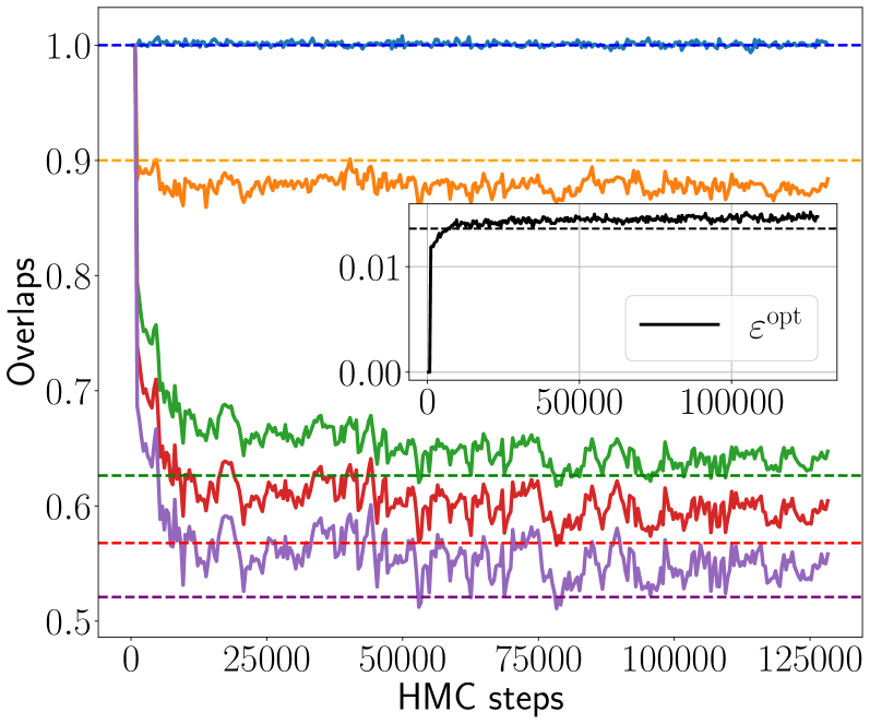
The image depicts a multi-line graph tracking the performance of five distinct data series (colored lines) over Hamiltonian Monte Carlo (HMC) steps. A secondary inset graph highlights the behavior of a specific metric, ε_opt, over a subset of the HMC steps. The primary graph emphasizes variability and convergence patterns, while the inset focuses on a critical threshold.
---
### Components/Axes
- **X-axis (HMC steps)**: Ranges from 0 to 125,000 in increments of 25,000.
- **Y-axis (Overlaps)**: Scaled from 0.5 to 1.0 in increments of 0.1.
- **Legend**: Positioned on the right, mapping colors to data series:
- Blue: "Series 1" (topmost line)
- Orange: "Series 2"
- Green: "Series 3"
- Red: "Series 4"
- Purple: "Series 5" (bottommost line)
- **Inset Graph**:
- X-axis: 0 to 100,000 HMC steps.
- Y-axis: ε_opt values from 0.00 to 0.01.
- Title: "ε_opt" (black line).
---
### Detailed Analysis
1. **Blue Line (Series 1)**:
- Remains nearly flat at **~1.0** throughout all HMC steps.
- Minor fluctuations (±0.005) observed but no significant deviation.
2. **Orange Line (Series 2)**:
- Starts at **~0.95**, drops sharply to **~0.9** by 25,000 steps.
- Fluctuates between **0.88–0.92** thereafter.
3. **Green Line (Series 3)**:
- Begins at **~0.7**, dips to **~0.65** by 25,000 steps.
- Stabilizes around **0.65–0.68** with minor oscillations.
4. **Red Line (Series 4)**:
- Starts at **~0.6**, fluctuates between **0.55–0.62** for the first 50,000 steps.
- Settles near **0.58–0.61** afterward.
5. **Purple Line (Series 5)**:
- Begins at **~0.5**, dips to **~0.45** by 25,000 steps.
- Stabilizes around **0.48–0.52** with persistent noise.
6. **ε_opt (Inset)**:
- Sharp rise from **0.00 to 0.01** between 0 and 50,000 steps.
- Plateaus at **~0.01** for the remaining steps.
---
### Key Observations
- **Convergence Patterns**:
- Series 1 (blue) shows no degradation, suggesting optimal or stable performance.
- Series 2 (orange) and Series 3 (green) exhibit early convergence but with higher variability.
- Series 4 (red) and Series 5 (purple) demonstrate slower stabilization, with Series 5 being the most unstable.
- **ε_opt Behavior**:
- The sharp increase in ε_opt by 50,000 steps implies a critical threshold or phase transition in the system being modeled.
- **Noise and Variability**:
- All lines exhibit noise, but Series 5 (purple) has the highest relative variability (±0.02).
---
### Interpretation
The graph likely represents the performance of different algorithms, configurations, or parameter sets in an HMC-based optimization or sampling task.
- **Series 1 (blue)** may represent a baseline or ideal scenario, maintaining maximum overlap (1.0) consistently.
- The **ε_opt** metric’s rapid rise suggests a critical point where the system stabilizes or transitions to a new regime, possibly indicating convergence or a phase shift in the underlying model.
- The variability in lower-performing series (e.g., purple) could reflect sensitivity to initialization conditions or parameter choices.
The inset emphasizes the importance of ε_opt as a diagnostic tool, highlighting its role in identifying convergence behavior early in the HMC process.