## Histogram Chart: Model Confidence Distribution by Answer Correctness
### Overview
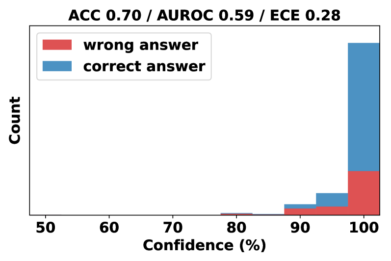
This image displays a stacked histogram chart analyzing the relationship between a model's confidence scores and the correctness of its answers. The chart includes performance metrics at the top and visualizes the distribution of confidence for correct versus incorrect predictions.
### Components/Axes
* **Title/Header:** Located at the top center. Text: "ACC 0.70 / AUROC 0.59 / ECE 0.28".
* **Legend:** Positioned in the top-left corner of the plot area. It contains two entries:
* A red rectangle labeled "wrong answer".
* A blue rectangle labeled "correct answer".
* **Y-Axis:** Vertical axis on the left. Label: "Count". The axis has no numerical markers, indicating it represents absolute frequency.
* **X-Axis:** Horizontal axis at the bottom. Label: "Confidence (%)". It has numerical markers at 50, 60, 70, 80, 90, and 100.
* **Plot Area:** Contains stacked bars representing the count of predictions within specific confidence bins. The bars are stacked with the "wrong answer" (red) segment at the bottom and the "correct answer" (blue) segment on top.
### Detailed Analysis
The histogram bins confidence scores into ranges, likely of width 5% or 10%, centered on the marked percentages. The visual distribution is as follows:
* **Confidence 50-70%:** No visible bars. The count of predictions in this low-confidence range is zero or negligible.
* **Confidence ~75-80%:** A very small, barely visible bar appears. It is almost entirely red ("wrong answer"), with a minuscule blue portion on top.
* **Confidence ~80-85%:** A small bar is present. The red ("wrong") segment constitutes the majority, with a smaller blue ("correct") segment stacked above it.
* **Confidence ~85-90%:** A slightly larger bar than the previous bin. The red segment is still significant, but the blue segment has grown proportionally.
* **Confidence ~90-95%:** A moderately sized bar. The blue ("correct") segment is now clearly larger than the red ("wrong") segment.
* **Confidence ~95-100%:** The largest bar by a substantial margin, located at the far right of the chart. The blue ("correct") segment is dominant, making up the vast majority of the bar's height. The red ("wrong") segment at the base is still present and appears to be the largest absolute count of wrong answers across all bins.
**Trend Verification:** The visual trend shows that as confidence increases from 75% to 100%, the total count of predictions increases dramatically. Furthermore, the proportion of correct answers (blue) within each bin increases with confidence, becoming overwhelmingly dominant in the highest confidence bin.
### Key Observations
1. **Extreme Confidence Bias:** The model's predictions are heavily skewed towards very high confidence (95-100%). There are virtually no predictions with confidence below 75%.
2. **High-Confidence Errors:** Despite the high overall accuracy (ACC=0.70), a notable number of incorrect predictions ("wrong answer") occur at the highest confidence level (95-100%). This is the largest cluster of errors.
3. **Calibration Issue:** The Expected Calibration Error (ECE) of 0.28 is relatively high, suggesting the model's confidence scores are not well-calibrated with its actual accuracy. The chart visually confirms this: at 100% confidence, the model is not 100% accurate.
4. **Poor Discriminative Power:** The Area Under the ROC Curve (AUROC) of 0.59 is only slightly better than random guessing (0.50). This indicates the model's confidence score is a weak indicator for distinguishing between correct and incorrect answers, which aligns with the visual overlap of red and blue segments across the high-confidence bins.
### Interpretation
This chart diagnoses a model that is **overconfident and poorly calibrated**. While it achieves 70% accuracy, it assigns extremely high confidence to the vast majority of its predictions, including many of its errors.
The key insight is the disconnect between confidence and correctness. The model's highest confidence bin (95-100%) contains both its most frequent correct predictions *and* its most frequent incorrect predictions. This means a high confidence score from this model is not a reliable signal of trustworthiness. The low AUROC further confirms that the confidence score fails to effectively rank correct predictions above incorrect ones.
From a Peircean investigative perspective, the chart reveals a "belief" (high confidence) that is not sufficiently grounded in "fact" (correctness). The anomaly is the concentration of errors at the peak of confidence, suggesting the model may be exploiting spurious patterns or suffering from overfitting, leading to assured but wrong conclusions. For practical use, this model's confidence outputs would require significant recalibration (e.g., via temperature scaling) before they could be used for risk-aware decision-making.