## Time-Series Plot: Multi-Axis Signal During Labeled Physical Activities
### Overview
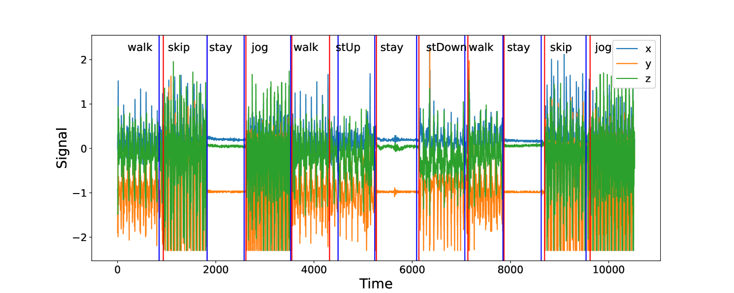
The image is a time-series plot displaying three signal channels (x, y, z) over a continuous time period. The plot is segmented by vertical lines into distinct phases, each labeled with a specific physical activity. The data appears to represent sensor readings (likely from an accelerometer or gyroscope) during a sequence of movements.
### Components/Axes
* **Chart Type:** Multi-line time-series plot.
* **X-Axis:** Labeled **"Time"**. The scale runs from 0 to slightly beyond 10,000 units (likely samples or milliseconds). Major tick marks are at 0, 2000, 4000, 6000, 8000, and 10000.
* **Y-Axis:** Labeled **"Signal"**. The scale ranges from approximately -2.5 to +2.5, with major tick marks at -2, -1, 0, 1, and 2.
* **Legend:** Located in the **top-right corner**. It defines three data series:
* **x** (blue line)
* **y** (orange line)
* **z** (green line)
* **Activity Segments:** The plot is divided by **vertical red and blue lines**. Each segment is labeled at the top with an activity name. The sequence from left to right is:
1. `walk`
2. `skip`
3. `stay`
4. `jog`
5. `walk`
6. `stUp` (likely "stand up")
7. `stay`
8. `stDown` (likely "sit down" or "stand down")
9. `walk`
10. `stay`
11. `skip`
12. `jog`
### Detailed Analysis
**Signal Behavior by Activity Segment:**
1. **`walk` (Segments 1, 5, 9):**
* **Trend:** All three signals show regular, moderate-amplitude oscillations.
* **Data Points:** The blue (x) and green (z) signals oscillate roughly between -1 and +1. The orange (y) signal oscillates with a negative bias, primarily between -2 and 0.
2. **`skip` (Segments 2, 11):**
* **Trend:** Signals exhibit high-amplitude, high-frequency oscillations, more intense than walking.
* **Data Points:** The blue (x) and green (z) signals show peaks reaching near +2 and troughs near -2. The orange (y) signal shows deep negative spikes, consistently reaching or exceeding -2.
3. **`stay` (Segments 3, 7, 10):**
* **Trend:** Signals are largely static with minimal noise.
* **Data Points:** The blue (x) and green (z) signals hover near 0 (approximately 0.1 to 0.2). The orange (y) signal is stable at a distinct negative offset, approximately -1.0.
4. **`jog` (Segments 4, 12):**
* **Trend:** Very high-frequency, high-amplitude oscillations, appearing denser than `skip`.
* **Data Points:** Similar range to `skip`, with signals frequently spanning from -2 to +2. The pattern is more continuous and less burst-like than `skip`.
5. **`stUp` (Segment 6):**
* **Trend:** A brief, distinct pattern. The blue (x) signal shows a sharp positive spike followed by a return to oscillatory behavior. The orange (y) and green (z) signals show a corresponding dip and recovery.
* **Data Points:** The blue spike reaches approximately +1.5. The orange signal dips to near -1.5.
6. **`stDown` (Segment 8):**
* **Trend:** Similar to `stUp` but with an inverted initial movement. The blue (x) signal shows a sharp negative spike.
* **Data Points:** The blue spike reaches approximately -1.5. The orange signal shows a positive spike to near +0.5.
### Key Observations
* **Signal Differentiation:** The three axes (x, y, z) show clearly different baselines and amplitudes during static (`stay`) periods, suggesting the sensor's orientation is fixed relative to gravity. The y-axis (orange) has a consistent negative offset during rest.
* **Activity Signatures:** Each activity produces a unique "signature" in the signal's amplitude, frequency, and inter-axis correlation. `stay` is flat, `walk` is rhythmic, `skip` and `jog` are vigorous, and `stUp`/`stDown` are transient events.
* **Temporal Sequence:** The activities are performed in a specific, non-random order, suggesting a structured data collection protocol.
* **Visual Clarity:** The use of distinct colors (blue, orange, green) and clear vertical segmentation makes the different phases and signals easy to distinguish.
### Interpretation
This plot visualizes **inertial measurement unit (IMU) data** from a sensor worn on a person's body (e.g., on the waist or chest) during a controlled sequence of movements. The data is likely used for **Human Activity Recognition (HAR)**.
* **What the data demonstrates:** It shows how raw accelerometer/gyroscope signals can be used to classify physical activities. The distinct patterns for each label (`walk`, `skip`, etc.) are the features a machine learning model would learn to recognize.
* **Relationship between elements:** The vertical lines and labels provide the "ground truth" annotation for the time-series data. The three signal lines (x, y, z) represent the multi-dimensional nature of movement. The `stay` segments act as a baseline, showing the sensor's static orientation.
* **Notable patterns/anomalies:**
* The `stUp` and `stDown` segments are very short, indicating quick transitional movements.
* The consistency of the `stay` signal across three separate instances (segments 3, 7, 10) confirms the reliability of the baseline.
* The `y` (orange) signal's strong negative bias during all activities is a key characteristic, likely indicating the sensor's primary axis is aligned with the direction of gravity when the subject is upright.
**Language:** All text in the image is in English.