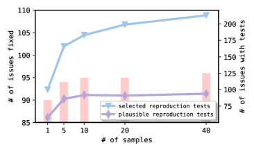
# Technical Document Analysis of Chart
## Chart Type
Line chart with dual y-axes and a bar chart overlay.
## Axes Labels
- **X-axis**: `# of samples` (categories: 1, 5, 10, 20, 40)
- **Left Y-axis**: `# of issues fixed` (range: 85–110)
- **Right Y-axis**: `# of issues with tests` (range: 75–200)
## Legend
- **Blue line**: `selected reproduction tests`
- **Purple line**: `plausible reproduction tests`
## Data Points
### Selected Reproduction Tests (Blue Line)
- **# of issues fixed**:
- 1 sample: 92
- 5 samples: 102
- 10 samples: 105
- 20 samples: 107
- 40 samples: 108
- **# of issues with tests**:
- 1 sample: 125
- 5 samples: 150
- 10 samples: 175
- 20 samples: 175
- 40 samples: 200
### Plausible Reproduction Tests (Purple Line)
- **# of issues fixed**:
- 1 sample: 86
- 5 samples: 90
- 10 samples: 91
- 20 samples: 91
- 40 samples: 91
- **# of issues with tests**:
- 1 sample: 75
- 5 samples: 100
- 10 samples: 125
- 20 samples: 125
- 40 samples: 125
## Key Trends
1. **Selected Reproduction Tests**:
- Steady increase in issues fixed (92 → 108) as samples grow from 1 to 40.
- Issues with tests rise sharply (125 → 200), peaking at 40 samples.
2. **Plausible Reproduction Tests**:
- Minimal growth in issues fixed (86 → 91), plateauing after 10 samples.
- Issues with tests increase moderately (75 → 125), stabilizing at 20+ samples.
## Observations
- The blue line (`selected`) consistently outperforms the purple line (`plausible`) in both metrics.
- The right y-axis (`# of issues with tests`) shows a direct correlation with the number of samples for selected tests, while plausible tests exhibit a slower growth rate.