## Heatmap: Global Wind Speed Ratio
### Overview
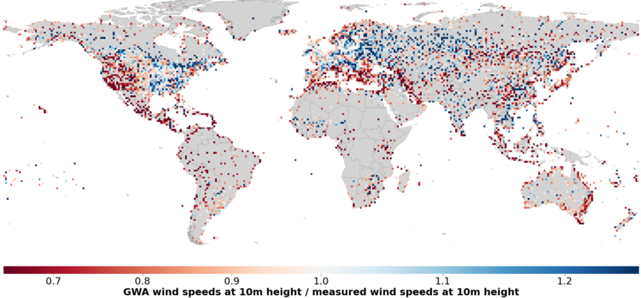
This image presents a global heatmap illustrating the ratio of Global Wind Atlas (GWA) wind speeds at 10m height to measured wind speeds at 10m height. The map uses a color gradient to represent the ratio, with red indicating lower ratios (GWA underestimates wind speed) and blue indicating higher ratios (GWA overestimates wind speed). Grey areas represent regions with no data.
### Components/Axes
* **Map Projection:** Equirectangular projection.
* **Color Scale:** A continuous color scale ranging from dark red to dark blue.
* **Color Scale Labels:**
* 0.7 (Dark Red)
* 0.8
* 0.9
* 1.0
* 1.1
* 1.2 (Dark Blue)
* **X-Axis:** Longitude (implied by map projection)
* **Y-Axis:** Latitude (implied by map projection)
* **Title:** "GWA wind speeds at 10m height / measured wind speeds at 10m height"
* **Geographic Regions:** Continents and major landmasses are visible.
### Detailed Analysis
The heatmap shows a global distribution of the GWA/measured wind speed ratio.
* **South America:** Predominantly red, indicating that GWA generally underestimates wind speeds in this region. The ratio appears to be consistently below 1.0, with many areas around 0.7-0.8.
* **North America:** A mix of red and blue, with a tendency towards red in the central US and Canada. The western US shows more blue, suggesting GWA overestimates wind speeds there. Ratios range from approximately 0.7 to 1.2.
* **Europe:** Predominantly blue, indicating that GWA generally overestimates wind speeds in this region. The ratio is often above 1.0, with some areas reaching 1.2.
* **Africa:** A mix of red and blue, with a larger proportion of red, particularly in the Sahara Desert and surrounding areas. Ratios range from approximately 0.7 to 1.1.
* **Asia:** A complex pattern with both red and blue areas. Central Asia and parts of China show red, while Southeast Asia and parts of India show blue. Ratios range from approximately 0.7 to 1.2.
* **Australia:** Predominantly red, indicating that GWA generally underestimates wind speeds in this region. The ratio appears to be consistently below 1.0, with many areas around 0.7-0.9.
* **Oceanic Regions:** Scattered data points are visible in oceanic regions, showing a mix of red and blue.
The density of data points varies significantly across the globe, with higher densities in populated areas and regions with more wind energy infrastructure.
### Key Observations
* GWA tends to underestimate wind speeds in South America, Australia, and parts of Africa and Asia.
* GWA tends to overestimate wind speeds in Europe and parts of North America and Asia.
* The accuracy of GWA varies significantly by region.
* There is a clear spatial pattern in the GWA/measured wind speed ratio.
* Data is sparse in many oceanic regions and remote land areas.
### Interpretation
This heatmap provides a valuable assessment of the accuracy of the Global Wind Atlas (GWA) wind speed data. The data suggests that GWA is not universally accurate and that its performance varies significantly by region. The systematic underestimation of wind speeds in some regions (e.g., South America, Australia) could lead to underestimation of wind energy potential, while the overestimation in other regions (e.g., Europe) could lead to overestimation.
The observed spatial patterns may be related to factors such as terrain complexity, atmospheric conditions, and the availability of high-quality measurement data. The sparse data in oceanic regions and remote land areas highlights the need for more ground-based measurements to improve the accuracy of wind resource assessments.
The ratio of 1.0 represents perfect agreement between GWA and measured wind speeds. Deviations from 1.0 indicate discrepancies, with values less than 1.0 suggesting GWA underestimates wind speeds and values greater than 1.0 suggesting GWA overestimates wind speeds. The magnitude of the deviation indicates the degree of error. The color scale allows for a quick visual assessment of these discrepancies across the globe.