## Geographic Scatter Plot: Global Wind Speed Ratio (GWA Modeled vs. Measured)
### Overview
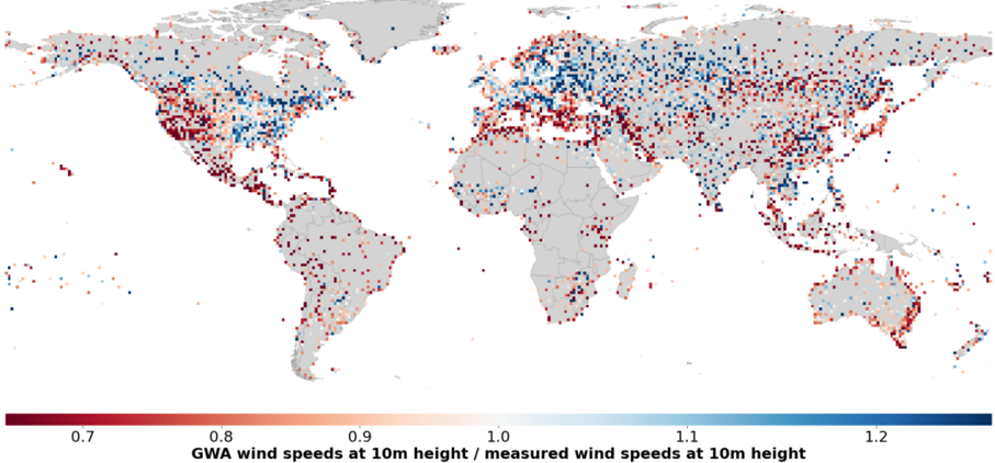
The image is a global map displaying the spatial distribution of the ratio between wind speeds modeled by the Global Wind Atlas (GWA) and actual measured wind speeds, both at a height of 10 meters above ground. Data is presented as a dense scatter of colored points across the world's landmasses. The visualization aims to show where the GWA model underestimates or overestimates wind speeds compared to ground measurements.
### Components/Axes
* **Main Chart Area:** A world map using a standard projection (likely Mercator or similar). Continents are filled with a uniform light gray color (`#d3d3d3` approx.), providing a neutral background for the data points. National borders are faintly visible as thin gray lines.
* **Data Points:** Thousands of small, circular dots are plotted across the land areas. Each dot represents a location where a comparison between GWA and measured wind speed data exists.
* **Color Scale / Legend:** A horizontal color bar is positioned at the bottom center of the image. It serves as the key for interpreting the data points.
* **Title/Label:** "GWA wind speeds at 10m height / measured wind speeds at 10m height" (This defines the plotted ratio: `Modeled / Measured`).
* **Scale:** A continuous gradient from dark red to dark blue.
* **Numerical Markers:** The scale is marked at intervals: `0.7`, `0.8`, `0.9`, `1.0`, `1.1`, `1.2`.
* **Color Meaning:**
* **Red tones (0.7 to <1.0):** Indicate locations where the GWA modeled wind speed is **lower** than the measured speed (underestimation).
* **White/Neutral (≈1.0):** Indicates locations where the GWA modeled and measured wind speeds are approximately equal.
* **Blue tones (>1.0 to 1.2):** Indicate locations where the GWA modeled wind speed is **higher** than the measured speed (overestimation).
### Detailed Analysis
* **Data Density & Distribution:** The data points are not uniformly distributed. High densities are observed in:
* North America (particularly the United States and southern Canada).
* Europe.
* East Asia (China, Japan, Korea).
* Parts of South America (coastal Brazil, Argentina).
* Australia (especially coastal regions).
* Sparse or no data points are visible in major desert regions (Sahara, Arabian Desert, central Australia), dense tropical rainforests (Amazon Basin, Congo Basin), and high-latitude polar regions.
* **Spatial Trends in the Ratio (Color):**
* **Coastal & Mountainous Regions:** A strong prevalence of **red and dark red dots** is visible along many coastlines worldwide (e.g., Eastern US seaboard, Western Europe, Chilean coast, Southeast Asian coasts). This suggests the GWA model frequently **underestimates** wind speeds in these complex terrains near water bodies.
* **Inland & Continental interiors:** A higher concentration of **blue dots** is observed in large inland areas, such as:
* Central Asia (Kazakhstan, Mongolia).
* The interior of North America (Great Plains region).
* Parts of inland Australia and Africa.
* This pattern suggests the GWA model tends to **overestimate** wind speeds in these flatter, more continental interiors.
* **Mixed Zones:** Many regions, like central Europe and parts of China, show a heterogeneous mix of red, white, and blue dots, indicating high local variability in model performance.
### Key Observations
1. **Systematic Geographic Bias:** The model does not have a uniform global bias. Its performance (underestimation vs. overestimation) is strongly correlated with geographic location and, by implication, terrain type.
2. **Coastal Underestimation:** The most consistent and widespread pattern is the underestimation of wind speeds (red dots) along coastlines and in regions with complex topography (e.g., the Alps, the Rockies).
3. **Inland Overestimation:** Conversely, overestimation (blue dots) is a common feature in large, relatively flat continental interiors.
4. **Data Availability Gap:** The absence of data points in certain biomes highlights gaps in the ground measurement network used for this comparison.
### Interpretation
This map provides a critical validation of the Global Wind Atlas model, revealing its spatially dependent accuracy. The data suggests that the GWA model's underlying physics or input data may not fully capture the local acceleration of wind flow near coastlines or in complex terrain, leading to systematic underestimation. Conversely, it may over-simplify atmospheric processes in continental interiors, leading to overestimation.
For stakeholders in wind energy, this is crucial information. A site in a coastal region might have a higher *actual* wind resource than the GWA model predicts, while a site in a central plain might have a slightly lower resource than predicted. The map doesn't provide absolute error values but clearly demonstrates that model bias is not random but geographically structured. This underscores the necessity of using local measurements to calibrate and correct model outputs for site-specific wind resource assessment. The investigation here is Peircean: the pattern of red coasts and blue interiors is the *sign* that points to the *fact* of a terrain-dependent model bias, which in turn leads to the *interpretation* that model inputs or parameterizations require regional tuning.