## Line Chart: Estimate of tr(Hθ) vs. Number of Samples
### Overview
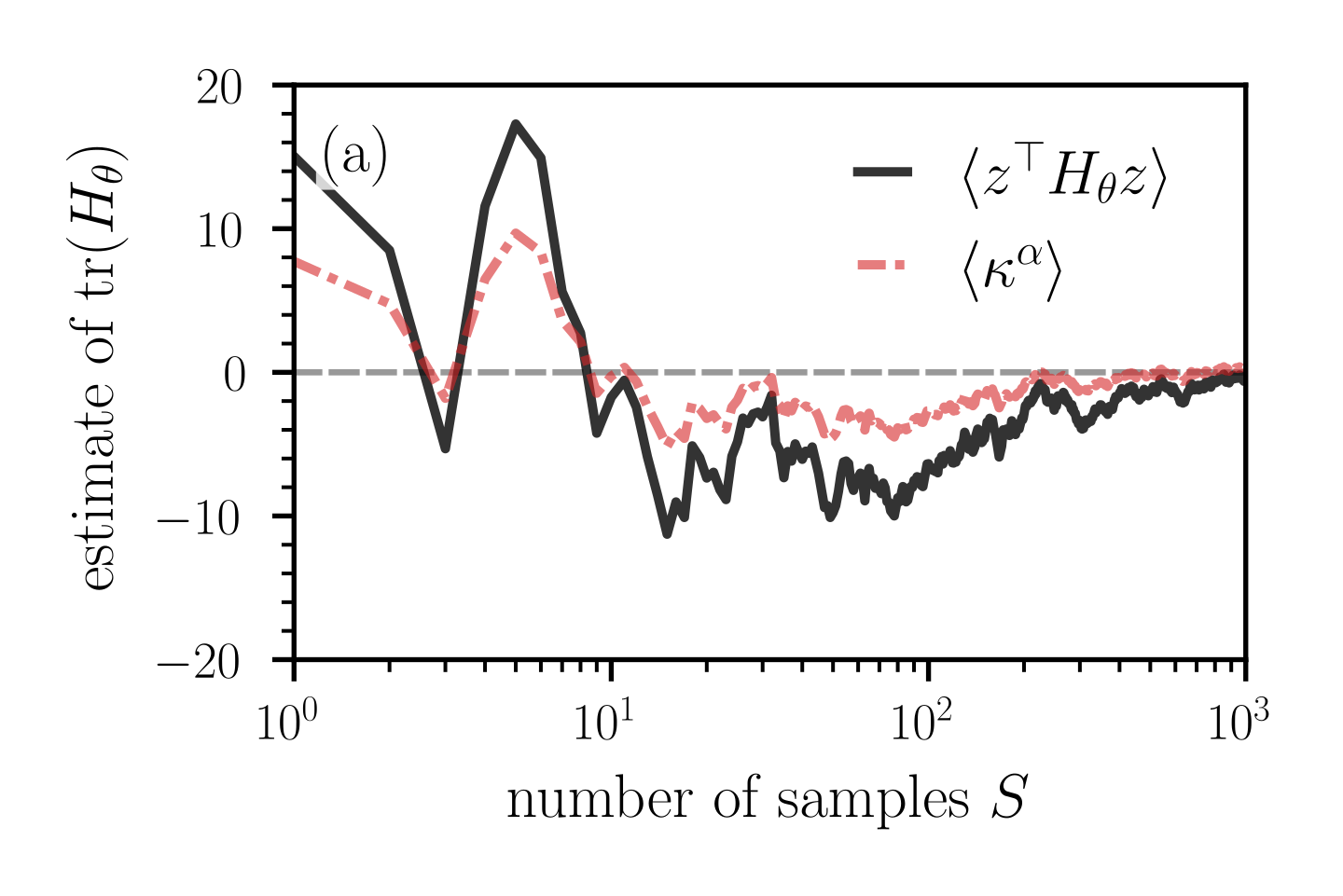
The image is a line chart comparing two data series: `<z^T Hθz>` (black solid line) and `<κ^α>` (red dashed line), plotted against the number of samples S on a logarithmic scale. The y-axis represents the estimate of tr(Hθ). Both series converge towards zero as the number of samples increases.
### Components/Axes
* **Title:** There is no overall title for the chart.
* **X-axis:**
* Label: "number of samples S"
* Scale: Logarithmic, ranging from 10^0 (1) to 10^3 (1000).
* Tick marks are present at 10^0, 10^1, 10^2, and 10^3.
* **Y-axis:**
* Label: "estimate of tr(Hθ)"
* Scale: Linear, ranging from -20 to 20.
* Tick marks are present at -20, -10, 0, 10, and 20.
* **Legend:** Located in the top-right corner.
* Black solid line: `<z^T Hθz>`
* Red dashed line: `<κ^α>`
* **Horizontal Line:** A dashed gray line is present at y = 0.
* **(a):** The letter (a) is present in the top-left corner of the chart.
### Detailed Analysis
* **`<z^T Hθz>` (Black Solid Line):**
* Trend: Starts at approximately 14 at S=1, fluctuates significantly, and converges towards 0 as S increases.
* Data Points:
* S = 1: approximately 14
* S = 5: approximately -6
* S = 8: approximately 18
* S = 10: approximately 10
* S = 20: approximately -5
* S = 50: approximately -8
* S = 100: approximately -5
* S = 1000: approximately 0
* **`<κ^α>` (Red Dashed Line):**
* Trend: Starts at approximately 8 at S=1, fluctuates, and converges towards 0 as S increases.
* Data Points:
* S = 1: approximately 8
* S = 5: approximately 10
* S = 8: approximately 0
* S = 10: approximately -2
* S = 20: approximately -5
* S = 50: approximately -3
* S = 100: approximately 0
* S = 1000: approximately 0
### Key Observations
* Both data series exhibit significant fluctuations for small values of S (number of samples).
* As the number of samples increases, both series converge towards 0.
* The black line `<z^T Hθz>` shows more extreme fluctuations than the red line `<κ^α>` for smaller values of S.
* The dashed gray line at y=0 represents a reference point, indicating the convergence value for both series.
### Interpretation
The chart illustrates how the estimates of tr(Hθ) for two different methods, represented by `<z^T Hθz>` and `<κ^α>`, change with an increasing number of samples. The convergence of both series towards zero suggests that both methods provide increasingly accurate estimates as the sample size grows. The fluctuations at smaller sample sizes indicate that the estimates are less stable and more sensitive to the specific samples used. The black line's greater fluctuations suggest that the corresponding method may be more sensitive to sample variations than the method represented by the red line, especially when the number of samples is limited. The logarithmic scale on the x-axis emphasizes the behavior of the estimates at smaller sample sizes.