# Technical Document Extraction: ROUGE-L Score Distribution Analysis
## 1. Title and Main Components
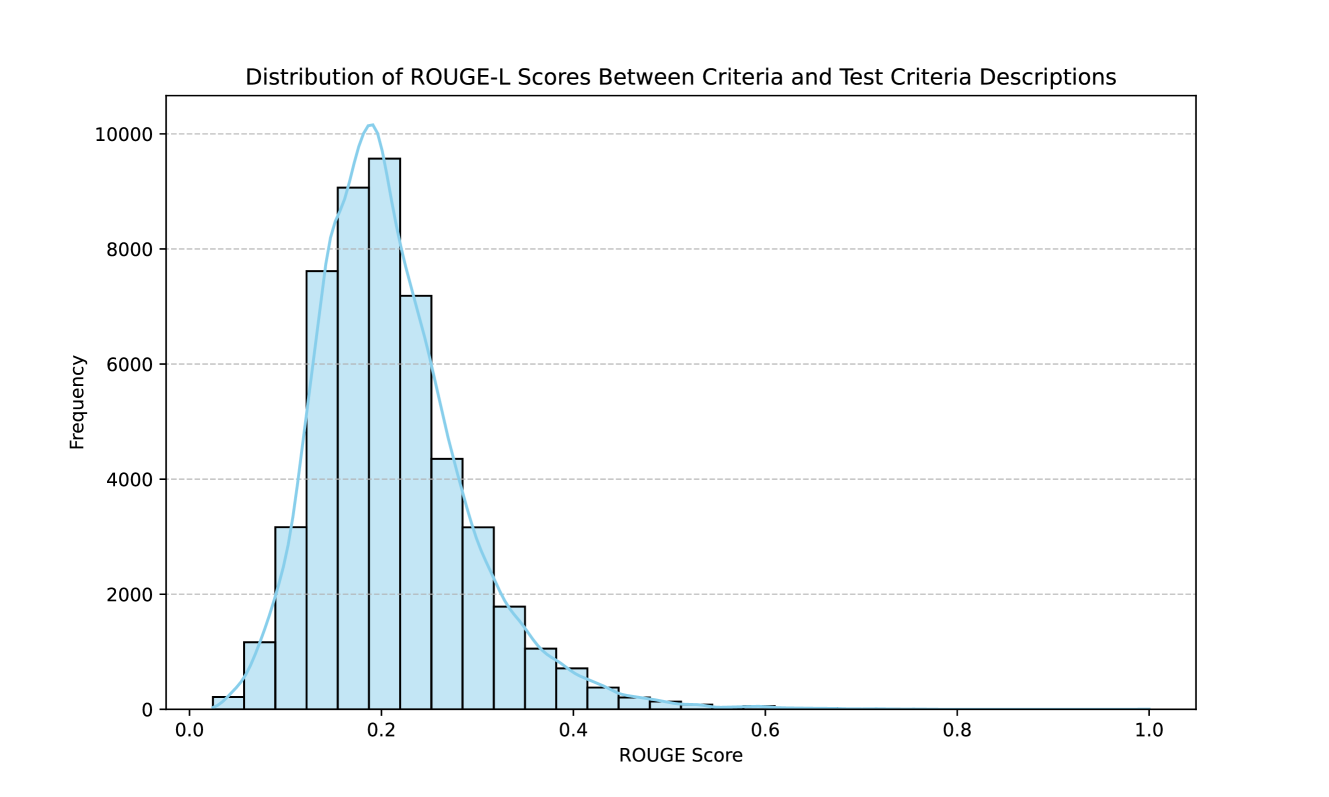
**Title**:
"Distribution of ROUGE-L Scores Between Criteria and Test Criteria Descriptions"
**Key Components**:
- Histogram with overlaid normal distribution curve
- X-axis: ROUGE Score (0.0–1.0)
- Y-axis: Frequency (0–10,000)
- Color scheme: Blue bars and blue line (no explicit legend present)
---
## 2. Axis Labels and Markers
### X-axis (ROUGE Score)
- **Range**: 0.0 to 1.0
- **Markers**: 0.0, 0.2, 0.4, 0.6, 0.8, 1.0
- **Units**: Dimensionless (ROUGE-L score)
### Y-axis (Frequency)
- **Range**: 0 to 10,000
- **Markers**: 0, 2000, 4000, 6000, 8000, 10,000
- **Units**: Count (frequency of occurrences)
---
## 3. Data Representation
### Histogram Bars
- **Color**: Blue
- **Distribution**:
- **Peak**: ~0.2 (highest frequency near 10,000)
- **Symmetry**: Decreases symmetrically toward 0.0 and 1.0
- **Trend**:
- Left tail (0.0–0.2): Gradual increase to peak
- Right tail (0.2–1.0): Steeper decline after peak
### Overlaid Normal Distribution Curve
- **Color**: Blue (matches histogram bars)
- **Purpose**: Models the data distribution
- **Key Observation**:
- Matches histogram shape closely, confirming Gaussian-like distribution
---
## 4. Spatial Grounding and Legend Analysis
- **Legend**:
- **Placement**: Not explicitly visible in the image
- **Color Matching**:
- Blue bars and line correspond to the same dataset (no sub-categories)
- **Conclusion**: No distinct legend required due to single data series
---
## 5. Trend Verification
- **Primary Trend**:
- Frequency increases to a peak at ~0.2, then decreases
- Symmetrical decay on both sides of the peak
- **Secondary Trend**:
- Overlaid curve validates the unimodal, bell-shaped distribution
---
## 6. Missing Elements
- **Data Table**: Not present (data represented visually via histogram)
- **Additional Text**: No embedded annotations or sub-titles
---
## 7. Language and Transcription
- **Language**: English (no non-English text detected)
- **Transcription Accuracy**: All labels and axis titles transcribed verbatim
---
## 8. Summary of Key Data Points
| ROUGE Score Range | Approximate Frequency |
|-------------------|-----------------------|
| 0.0–0.1 | <2000 |
| 0.1–0.2 | 3,000–10,000 |
| 0.2–0.3 | 7,000–9,000 |
| 0.3–0.4 | 4,000–5,000 |
| 0.4–0.5 | 1,000–2,000 |
| 0.5–1.0 | <500 |
---
## 9. Conclusion
The histogram and overlaid curve confirm a unimodal distribution of ROUGE-L scores, with the majority of values clustering around 0.2. The absence of a legend simplifies interpretation, as only one data series is represented. The symmetric decay of frequencies suggests a normal-like distribution, though slight asymmetry in the right tail may indicate minor skewness.