## Batch Size Scan Comparison: 3M vs. 85M Parameter Models
### Overview
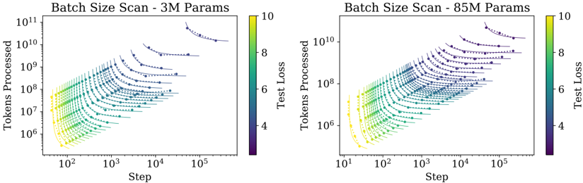
The image contains two side-by-side scatter plots comparing the training dynamics of two neural language models of different sizes (3 million and 85 million parameters). Both plots visualize the relationship between training steps, total tokens processed, and the resulting test loss, with data points colored by loss value. The plots demonstrate how batch size affects the efficiency and trajectory of model training.
### Components/Axes
* **Titles:**
* Left Plot: "Batch Size Scan - 3M Params"
* Right Plot: "Batch Size Scan - 85M Params"
* **Axes (Both Plots):**
* **X-axis:** "Step" (Logarithmic scale). Represents the number of training optimization steps.
* **Y-axis:** "Tokens Processed" (Logarithmic scale). Represents the cumulative number of training tokens seen by the model.
* **Color Bar/Legend (Both Plots):**
* Located to the right of each plot.
* Label: "Test Loss"
* Scale: Linear, ranging from 4 (dark purple) to 10 (bright yellow).
* This color mapping is applied to all data points within the corresponding plot.
* **Data Series:**
* Each plot contains multiple series of data points, where each series corresponds to a specific batch size used during a training run.
* Points within a series are connected by a faint, dark dashed line, showing the progression of a single training run over time (steps/tokens).
* The series are not explicitly labeled with their batch size values in the image.
### Detailed Analysis
**Left Plot (3M Params):**
* **X-axis Range:** Approximately 10^2 (100) to 10^5 (100,000) steps.
* **Y-axis Range:** Approximately 10^6 to 10^11 tokens processed.
* **Data Distribution:** The plot shows a family of curves fanning out from the bottom-left to the top-right.
* **Trend Verification:** Each curve (batch size series) slopes upward and to the right, indicating that as training steps increase, the total tokens processed also increase. The slope is steeper for smaller batch sizes (lower curves) and shallower for larger batch sizes (higher curves).
* **Color/Loss Trend:** For any given curve, the color transitions from yellow/green (high loss ~8-10) at the start (bottom-left) to blue/purple (low loss ~4-6) at the end (top-right). This shows test loss decreasing as training progresses.
* **Batch Size Effect:** Curves representing larger batch sizes are positioned higher on the Y-axis (processing more tokens per step) but extend further to the right on the X-axis (requiring more steps to reach similar loss levels). The highest curve starts near 10^10 tokens/step and ends past 10^5 steps.
**Right Plot (85M Params):**
* **X-axis Range:** Approximately 10^1 (10) to 10^5 (100,000) steps.
* **Y-axis Range:** Approximately 10^6 to 10^10 tokens processed.
* **Data Distribution:** Shows a similar fan-shaped pattern of curves as the left plot, but the entire distribution is shifted.
* **Trend Verification:** Curves also slope upward and to the right. The overall shape is more compressed vertically compared to the 3M plot.
* **Color/Loss Trend:** The same loss-to-color mapping applies. Curves start yellow/green and end blue/purple.
* **Batch Size Effect:** The relationship between batch size, steps, and tokens is analogous to the 3M model. However, the maximum "Tokens Processed" value is lower (peaking near 10^10 vs. 10^11 for the 3M model), and the curves appear to converge to slightly higher final loss values (more blue, less deep purple) at equivalent step counts.
### Key Observations
1. **Consistent Scaling Law:** Both model sizes exhibit the same fundamental trade-off: increasing batch size reduces the number of steps needed for a given level of performance but increases the total data (tokens) processed per step.
2. **Parameter Count Impact:** The 85M parameter model operates in a different regime. Its curves are shifted down and to the left compared to the 3M model, indicating it processes fewer tokens per step for a given batch size configuration and may require more steps to achieve comparable loss.
3. **Loss Convergence:** The final test loss (color at the end of each curve) appears slightly higher for the 85M model across similar batch size trajectories, suggesting it is a more challenging model to train to the same loss level.
4. **Data Density:** The plots are densely populated with data points, indicating a comprehensive scan over many batch size values for each model size.
### Interpretation
This visualization is a classic empirical demonstration of **scaling laws in neural network training**, specifically focusing on the **batch size dimension**. The data suggests that:
* **Efficiency vs. Speed Trade-off:** There is no single "best" batch size. Smaller batches (lower curves) offer faster convergence in terms of training steps but are less computationally efficient per step. Larger batches (higher curves) are more efficient per step (processing more data in parallel) but require more total steps to reach the same loss, potentially due to a need for more frequent updates or different optimization dynamics.
* **Model Size Matters:** The relationship between batch size, steps, and tokens is not invariant to model scale. The 85M model's different positioning implies that optimal batch size strategies may need to be re-calibrated when scaling up model parameters. The shift suggests larger models might be less sample-efficient (require more tokens) at equivalent step counts under these training conditions.
* **Underlying Principle:** The fan-shaped curves are a visual signature of the **compute-optimal frontier**. For a fixed compute budget (which correlates with "Tokens Processed"), one can choose a point on one of these curves by selecting a specific batch size and training duration (steps). The plot helps identify which combination yields the lowest loss for a given amount of computation.
**In essence, the image provides a technical map for navigating the hyperparameter space of batch size and training duration, revealing how this critical choice interacts with model size to determine training efficiency and final model performance.**