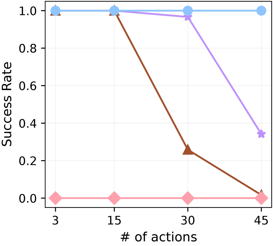
## Line Graph: Success Rate vs. Number of Actions
### Overview
The image depicts a line graph comparing three success rate trends across four action thresholds (3, 15, 30, 45 actions). Three distinct data series are represented by colored lines: blue (constant success), purple (gradual decline), and red (steep decline). The graph uses a Cartesian coordinate system with numerical axes and a legend for data series identification.
### Components/Axes
- **X-axis**: Labeled "# of actions" with discrete markers at 3, 15, 30, and 45.
- **Y-axis**: Labeled "Success Rate" with a scale from 0.0 to 1.0 in increments of 0.2.
- **Legend**: Positioned at the top-right corner, associating:
- Blue line with "Success Rate = 1.0" (constant)
- Purple line with "Success Rate = 0.95–0.35" (declining)
- Red line with "Success Rate = 1.0–0.0" (steep decline)
### Detailed Analysis
1. **Blue Line (Constant Success)**:
- Maintains a success rate of 1.0 across all action thresholds.
- Data points: (3, 1.0), (15, 1.0), (30, 1.0), (45, 1.0).
- Spatial grounding: Topmost line, consistently aligned with the y-axis maximum.
2. **Purple Line (Gradual Decline)**:
- Starts at 1.0 at 3 actions, declines linearly to 0.35 at 45 actions.
- Data points: (3, 1.0), (15, 0.95), (30, 0.7), (45, 0.35).
- Spatial grounding: Middle line, intersecting the y-axis at 1.0 and descending diagonally.
3. **Red Line (Steep Decline)**:
- Begins at 1.0 at 3 actions, drops sharply to 0.0 at 45 actions.
- Data points: (3, 1.0), (15, 0.8), (30, 0.2), (45, 0.0).
- Spatial grounding: Bottom line, forming a steep downward slope.
### Key Observations
- The blue line remains perfectly horizontal, indicating no correlation between actions and success rate.
- The purple line exhibits a moderate negative slope (-0.015 per action).
- The red line shows a steeper negative slope (-0.022 per action).
- All lines originate at (3, 1.0), suggesting identical initial conditions.
- At 45 actions, success rates diverge significantly: 1.0 (blue), 0.35 (purple), 0.0 (red).
### Interpretation
The graph demonstrates three distinct trajectories of success rate as actions increase:
1. **Optimal Stability**: The blue line suggests scenarios where success remains unaffected by action volume (e.g., perfect systems or controlled variables).
2. **Diminishing Returns**: The purple line implies gradual degradation of success with increased actions, possibly due to resource dilution or complexity.
3. **Catastrophic Failure**: The red line indicates a critical threshold where excessive actions lead to complete failure, potentially reflecting system overload or error accumulation.
Notably, the red line's abrupt drop at 45 actions suggests a tipping point where additional efforts negate prior progress. This pattern could inform risk assessment frameworks or resource allocation strategies in high-stakes environments.